使用文本
我正在尝试创建一个在主div后面有一条线的横幅/ tittle。我希望tittle的线和文本位于中间(垂直),如图所示:
问题是,如果我更改浏览器的大小,hr和文本不会对齐(垂直)。以下是第一个版本:
.section {
	clear: both;
	padding: 0px;
	margin: 0px;
}

.col {
    text-align:center;
	display: block;
	float:left;
	margin: 1% 0 1% 0%;
}
.col:first-child { margin-left: 0; }

.group:before,
.group:after { content:""; display:table; }
.group:after { clear:both;}
.group { zoom:1; /* For IE 6/7 */ }

.span_3_of_3 { width: 100%; }
.span_2_of_3 { width: 66.66%; }
.span_1_of_3 { width: 33.33%; }

@media only screen and (max-width: 480px) {
	.col {  margin: 1% 0 1% 0%; }
	.span_3_of_3, .span_2_of_3, .span_1_of_3 { width: 100%; }
}

#middle
{
  background:#CCC;
  color:#FC3699;
  height:100px;
  margin-top:0;
  line-height:100px;
}

hr {
  margin-top:40px;
  border:2px solid #FC3699;
}
<div class="section group">
<div class="col span_1_of_3">
<div class="topsection">
<div class="header"><hr /></div>
</div>
</div>
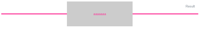
<div id="middle" class="col span_1_of_3">
aaaaaaa
</div>
<div class="col span_1_of_3">
<div class="topsection">
<div class="header"><hr /></div>
</div>
</div>
</div>
这是第二个版本。而不是有3列我可以使用下面的代码片段。问题出在这一行:
高度:100像素; line-height:100px;
我希望高度为100%。但行高不能:
.main {
    height:100%;
    min-height:100px;
    display: block;
    text-align: center;
    overflow: hidden;
    white-space: nowrap;
}

.main > span {
    width:200px;
    height:100px;
    line-height: 100px;
    background:#F1F1F1;
    position: relative;
    display: inline-block;
}

.main > span:before,
.main > span:after {
    content: "";
    position: absolute;
    top: 50%;
    width: 9999px;
    height: 3px;
    background: #FC3699;
}

.main > span:before {
    right: 100%;
    margin-right: 15px;
}

.main > span:after {
    left: 100%;
    margin-left: 15px;
}
<div class="main">
<span style="vertical-align: middle;">Text</span>
</div>
这是第三个也是最好的版本,我只需要text-aling:center;文本。但即使我在CSS中添加它,它也不起作用:
.main {
    height:100%;
    min-height:100px;
    display: block;
    text-align: center;
    overflow: hidden;
    white-space: nowrap;
}

.main > span {
    width:200px;
    height:100px;
    line-height: 100px;
    background:#F1F1F1;
    position: relative;
    display: inline-block;
}

.main > span:before,
.main > span:after {
    content: "";
    position: absolute;
    top: 50%;
    width: 9999px;
    height: 3px;
    background: #FC3699;
}

.main > span:before {
    right: 100%;
}

.main > span:after {
    left: 100%;
}

#child {
    display: table-cell;
    vertical-align: middle;
}
<div class="main">
<span><div id="child">Text</div></span>
</div>
3 个答案:
答案 0 :(得分:3)
如果flexbox是一个选项,这很容易 - 您只需要提供
  display: flex;
  justify-content:center;
  align-items:center;
您可以取消所有定位和宽度计算 - 请参阅下面的演示:
.main {
  height: 100%;
  min-height: 100px;
  display: flex;
  justify-content:center;
  align-items:center;
  width: 100%;
  text-align: center;
  white-space: nowrap;
}
.main > span {
  width: 200px;
  height: 100px;
  background: #F1F1F1;
  display: inline-flex;
  justify-content:center;
  align-items:center;
}
.main:before,
.main:after {
  content: "";
  height: 3px;
  background: #FC3699;
  flex:1;
}
<div class="main">
<span>Text</span>
</div>
答案 1 :(得分:1)
问题是1%的{{1}}保证金和.col的固定排名。
我建议使用hr作为包装器并将其垂直放置在包装器中。这样即使更改了包装器高度,行也将相对于包装器位于相同的位置( jQuery仅用于演示):
:before$(document).ready(function() {
setInterval(function() {
$('.col3').animate(
{height: 300},
2000,
function() {
$('.col3').animate({height: 120}, 2000);
});
}, 5000);
})* {
box-sizing: border-box;
}
.col3 {
width: 33.33333%;
height: 120px;
display: inline-block;
background-color: grey;
color: #fc3699;
z-index: 10;
position: relative;
margin: 1% 0;
}
.col3:before {
content: '';
height: 100%;
vertical-align: middle;
display: inline-block;
}
.wrapper {
position: relative;
text-align: center;
}
.wrapper:before {
content: '';
display: block;
width: 100%;
height: 4px;
background-color: #fc3699;
position: absolute;
left: 0;
top: 50%;
margin-top: -2px;
}
答案 2 :(得分:1)
我就是这样做的,带有一个图标:
gulp.task('watch', function() {
  gulp.watch('dev/templates/**/*.jade').on('change', function(changedFile) {
    return compileJade(isPartial(changedFile) ? findAffectedFiles(changedFile) : changedFile);
  });
});
CSS:
<div class="propos_underline marginbottom">
            <div class="icon icon-cubes"></div>
            <div class="clear"></div>
        </div>
结果:
jade-inheritance
相关问题
最新问题
- 我写了这段代码,但我无法理解我的错误
- 我无法从一个代码实例的列表中删除 None 值,但我可以在另一个实例中。为什么它适用于一个细分市场而不适用于另一个细分市场?
- 是否有可能使 loadstring 不可能等于打印?卢阿
- java中的random.expovariate()
- Appscript 通过会议在 Google 日历中发送电子邮件和创建活动
- 为什么我的 Onclick 箭头功能在 React 中不起作用?
- 在此代码中是否有使用“this”的替代方法?
- 在 SQL Server 和 PostgreSQL 上查询,我如何从第一个表获得第二个表的可视化
- 每千个数字得到
- 更新了城市边界 KML 文件的来源?