如何以2-3-2树顺序排列CSS3六边形
尝试创建六边形图库,我在互联网上搜索并找到了一些示例,并创建了类似画廊的this (this is my test hosting site, and that galley designed by me by referring some links)
我正在使用此代码:


#hexGrid {
  overflow: hidden;
  width: 60%;
  margin: 0 auto;
  padding: 0.866% 0;
  font-family: 'Raleway', sans-serif;
  font-size: 15px;
}
#hexGrid:after {
  content: "";
  display: block;
  clear: both;
}
.hex {
  position: relative;
  list-style-type: none;
  float: left;
  overflow: hidden;
  visibility: hidden;
  outline: 1px solid transparent;  /* fix for jagged edges in FF on hover transition */
  -webkit-transform: rotate(-60deg) skewY(30deg) translatez(-1px);
  -ms-transform: rotate(-60deg) skewY(30deg) translatez(-1px);
  transform: rotate(-60deg) skewY(30deg) translatez(-1px);
}
.hex * {
  position: absolute;
  visibility: visible;
  outline: 1px solid transparent;  /* fix for jagged edges in FF on hover transition */
}
.hexIn {
  display: block;
  width: 100%;
  height: 100%;
  text-align: center;
  color: #fff;
  overflow: hidden;
  -webkit-transform: skewY(-30deg) rotate(60deg);
  -ms-transform: skewY(-30deg) rotate(60deg);
  transform: skewY(-30deg) rotate(60deg);
}
/*** HEX CONTENT **********************************************************************/

.hex div {
  left: -100%;
  right: -100%;
  width: auto;
  height: 100%;
  margin: 0 auto;
}
.hex h1,
.hex p {
  width: 102%;
  left: -1%;  /* prevent line on the right where background doesn't cover image */
  padding: 5%;  box-sizing: border-box;
  background-color: rgba(0, 128, 128, 0.8);
  font-weight: 300;
  -webkit-transition: -webkit-transform .2s ease-out, opacity .3s ease-out;
  transition: transform .2s ease-out, opacity .3s ease-out;
}
.hex h1 {
  bottom: 50%;
  padding-top: 50%;
  font-size: 1.5em;
  z-index: 1;
  -webkit-transform: translateY(-100%) translatez(-1px);
  -ms-transform: translateY(-100%) translatez(-1px);
  transform: translateY(-100%) translatez(-1px);
}
.hex h1:after {
  content: '';
  position: absolute;
  bottom: 0;
  left: 45%;
  width: 10%;
  text-align: center;
  border-bottom: 1px solid #fff;
}
.hex p {
  top: 50%;
  padding-bottom: 50%;
  -webkit-transform: translateY(100%) translatez(-1px);
  -ms-transform: translateY(100%) translatez(-1px);
  transform: translateY(100%) translatez(-1px);
}
@media (min-width: 1201px) {  /* <- 5-4  hexagons per row */
  .hex {
    width: 24.25%;    /* = (100-3) / 4 */
    padding-bottom: 28.001%;    /* =  width / sin(60deg) */
  }
  .hex:nth-child(7n+5),  .hex:nth-child(7n+6),  .hex:nth-child(7n+7) {
    margin-top: -6.134%;
    margin-bottom: -6.134%;
    -webkit-transform: translateX(50%) rotate(-60deg) skewY(30deg);
    -ms-transform: translateX(50%) rotate(-60deg) skewY(30deg);
    transform: translateX(50%) rotate(-60deg) skewY(30deg);
  }
  .hex:nth-child(7n+5):last-child,  .hex:nth-child(7n+6):last-child,  .hex:nth-child(7n+7):last-child {
    margin-bottom: 0;
  }
  .hex:nth-child(7n+2),  .hex:nth-child(7n+6) {
    margin-left: 1%;
    margin-right: 1%;
  }
  .hex:nth-child(7n+3) {
    margin-right: 1%;
  }
  .hex:nth-child(7n+8) {
    clear: left;
  }
  .hex:nth-child(7n+5) {
    clear: left;
    margin-left: 0.5%;
  }
}
<ul id="hexGrid">
<li class="hex">
<a class="hexIn" href="#">
<div class="mono-green"></div>
<!--Empty Hex-->
</a>
</li>
<li class="hex">
<a class="hexIn" href="#">
<div class="mono-violet"></div>
<h1>2</h1>
</a>
</li>
</ul>
<!-- like this 11 hexagons but i'll remove 4 of them to create that -->
我想安排这样的六边形:
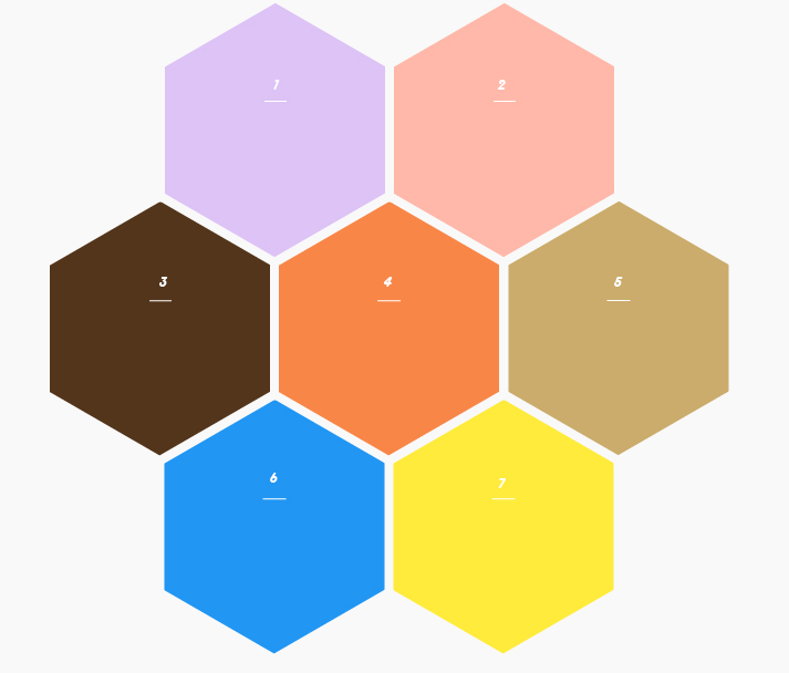
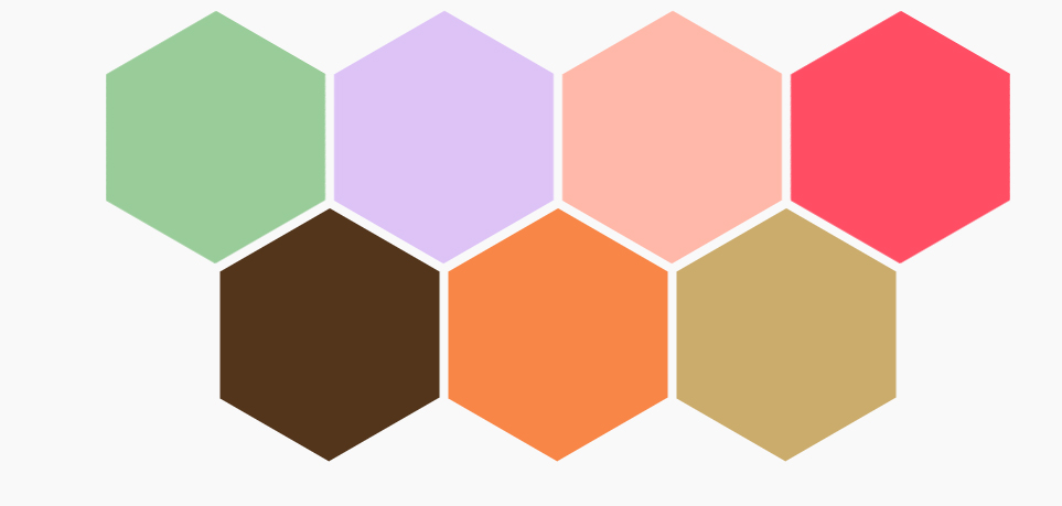
我现在使用11个六边形,如果我删除了上面结构中的4个十六进制,它会变成这样:
但我需要2-3-2结构!我应该在这段代码中修改什么?
2 个答案:
答案 0 :(得分:2)
如果您想修改该代码 (要有一个自适应的十六进制网格)查看更改(我改变了一些内容,我写了&#39;改性&#39; )。无论如何,我认为有时候从头开始编写代码会更好。
&#13;
&#13;
&#13;
&#13;
* {
    margin: 0;
    padding: 0;
}
body{
	background:#F9F9F9;
}
#hexGrid {
    overflow: hidden;
    width: 60%;
    margin: 0 auto;
    font-family: 'Raleway', sans-serif;
    font-size: 15px;
	background-color:rgba(0,0,0,0.1);				/*modified*/
	padding-bottom:5.3%;                            /*modified*/
}
#hexGrid:after {
    content: "";
    display: block;
    clear: both;
}
.hex {
    position: relative;
    list-style-type: none;
    float: left;
    overflow: hidden;
    visibility: hidden;
    outline:1px solid transparent; /* fix for jagged edges in FF on hover transition */
    -webkit-transform: rotate(-60deg) skewY(30deg) translatez(-1px);
        -ms-transform: rotate(-60deg) skewY(30deg) translatez(-1px);
            transform: rotate(-60deg) skewY(30deg) translatez(-1px);
}
.hex * {
    position: absolute;
    visibility: visible;
    outline:1px solid transparent; /* fix for jagged edges in FF on hover transition */
}
.hexIn {
    display:block;
    width: 100%;
    height: 100%;
    text-align: center;
    color: #fff;
    overflow: hidden;
    -webkit-transform: skewY(-30deg) rotate(60deg);
        -ms-transform: skewY(-30deg) rotate(60deg);
            transform: skewY(-30deg) rotate(60deg);
}

/*** HEX CONTENT **********************************************************************/
.hex div {
    left: -100%;
    right: -100%;
    width: auto;
    height: 100%;
    margin: 0 auto;
}

.hex h1, .hex p {
    width: 102%;
    left:-1%; /* prevent line on the right where background doesn't cover image */
    padding: 5%;
    box-sizing:border-box;
    background-color: rgba(0, 128, 128, 0.8);
    font-weight: 300;
    -webkit-transition:  -webkit-transform .2s ease-out, opacity .3s ease-out;
            transition:          transform .2s ease-out, opacity .3s ease-out;
}
.hex h1 {
    bottom: 50%;
    padding-top:50%;
    font-size: 1.5em;
    z-index: 1;
    -webkit-transform:translateY(-100%) translatez(-1px);
        -ms-transform:translateY(-100%) translatez(-1px);
            transform:translateY(-100%) translatez(-1px);
}
.hex h1:after {
    content: '';
    position: absolute;
    bottom: 0;
    left: 45%;
    width: 10%;
    text-align: center;
    border-bottom: 1px solid #fff;
}
.hex p {
    top: 50%;
    padding-bottom:50%;
    -webkit-transform:translateY(100%) translatez(-1px);
        -ms-transform:translateY(100%) translatez(-1px);
            transform:translateY(100%) translatez(-1px);
}


/*** HOVER EFFECT  **********************************************************************/
.hexIn:hover h1, .hexIn:focus h1,
.hexIn:hover p, .hexIn:focus p{
    -webkit-transform:translateY(0%) translatez(-1px);
        -ms-transform:translateY(0%) translatez(-1px);
            transform:translateY(0%) translatez(-1px);
}

/*** SPACING AND SIZING **************************************/        /*modified*/

    .hex {
        width: 32.3333333333%; /* = (100-3) / 3    or use 'calc()' */
        padding-bottom: 37.3353174076%; /* =  width / sin(60deg) */
		margin-bottom: -8.4%;
    }
    .hex:nth-child(5n+1),
    .hex:nth-child(5n+2),
    .hex:nth-child(5n+3) {
        -webkit-transform: translateX(50%) rotate(-60deg) skewY(30deg);
            -ms-transform: translateX(50%) rotate(-60deg) skewY(30deg);
                transform: translateX(50%) rotate(-60deg) skewY(30deg);
    }

    .hex:nth-child(5n+3),
    .hex:nth-child(5n+4),
    .hex:nth-child(5n+5) {
        -webkit-transform: translateX(0%) rotate(-60deg) skewY(30deg);
            -ms-transform: translateX(0%) rotate(-60deg) skewY(30deg);
                transform: translateX(0%) rotate(-60deg) skewY(30deg);
    }

	.hex:nth-child(5n+1){
        margin-left: 1%;
        margin-right: 1%;
    }

    .hex:nth-child(5n+4){
        margin-left: 1%;
        margin-right: 1%;
    }

    .hex:nth-child(5n+3) {
        clear: left;
        margin-left: 0.5%;
    }
}
<!doctype html>
<html>
<head>
<meta charset="utf-8">
<title></title>
<meta name="viewport" content="width=device-width, initial-scale=1">
<link rel="stylesheet" type="text/css" href="hexagons.css">
<link rel="stylesheet" type="text/css" href="http://supersevadeals.16mb.com/rak_code_hex/css/colors.css">
<link rel="stylesheet" type="text/css" href="css/materialize.min.css">
<link href='https://fonts.googleapis.com/css?family=Raleway:300' rel='stylesheet' type='text/css'>
</head>
<body>
<ul id="hexGrid">
<li class="hex">
<a class="hexIn" href="#">
<div class="mono-orange"></div>
<h1>1</h1>
</a>
</li>
<li class="hex">
<a class="hexIn" href="#">
<div class="mono-orange"></div>
<h1>2</h1>
</a>
</li>
<li class="hex">
<a class="hexIn" href="#">
<div class="mono-orange"></div>
<h1>3</h1>
</a>
</li>
<li class="hex">
<a class="hexIn" href="#">
<div class="mono-orange"></div>
<h1>4</h1>
</a>
</li>
<li class="hex">
<a class="hexIn" href="#">
<div class="mono-orange"></div>
<h1>5</h1>
</a>
</li>
<li class="hex">
<a class="hexIn" href="#">
<div class="mono-orange"></div>
<h1>6</h1>
</a>
</li>
<li class="hex">
<a class="hexIn" href="#">
<div class="mono-orange"></div>
<h1>7</h1>
</a>
</li>
<li class="hex">
<a class="hexIn" href="#">
<div class="mono-orange"></div>
<h1>8</h1>
</a>
</li>
<li class="hex">
<a class="hexIn" href="#">
<div class="mono-orange"></div>
<h1>9</h1>
</a>
</li>
<li class="hex">
<a class="hexIn" href="#">
<div class="mono-orange"></div>
<h1>10</h1>
</a>
</li>
<li class="hex">
<a class="hexIn" href="#">
<div class="mono-orange"></div>
<h1>11</h1>
</a>
</li>
<li class="hex">
<a class="hexIn" href="#">
<div class="mono-orange"></div>
<h1>12</h1>
</a>
</li>
</ul>
</body>
</html>
答案 1 :(得分:1)
您可以使用position: absolute定位每个六边形。
body {
  min-height: 100vh;
  margin: 0;
  padding: 0;
}
.content {
  position: absolute;
  left: 50%;
  top: 50%;
}
.hexagon {
  position: absolute;
  transform: translate(-100%, -220%);
  top: 0;
  left: 0;
  width: 100px;
  height: 57.74px;
  background-color: #64C7CC;
  margin: 28.87px 0;
}
.hexagon:before,
.hexagon:after {
  content: "";
  position: absolute;
  width: 0;
  border-left: 50px solid transparent;
  border-right: 50px solid transparent;
}
.hexagon:before {
  bottom: 100%;
  border-bottom: 28.87px solid #64C7CC;
}
.hexagon:after {
  top: 100%;
  width: 0;
  left: 0;
  border-top: 28.87px solid #64C7CC;
}
.hexagon:nth-child(2) {
  left: 110px;
}
.hexagon:nth-child(3) {
  left: -55px;
  top: 95px;
}
.hexagon:nth-child(4) {
  left: 55px;
  top: 95px;
}
.hexagon:nth-child(5) {
  left: 165px;
  top: 95px;
}
.hexagon:nth-child(6) {
  top: 190px;
}
.hexagon:nth-child(7) {
  left: 110px;
  top: 190px;
}
<div class="content">
<div class="hexagon">1</div>
<div class="hexagon">2</div>
<div class="hexagon">3</div>
<div class="hexagon">4</div>
<div class="hexagon">5</div>
<div class="hexagon">6</div>
<div class="hexagon">7</div>
</div>
相关问题
最新问题
- 我写了这段代码,但我无法理解我的错误
- 我无法从一个代码实例的列表中删除 None 值,但我可以在另一个实例中。为什么它适用于一个细分市场而不适用于另一个细分市场?
- 是否有可能使 loadstring 不可能等于打印?卢阿
- java中的random.expovariate()
- Appscript 通过会议在 Google 日历中发送电子邮件和创建活动
- 为什么我的 Onclick 箭头功能在 React 中不起作用?
- 在此代码中是否有使用“this”的替代方法?
- 在 SQL Server 和 PostgreSQL 上查询,我如何从第一个表获得第二个表的可视化
- 每千个数字得到
- 更新了城市边界 KML 文件的来源?