Css框阴影移动到顶部和左侧
CSS& HTML:


body {background:#ccc}

.box h3{
  text-align:center;
    position:relative;
    top:80px;
}
.box {
    width:70%;
    height:200px;
    background:#FFF;
    margin:40px auto;
}

.effect3
{
  position: relative;
}
.effect3:before
{
  z-index: -1;
  position: absolute;
  content: "";
  bottom: 15px;
  left: 10px;
  width: 50%;
  top: 80%;
  max-width:300px;
  background: #777;
  -webkit-box-shadow: 0 15px 10px #777;
  -moz-box-shadow: 0 15px 10px #777;
  box-shadow: 0 15px 10px #777;
  -webkit-transform: rotate(-3deg);
  -moz-transform: rotate(-3deg);
  -o-transform: rotate(-3deg);
  -ms-transform: rotate(-3deg);
  transform: rotate(-3deg);
}
<div class="box effect3">
<h3>Effect 3</h3>
</div>
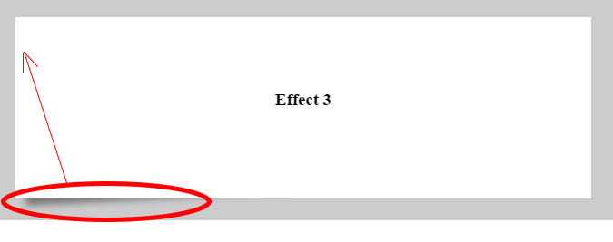
我正在尝试用阴影装饰一个盒子。
上面的css是阴影底部和左边(红色圆圈)。 什么可以应用于顶部和左侧的红色(红色箭头)?
4 个答案:
答案 0 :(得分:1)
body {
  background: #ccc
}

.box h3 {
  text-align: center;
  position: relative;
  top: 80px;
}

.box {
  width: 70%;
  height: 200px;
  background: #FFF;
  margin: 40px auto;
}

.effect3 {
  position: relative;
}

.effect3:before {
    z-index: -1;
    position: absolute;
    content: "";
    left: -46px;
    width: 20%;
    bottom: 15px;
    top: 25%;
    max-width: 300px;
    height: 20px;
    background: #777;
    -webkit-box-shadow: 0 15px 10px #777;
    -moz-box-shadow: 0 15px 10px #777;
    box-shadow: -10px -5px 10px #777;
    -webkit-transform: rotate(-93deg);
    -moz-transform: rotate(-93deg);
    -o-transform: rotate(-93deg);
    -ms-transform: rotate(-93deg);
    transform: rotate(-93deg);
}
我认为这就是你要求的......
答案 1 :(得分:1)
请将这些代码用于左上角的框阴影:
.effect3:before {
    z-index: -1;
    position: absolute;
    content: "";
    bottom: 15px;
    left: 3px;
    width: 18%;
    top: 24px;
    max-width: 300px;
    background: #777;
    -webkit-box-shadow: -8px 15px 10px #777;
    -moz-box-shadow: -8px 15px 10px #777;
    -webkit-transform: rotate(87deg);
    -moz-transform: rotate(87deg);
    transform: rotate(87deg);
 }

答案 2 :(得分:0)
left()答案 3 :(得分:0)
使用after并更改before,如下所示:
.effect3:before {
    z-index: -1;
    position: absolute;
    content: "";
    left: 15px;
    width: 50%;
    bottom: 15px;
    top: 4%;
    max-width: 300px;
    height: 20px;
    background: #777;
    -webkit-box-shadow: 0 15px 10px #777;
    -moz-box-shadow: 0 15px 10px #777;
    box-shadow: -10px -5px 10px #777;
    -webkit-transform: rotate(-3deg);
    -moz-transform: rotate(-3deg);
    -o-transform: rotate(-3deg);
    -ms-transform: rotate(-3deg);
    transform: rotate(3deg);
}

.effect3:after {
    z-index: -1;
    position: absolute;
    content: "";
    bottom: 15px;
    left: 10px;
    width: 50%;
    top: 80%;
    max-width: 300px;
    background: #777;
    -webkit-box-shadow: 0 15px 10px #777;
    -moz-box-shadow: 0 15px 10px #777;
    box-shadow: 0 15px 10px #777;
    -webkit-transform: rotate(-3deg);
    -moz-transform: rotate(-3deg);
    -o-transform: rotate(-3deg);
    -ms-transform: rotate(-3deg);
    transform: rotate(-3deg);
}
相关问题
最新问题
- 我写了这段代码,但我无法理解我的错误
- 我无法从一个代码实例的列表中删除 None 值,但我可以在另一个实例中。为什么它适用于一个细分市场而不适用于另一个细分市场?
- 是否有可能使 loadstring 不可能等于打印?卢阿
- java中的random.expovariate()
- Appscript 通过会议在 Google 日历中发送电子邮件和创建活动
- 为什么我的 Onclick 箭头功能在 React 中不起作用?
- 在此代码中是否有使用“this”的替代方法?
- 在 SQL Server 和 PostgreSQL 上查询,我如何从第一个表获得第二个表的可视化
- 每千个数字得到
- 更新了城市边界 KML 文件的来源?