使用css
我一直在尝试自定义默认单选按钮,使其看起来像开/关按钮 我已经创建了一个使用2个图像(使用javascript)进行开启和关闭状态,但是没有动画可以在两个状态之间进行转换。
有没有办法用纯css(+动画)实现这个目标?
我需要这样的按钮 -
2 个答案:
答案 0 :(得分:2)
您可以使用复选框
执行此操作


#mc, #mc2, #mc3 {
  display: none;
}
.switch {
  background: gray;
  width: 40px;
  height: 20px;
  border-radius: 10px;
  display: block;
  position: relative;
  margin: 10px;
}
.switch:hover {
  cursor: pointer
}
.switch:after {
  content: "";
  height: 18px;
  width: 18px;
  border-radius: 9px;
  display: block;
  position: absolute;
  top: 1px;
  left: 1px;
  background: lightblue;
  transition: ease-out 0.5s;
}
input[type=radio]:checked + label:after,
input[type=checkbox]:checked + label:after{
  left: calc(100% - 19px);
  background: lightgreen;
  }
<p>Radio</p>
<input type="radio" id="mc" name="Switch" />
<label class="switch" for="mc"></label>
<input type="radio" id="mc2" name="Switch" />
<label class="switch" for="mc2"></label>
<p>Checkbox</p>
<input type="checkbox" id="mc3" name="Switch" />
<label class="switch" for="mc3"></label>
答案 1 :(得分:0)
要在两种状态(打开/关闭)之间转换,请设置:checked 伪类的样式。
:checked 伪类与每个选中的元素(单选,复选框和选项)匹配。
/* The container */
.switch {
position: relative;
display: inline-block;
vertical-align: middle;
margin-right: .5em;
width: 46px;
height: 24px;
}
/* Hide the browser's default radio */
.switch input[type=radio] {
position: absolute;
opacity: 0;
}
/* Create a custom switch */
.switch .slider {
position: absolute;
cursor: pointer;
top: 0;
left: 0;
right: 0;
bottom: 0;
border-radius: 34px;
border: 1px solid #daa2e6;
transition: .2s;
}
/* Create the indicator/dot */
.switch .slider::before {
position: absolute;
top: 2px;
left: 4px;
content: "";
height: 18px;
width: 18px;
border-radius: 50%;
background-color: #bababa;
transition: .2s;
}
/* When the switch is checked, add a blue background */
.switch input[type=radio]:checked + .slider {
background-color: #007bff;
}
/* When the switch is checked, change position of the indicator/dot */
.switch input[type=radio]:checked + .slider::before {
background-color: #fff;
-webkit-transform: translateX(18px);
-ms-transform: translateX(18px);
transform: translateX(18px);
}
/* When the switch gets focus, add a shadow */
.switch input[type=radio]:focus + .slider {
box-shadow: 0 0 0 0.2rem rgba(0,123,255,.25);
border-color: #80bdff;
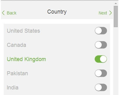
}<p>
<label class="switch">
<input type="radio" name="country">
<span class="slider"></span>
</label> United States
</p>
<p>
<label class="switch">
<input type="radio" name="country">
<span class="slider"></span>
</label> Canada
</p>
<p>
<label class="switch">
<input type="radio" name="country" checked>
<span class="slider"></span>
</label> United Kingdom
</p>
<p>
<label class="switch">
<input type="radio" name="country">
<span class="slider"></span>
</label> India
</p>
相关问题
最新问题
- 我写了这段代码,但我无法理解我的错误
- 我无法从一个代码实例的列表中删除 None 值,但我可以在另一个实例中。为什么它适用于一个细分市场而不适用于另一个细分市场?
- 是否有可能使 loadstring 不可能等于打印?卢阿
- java中的random.expovariate()
- Appscript 通过会议在 Google 日历中发送电子邮件和创建活动
- 为什么我的 Onclick 箭头功能在 React 中不起作用?
- 在此代码中是否有使用“this”的替代方法?
- 在 SQL Server 和 PostgreSQL 上查询,我如何从第一个表获得第二个表的可视化
- 每千个数字得到
- 更新了城市边界 KML 文件的来源?