右对齐两个弹性容器
我无法在弹性框中对齐两个元素: 我想要发生的是拥有"帮助"然后离开那个" XX" DIV。我是灵活容器的新手,通常会在一个元素之后立即浮动一个元素,从而产生所需的效果。有谁知道我怎么能做到这一点?
<html>
<head>
<style>
body {
   margin:0;
   padding:0;
   font-family: 'Helvetica Neue', Helvetica, Arial, sans-serif;
}

#menuStrip {
   position:relative;
   border-style: solid;
   border-width: 1px;
   height:36px;
   padding:0;
   margin:0;
   background-color:black;
}

#menuContainer {
   position:relative;
   background-color:grey;
   border-style: solid;
   border-width: 1px;
   padding:0;
   width:96%;
   height:98%;
   margin: 0 auto;
   display: flex;
}

#hh {
   position:relative;
   display:flex;
   align-self: center;
   font-size:14px;
   width:80px;
   border-style: solid;
   border-width: 1px;
   height:50%;
   margin-left:auto;
}


#pp {
   position:relative;
   display:flex;
   height:70%;
   width:36px;
   align-self: center;
   justify-content: center;
   margin-left: auto;
   background-color:white;
   border-style: solid;
   border-width: 1px;
   padding:0;
}
</style>
</head>
<body>
   <div id="menuStrip">
      <div id="menuContainer">
         <div id="hh">Help</div>
        <div id="pp"> XX</div>
   </div>
</body>
</html>
1 个答案:
答案 0 :(得分:5)
JUSTIFY CONTENT
您正在寻找flex-end中使用的属性值justify-content。同时删除margin-left: auto;,因为它不需要。
body {
  margin: 0;
  padding: 0;
  font-family: 'Helvetica Neue', Helvetica, Arial, sans-serif;
}
#menuStrip {
  position: relative;
  border-style: solid;
  border-width: 1px;
  height: 36px;
  padding: 0;
  margin: 0;
  background-color: black;
}
#menuContainer {
  position: relative;
  background-color: grey;
  border-style: solid;
  border-width: 1px;
  padding: 0;
  width: 96%;
  height: 98%;
  margin: 0 auto;
  display: flex;
  justify-content: flex-end;
}
#hh {
  position: relative;
  display: flex;
  align-self: center;
  font-size: 14px;
  width: 80px;
  border-style: solid;
  border-width: 1px;
  height: 50%;
}
#pp {
  position: relative;
  display: flex;
  height: 70%;
  width: 36px;
  align-self: center;
  justify-content: center;
  background-color: white;
  border-style: solid;
  border-width: 1px;
  padding: 0;
}
<div id="menuStrip">
<div id="menuContainer">
<div id="hh">Help</div>
<div id="pp">XX</div>
</div>
ORDER
要更改您在评论中提出的顺序,您将使用属性order。这很直接。 flex-items的订单默认值为0。您可以使用消极值或正值,例如-1,-2,1,2等。
您可以在第一个或第二个项目中设置此属性,根据您希望更改的值不同,它们都会得到相同的结果。
使用正值在第一个项目中声明:
body {
  margin: 0;
  padding: 0;
  font-family: 'Helvetica Neue', Helvetica, Arial, sans-serif;
}
#menuStrip {
  position: relative;
  border-style: solid;
  border-width: 1px;
  height: 36px;
  padding: 0;
  margin: 0;
  background-color: black;
}
#menuContainer {
  position: relative;
  background-color: grey;
  border-style: solid;
  border-width: 1px;
  padding: 0;
  width: 96%;
  height: 98%;
  margin: 0 auto;
  display: flex;
  justify-content: flex-end;
}
#hh {
  position: relative;
  display: flex;
  align-self: center;
  font-size: 14px;
  width: 80px;
  border-style: solid;
  border-width: 1px;
  height: 50%;
  order: 1;
}
#pp {
  position: relative;
  display: flex;
  height: 70%;
  width: 36px;
  align-self: center;
  justify-content: center;
  background-color: white;
  border-style: solid;
  border-width: 1px;
  padding: 0;
}
<div id="menuStrip">
<div id="menuContainer">
<div id="hh">Help</div>
<div id="pp">XX</div>
</div>
使用负值在第二个中声明它:
body {
  margin: 0;
  padding: 0;
  font-family: 'Helvetica Neue', Helvetica, Arial, sans-serif;
}
#menuStrip {
  position: relative;
  border-style: solid;
  border-width: 1px;
  height: 36px;
  padding: 0;
  margin: 0;
  background-color: black;
}
#menuContainer {
  position: relative;
  background-color: grey;
  border-style: solid;
  border-width: 1px;
  padding: 0;
  width: 96%;
  height: 98%;
  margin: 0 auto;
  display: flex;
  justify-content: flex-end;
}
#hh {
  position: relative;
  display: flex;
  align-self: center;
  font-size: 14px;
  width: 80px;
  border-style: solid;
  border-width: 1px;
  height: 50%;
}
#pp {
  position: relative;
  display: flex;
  height: 70%;
  width: 36px;
  align-self: center;
  justify-content: center;
  background-color: white;
  border-style: solid;
  border-width: 1px;
  padding: 0;
  order: -1;
}
<div id="menuStrip">
<div id="menuContainer">
<div id="hh">Help</div>
<div id="pp">XX</div>
</div>
简单的订单更改互动:
注意:单击锚元素会将每个奇数弹性项目的顺序更改为-1。
body {
  margin: 0;
}
a {
  font-size: 2em;
  position: absolute;
  top: 30%;
  left: 50%;
  transform: translate(-50%, -30%);
  background-color: white;
}
.flex-container {
  counter-reset: flex-items;
  height: 100vh;
  background-color: peachpuff;
  display: flex;
  justify-content: space-around;
  /* Default Value */
}
.flex-item {
  counter-increment: flex-items;
  background-color: gold;
}
.flex-item:nth-child(even) {
  background-color: dodgerblue;
}
.flex-item::after {
  content: counter(flex-items);
  display: flex;
  justify-content: center;
  align-items: center;
  height: 100%;
  font-size: 3em;
}
.flex-container:target .flex-item:nth-child(odd) {
  order: -1;
}
<a href="#flex-container">Change Order</a>
<section id="flex-container" class="flex-container">
<div class="flex-item"></div>
<div class="flex-item"></div>
<div class="flex-item"></div>
<div class="flex-item"></div>
<div class="flex-item"></div>
<div class="flex-item"></div>
<div class="flex-item"></div>
<div class="flex-item"></div>
<div class="flex-item"></div>
</section>
进一步解释:
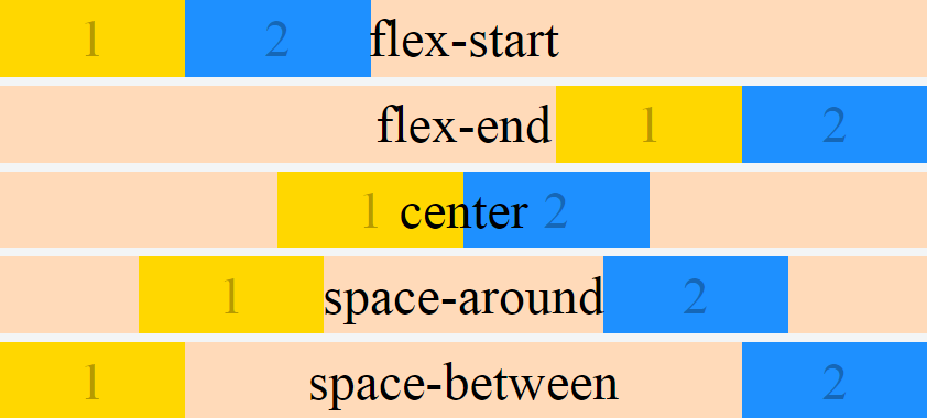
justify-content属性接受5个不同的值:
- flex-start,这是默认设置。
- 柔性端
- 中心
- 空间之间
- 空间的周围
柔性起动
body{
  margin: 0;
}
.flex-container {
  counter-reset: flex-items;
  height: 100vh;
  background-color: peachpuff;
  display: flex;
  justify-content: flex-start; /* Default Value */
}
.flex-item {
  counter-increment: flex-items;
  flex: 0 0 30%;
  background-color: gold;
}
.flex-item:nth-child(even) {
  background-color: dodgerblue;
}
.flex-item::after {
  content: counter(flex-items);
  display: flex;
  justify-content: center;
  align-items: center;
  height: 100%;
  font-size: 3em;
}
<section class="flex-container">
<div class="flex-item"></div>
<div class="flex-item"></div>
</section>
柔性端
body{
  margin: 0;
}
.flex-container {
  counter-reset: flex-items;
  height: 100vh;
  background-color: peachpuff;
  display: flex;
  justify-content: flex-end;
}
.flex-item {
  counter-increment: flex-items;
  flex: 0 0 30%;
  background-color: gold;
}
.flex-item:nth-child(even) {
  background-color: dodgerblue;
}
.flex-item::after {
  content: counter(flex-items);
  display: flex;
  justify-content: center;
  align-items: center;
  height: 100%;
  font-size: 3em;
}
<section class="flex-container">
<div class="flex-item"></div>
<div class="flex-item"></div>
</section>
中心
body{
  margin: 0;
}
.flex-container {
  counter-reset: flex-items;
  height: 100vh;
  background-color: peachpuff;
  display: flex;
  justify-content: center;
}
.flex-item {
  counter-increment: flex-items;
  flex: 0 0 30%;
  background-color: gold;
}
.flex-item:nth-child(even) {
  background-color: dodgerblue;
}
.flex-item::after {
  content: counter(flex-items);
  display: flex;
  justify-content: center;
  align-items: center;
  height: 100%;
  font-size: 3em;
}
<section class="flex-container">
<div class="flex-item"></div>
<div class="flex-item"></div>
</section>
空间之间
body{
  margin: 0;
}
.flex-container {
  counter-reset: flex-items;
  height: 100vh;
  background-color: peachpuff;
  display: flex;
  justify-content: space-between;
}
.flex-item {
  counter-increment: flex-items;
  flex: 0 0 30%;
  background-color: gold;
}
.flex-item:nth-child(even) {
  background-color: dodgerblue;
}
.flex-item::after {
  content: counter(flex-items);
  display: flex;
  justify-content: center;
  align-items: center;
  height: 100%;
  font-size: 3em;
}
<section class="flex-container">
<div class="flex-item"></div>
<div class="flex-item"></div>
</section>
空间的周围
body{
  margin: 0;
}
.flex-container {
  counter-reset: flex-items;
  height: 100vh;
  background-color: peachpuff;
  display: flex;
  justify-content: space-around;
}
.flex-item {
  counter-increment: flex-items;
  flex: 0 0 30%;
  background-color: gold;
}
.flex-item:nth-child(even) {
  background-color: dodgerblue;
}
.flex-item::after {
  content: counter(flex-items);
  display: flex;
  justify-content: center;
  align-items: center;
  height: 100%;
  font-size: 3em;
}
<section class="flex-container">
<div class="flex-item"></div>
<div class="flex-item"></div>
</section>
<强>概要
* {
  box-sizing: border-box;
}
body {
  margin: 0;
}
.flex-container {
  counter-reset: flex-items;
  background-color: peachpuff;
  display: flex;
  height: calc(20vh - .5em);
  justify-content: flex-start;
  margin-bottom: .5em;
  position: relative;
}
.flex-container:nth-child(2) {
  justify-content: flex-end;
}
.flex-container:nth-child(3) {
  justify-content: center;
}
.flex-container:nth-child(4) {
  justify-content: space-around;
}
.flex-container:nth-child(5) {
  justify-content: space-between;
}
.flex-container::after {
  position: absolute;
  display: flex;
  content: attr(data-justify-content);
  justify-content: center;
  align-items: center;
  height: 100%;
  width: 100%;
  font-size: 3em;
}
.flex-item {
  counter-increment: flex-items;
  flex: 0 0 20%;
  background-color: gold;
}
.flex-item:nth-child(even) {
  background-color: dodgerblue;
}
.flex-item::after {
  content: counter(flex-items);
  display: flex;
  justify-content: center;
  align-items: center;
  height: 100%;
  font-size: 3em;
  color: rgba(0, 0, 0, .3);
}
<section class="flex-container" data-justify-content="flex-start">
<div class="flex-item"></div>
<div class="flex-item"></div>
</section>
<section class="flex-container" data-justify-content="flex-end">
<div class="flex-item"></div>
<div class="flex-item"></div>
</section>
<section class="flex-container" data-justify-content="center">
<div class="flex-item"></div>
<div class="flex-item"></div>
</section>
<section class="flex-container" data-justify-content="space-around">
<div class="flex-item"></div>
<div class="flex-item"></div>
</section>
<section class="flex-container" data-justify-content="space-between">
<div class="flex-item"></div>
<div class="flex-item"></div>
</section>
更多信息:
您可以在以下资源中找到更多信息:
<强> CSS Tricks
<强> Stack Overflow Michael_B's Flexbox Post
游乐场:
<强> Flexbox Froggy
相关问题
最新问题
- 我写了这段代码,但我无法理解我的错误
- 我无法从一个代码实例的列表中删除 None 值,但我可以在另一个实例中。为什么它适用于一个细分市场而不适用于另一个细分市场?
- 是否有可能使 loadstring 不可能等于打印?卢阿
- java中的random.expovariate()
- Appscript 通过会议在 Google 日历中发送电子邮件和创建活动
- 为什么我的 Onclick 箭头功能在 React 中不起作用?
- 在此代码中是否有使用“this”的替代方法?
- 在 SQL Server 和 PostgreSQL 上查询,我如何从第一个表获得第二个表的可视化
- 每千个数字得到
- 更新了城市边界 KML 文件的来源?