将徽标和标题并排放置
我试图将徽标和标题并排对齐,以便该段落在下面。我尝试漂浮它不起作用。我怎么能轻松做到?(css noobs)
<div class="left-column" style="float:left; background-color:#FF0; margin-left:10px; margin-top:20px;" width = "515">
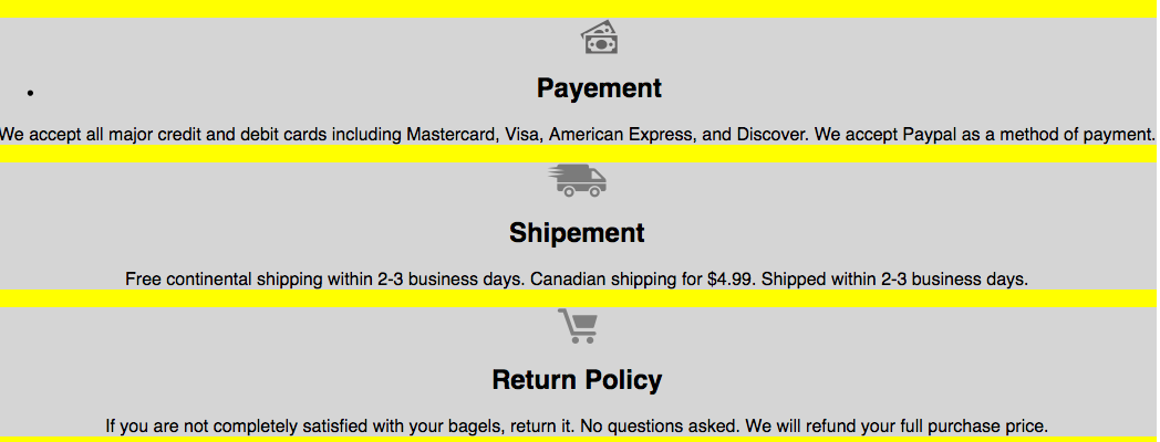
<div class= "Payement" style=" background-color:#D5D5D5">
<img src="images/Forma1copy.png" class="logo_page"/>
<h2>Payement</h2>
<p> We accept all major credit and debit cards including Mastercard,Visa, American Express, and Discover.
We accept Paypal as a method of payment. </p>
</div>
<div class= "shipement" style=" background-color:#D5D5D5">
<img src="images/Forma1_0.png" class="shipement_logo" />
<h2>Shipement</h2>
<p>Free continental shipping within 2-3 business days.
Canadian shipping for $4.99. Shipped within 2-3 business days.</p>
</div>
<div class ="return_policy" style=" background-color:#D5D5D5">
<img src="images/Forma1.png" class="return_policy" />
<h2>Return Policy</h2>
<p> If you are not completely satisfied with your bagels, return it. No questions asked. We will refund your full purchase price.</p>
</div>
</div>
6 个答案:
答案 0 :(得分:0)
You can use something about following code.

<div style="">
<div style="float:left;width:80px;height:50px;">
<img src="images/Forma1copy.png" class="logo_page"/>
</div>
<div style="float:left;width:200px;text-align:left;">
     <h2>Payement</h2>
</div>
<div style="clear:both"></div>
</div>
答案 1 :(得分:0)
<div class= "Payement" style=" background-color:#D5D5D5">
     <div style="display:flex">
     <img src="images/Forma1copy.png" class="logo_page"/>
     <h2>Payement</h2>
     </div>
     <p> We accept all major credit and debit cards including Mastercard,Visa, American Express, and Discover.
 We accept Paypal as a method of payment. </p>
    </div>
将img和h2包装在div中并将样式显示为display:flex
答案 2 :(得分:0)
您可以使用flexbox获得所需的结果。我认为这是最简单的解决方案,也是最好的解决方案。
<div class="left-column" style="float:left; background-color:#FF0; margin-left:10px; margin-top:20px;" width = "515">
  <div class= "Payement" style=" background-color:#D5D5D5">
    <div class = "flex-wrapper">
      <img src="images/Forma1copy.png" class="logo"/>
      <h2>Payement</h2>
      <p> We accept all major credit and debit cards including Mastercard,Visa, American Express, and Discover.
        We accept Paypal as a method of payment. </p>
    </div>
  </div>
  <div class= "shipement" style=" background-color:#D5D5D5">
    <div class = "flex-wrapper">
      <img src="images/Forma1_0.png"  class="logo" />
      <h2>Shipement</h2>
      <p>Free continental shipping within 2-3 business days.
        Canadian shipping for $4.99. Shipped within 2-3 business days.</p>
    </div>
  </div>
  <div class ="return_policy" style=" background-color:#D5D5D5">
    <div class = "flex-wrapper">
      <img src="images/Forma1.png" class="logo" />
      <h2>Return Policy</h2>
      <p> If you are not completely satisfied with your bagels, return it. No questions asked. We will refund your full purchase price.</p>
    </div>
  </div>
</div>
这是CSS:
.flex-wrapper {
  display: flex;
  flex-direction: row;
  justify-content: space-between;
  align-items: center;
}

.logo {

  flex-shrink: 0;
  width: 30px;
  height: 30px;
  background-color: black; /* remove this line */

}

h2 {

  margin-right: 50px;
  margin-left: 25px;
  width: 100px;
  flex-shrink: 0;

}
答案 3 :(得分:-1)
您应该使用:text-align: left;代替float:left;
答案 4 :(得分:-1)
将您的图片浮动:
img {
  float: left;
}
img {
  float: left;
}
<div class="left-column" style="background-color:#FF0; margin-left:10px; margin-top:20px;" width="515">
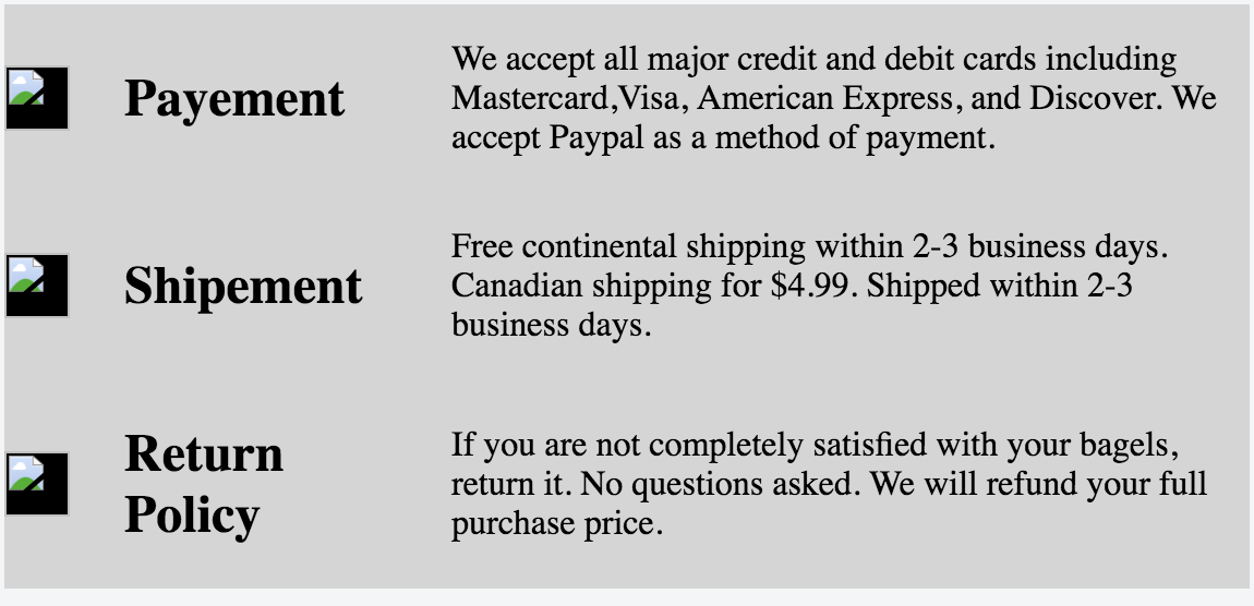
<div class="Payement" style=" background-color:#D5D5D5">
<img src="images/Forma1copy.png" class="logo_page" />
<h2>Payement</h2>
<p>We accept all major credit and debit cards including Mastercard,Visa, American Express, and Discover. We accept Paypal as a method of payment.</p>
</div>
<div class="shipement" style=" background-color:#D5D5D5">
<img src="images/Forma1_0.png" class="shipement_logo" />
<h2>Shipement</h2>
<p>Free continental shipping within 2-3 business days. Canadian shipping for $4.99. Shipped within 2-3 business days.</p>
</div>
<div class="return_policy" style=" background-color:#D5D5D5">
<img src="images/Forma1.png" class="return_policy" />
<h2>Return Policy</h2>
<p>If you are not completely satisfied with your bagels, return it. No questions asked. We will refund your full purchase price.</p>
</div>
</div>
答案 5 :(得分:-1)
你需要的就是这样:
img, h2 {
    display: inline-block;
}
显然你可以像class h2 , etc那样更加细致,或者你可以像你现在这样做内联...虽然多余(无论你喜欢什么)......但是应该这样做。
如果你想要更现代的css3,你也可以在父div上做flex
相关问题
最新问题
- 我写了这段代码,但我无法理解我的错误
- 我无法从一个代码实例的列表中删除 None 值,但我可以在另一个实例中。为什么它适用于一个细分市场而不适用于另一个细分市场?
- 是否有可能使 loadstring 不可能等于打印?卢阿
- java中的random.expovariate()
- Appscript 通过会议在 Google 日历中发送电子邮件和创建活动
- 为什么我的 Onclick 箭头功能在 React 中不起作用?
- 在此代码中是否有使用“this”的替代方法?
- 在 SQL Server 和 PostgreSQL 上查询,我如何从第一个表获得第二个表的可视化
- 每千个数字得到
- 更新了城市边界 KML 文件的来源?