如何为多个div设置背景图像?
我使用四个div来显示一些服务:
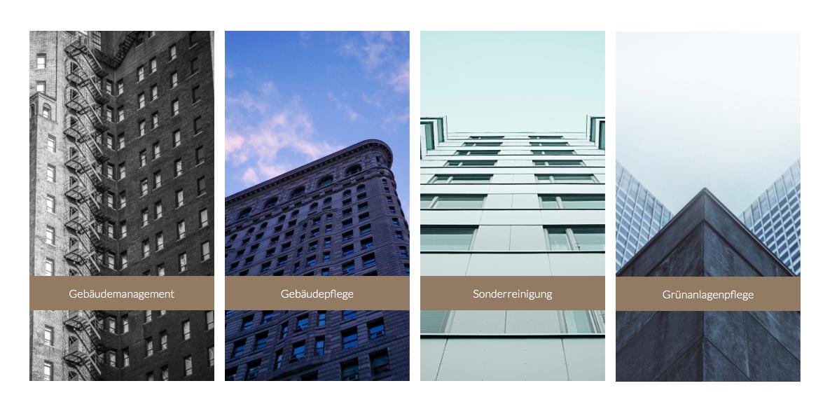
我想在这个例子中使用背景图像作为四个图像:
我该怎么办?分辨率应具有响应性,因此我无法使用裁剪工具剪切图像。
5 个答案:
答案 0 :(得分:2)
以下是更新的 Demo
它实际上是position: absolute的游戏。您给出的示例站点也以相同的方式执行。它实际上是<img>标签,而不是背景
这是代码:
&#13;
&#13;
&#13;
&#13;
.container{
	max-width: 600px;
	position: absolute;
	top: 10px;
}
img{
	max-width: 600px;
}
.divider{
	width: 10px;
	position: absolute;
	top: 0px;
	height: 100%;
	background: white;
}
.one{
	left: 150px;
}
.two{
	left: 300px;
}
.three{
	left: 450px;
}
<div class="container">
<img src="https://static.wixstatic.com/media/b2c0a7_a44d01e99b665e19effb29e4fc36ded3.jpg/v1/fill/w_880,h_500,al_c,q_85/b2c0a7_a44d01e99b665e19effb29e4fc36ded3.jpg" alt="">
<div class="divider one"></div>
<div class="divider two"></div>
<div class="divider three"></div>
</div>
答案 1 :(得分:0)
对于响应式图像,我建议你尝试bootstrap:
http://www.w3schools.com/bootstrap/bootstrap_images.asp
<img class="img-responsive" src="img_chania.jpg" alt="Chania">
或者您可以使用css来执行此操作,请点击以下链接: http://www.w3schools.com/css/css_rwd_images.asp
答案 2 :(得分:0)
在该示例中,div是透明的,让背景图像闪耀。
想象一下,你有四个窗户。你把一张巨幅照片放在他们身后。那是什么。
您可以对价值进行更多研究&#34;背景:透明&#34;获得经验。
答案 3 :(得分:0)
或许你可以使用这种方法帮助
*,:before,:after {
  -webkit-box-sizing: border-box;
  -moz-box-sizing: border-box;
  box-sizing: border-box;
}

.container {
  width: 100%;
  position: relative;
  display: inline-block;
  height: 400px;
}

.container img {
  position: absolute;
  top: 0;
  left: 0;
  right: 0;
  width: 100%;
  height: 100%;
}

.divider {
  width: 25%;
  border: 10px solid #fff;
  position: relative;
  display: inline-block;
  float: left;
  top: 0px;
  height: 100%;
}

.btn {
  background: green;
  color: white;
  width: 100%;
  position: absolute;
  bottom: 3em;
  padding: 1em;
  text-align: center;
  text-decoration: none;
}
<div class="container">
<img src="https://static.wixstatic.com/media/b2c0a7_a44d01e99b665e19effb29e4fc36ded3.jpg/v1/fill/w_880,h_500,al_c,q_85/b2c0a7_a44d01e99b665e19effb29e4fc36ded3.jpg" alt="">
<div class="divider one"><a class="btn" href="#">Button</a></div>
<div class="divider two"><a class="btn" href="#">Button</a></div>
<div class="divider three"><a class="btn" href="#">Button</a></div>
<div class="divider four"><a class="btn" href="#">Button</a></div>
</div>
答案 4 :(得分:0)
这是一个响应更快的解决方案。它有响应div(列和横幅)和背景。与示例网站不同,容器不是固定宽度。
https://jsfiddle.net/Lqzqo5xf/
通过将min-width属性应用于.wrapper类,当屏幕缩小到一定大小时,您还可以将容器设置为固定宽度。
就像你给出的例子一样,它需要分隔符的div(白色列)和一个与容器重叠的单独容器和背景。它还使用绝对定位分频器,而是使用百分比来表示响应。
.wrapper {
  width: 100%;
  height:400px;
  margin:0;
  padding:0;
  position: absolute;
  top:0;
  left:0;
}

#bg-wrapper {
  background-image: url('http://www.gstatic.com/webp/gallery/1.jpg');
  background-size: cover; /** Also try "contain" **/
}

.banner {
  float: left;
  margin-top: 70px;
  width: 25%;
  height: 50px;
  background-color: rgba(0,0,0,0.7);
  vertical-align:middle;
  text-align: center;
  color:white;
}

.divider {
  position: absolute;
  width:2%;
  height: 100%;
  background-color: white;
  margin: 0 0 0 -1%;
  padding: 0;
}
<div class="wrapper" id="bg-wrapper">
<div class="banner">
<h4>
willkommen
</div>
<div class="banner">
<h4>
willkommen
</div>
<div class="banner">
<h4>
willkommen
</div>
<div class="banner">
<h4>
willkommen
</div>
</div>
<div class="wrapper">
<div class="divider" style="left:25%;">
</div>
<div class="divider" style="left: 50%;">
</div>
<div class="divider" style="left:75%;">
</div>
</div>
相关问题
最新问题
- 我写了这段代码,但我无法理解我的错误
- 我无法从一个代码实例的列表中删除 None 值,但我可以在另一个实例中。为什么它适用于一个细分市场而不适用于另一个细分市场?
- 是否有可能使 loadstring 不可能等于打印?卢阿
- java中的random.expovariate()
- Appscript 通过会议在 Google 日历中发送电子邮件和创建活动
- 为什么我的 Onclick 箭头功能在 React 中不起作用?
- 在此代码中是否有使用“this”的替代方法?
- 在 SQL Server 和 PostgreSQL 上查询,我如何从第一个表获得第二个表的可视化
- 每千个数字得到
- 更新了城市边界 KML 文件的来源?