网页没有响应:如何使用绝对位置和相对位置?
我创建了一个简单的网站,但div没有正确显示
- 我有一个div
section-one,position: relative[green] ,我的第二个div叫silver-break-bardiv,里面是position: absolute。
我section-two下面还有一个section-one div [红色]。 问题有三个。
-
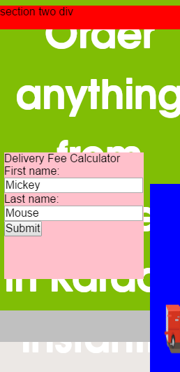
section-two显示在绿色div上。为什么不显示在绿色div下方?我甚至做过body {height: auto} -
第二个问题是我已经
red-car imgpadding:0 margin:0,所以我不会在页面之外,但div 仍然没有环绕图像吗 -
第三个问题是,当我调整浏览器大小时,粉红色的div正在掩盖标题?那是为什么?
更新:最后,我试图创建显示在彼此之下的div,即第一部分,第二部分,第三部分,类似于此。
更新:这是代码,对不起,我忘了添加它!
HTML
<!DOCTYPE html>
<html>
<head>
<title>Responsive Navigation Demo</title>
<meta name="viewport" content="width=device-width, initial-scale=1, maximum-scale=1">
<link rel="stylesheet" href="css/normalize.css">
<link rel="stylesheet" href="css/style.css">
<link href='http://fonts.googleapis.com/css?family=PT+Sans:400,700' rel='stylesheet' type='text/css'>
<script src="js/jquery-3.0.0.min.js"></script>
<script>
$(function() {
var pull = $('#pull');
menu = $('nav ul');
menuHeight = menu.height();
$(pull).on('click', function(e) {
e.preventDefault();
menu.slideToggle();
});
$(window).resize(function(){
var w = $(window).width();
if(w > 320 && menu.is(':hidden')) {
menu.removeAttr('style');
}
});
});
</script>
</head>
<body>
<div id='main-header'>
<nav class="clearfix">
<ul class="clearfix">
<li><a href="#">Home</a></li>
<li><a href="#">How ItS</a></li>
<li><a href="#">Why Us</a></li>
<li><a href="#">FAQ</a></li>
<li><a href="#">Contact</a></li>
</ul>
<a href="#" id="pull">Menu</a>
</nav>
</div>
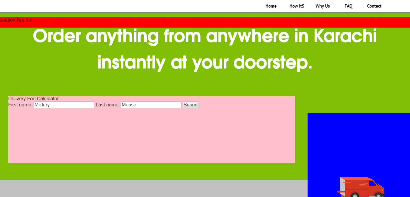
<div id='section-one'>
<h1> Order anything from anywhere in Karachi instantly at your doorstep. </h1>
<div class='silver-line-break'></div>
<div id='fee-estimate-box'>
<form id='fee-estimate-form' action="#">
<legend>Delivery Fee Calculator</legend>
<span>First name: </span> <input type="text" name="firstname" value="Mickey">
<span>Last name: </span> <input type="text" name="lastname" value="Mouse">
<input type="submit" value="Submit">
</form>
</div> <div class='silver-break-bar'>
<img id='red-car' src="img/red-car.png" alt="" height="60%" width="30%;">
</div>
</div>
<div id='section-two'>
<p>section two div</p>
</div>
</body>
</html>
CSS
/* Basic Styles */
* {
   margin-top:  0px;
   padding: 0;
}
body {
    margin: 0;
  height: auto;
    background-color: #ece8e5;
}

/***** NAVIGATION ***/
/* Clearfix */
.clearfix:before,
.clearfix:after {
    content: " ";
    display: table;
}
.clearfix:after {
    clear: both;
}
.clearfix {
    *zoom: 1;
}

nav {
    height: 40px;
    width: 100%;
    background: white;
    font-size: 11pt;
    font-family: 'PT Sans', Arial, sans-serif;
    font-weight: bold;
    position: relative;
    border-bottom: 1px solid #283744;

}
nav ul {
    padding-right: :5px;
    margin: 0 auto;
    width: 500px;
    height: 40px;
  float: right;
  margin-right: 0%;
}
nav li {
    display: inline;
    float: left;
}
nav a {
    color: black;
    display: inline-block;
    width: 85px;
    text-align: center;
    text-decoration: none;
    line-height: 40px;
    /*text-shadow: 1px 1px 0px #283744;*/
}
nav li a {
    /*border-right: 1px solid #576979;*/
    box-sizing:border-box;
    -moz-box-sizing:border-box;
    -webkit-box-sizing:border-box;
}
nav li:last-child a {
    border-right: 0;
}
nav a:hover, nav a:active {
    background-color: #8c99a4;
}
nav a#pull {
    display: none;
}

/*Styles for screen 600px and lower*/
@media screen and (max-width: 600px) {
    nav {
        height: auto;
    }
    nav ul {
        width: 100%;
        display: block;
        height: auto;
      float: none;
    }
    nav li {
        width: 50%;
        float: left;
        position: relative;
    }
    nav li a {
        border-bottom: 1px solid #576979;
        border-right: 1px solid #576979;
    }
    nav a {
        text-align: left;
        width: 100%;
        text-indent: 25px;
    }
}

/*Styles for screen 515px and lower*/
@media only screen and (max-width : 480px) {
    nav {
        border-bottom: 0;
    }
    nav ul {
        display: none;
        height: auto;
    }
    nav a#pull {
        display: block;
        background-color: white;
        width: 100%;
        position: relative;
    }
    nav a#pull:after {
        content:"";
        background: url('../img/nav-icon.png') no-repeat;
        width: 30px;
        height: 30px;
        display: inline-block;
        position: absolute;
        right: 15px;
        top: 10px;
    }
}

/*Smartphone*/
@media only screen and (max-width : 320px) {

  nav ul {
    float: none;
  }

    nav li {
        display: block;
        float: none;
        width: 100%;
    }
    nav li a {
        border-bottom: 1px solid #576979;
    }
}

#section-one {
    position: absolute;;
    background-color:  #80be05;
    margin-top: 0 auto;
    padding: 0;
  height: 85%;

}

#section-one h1 {
  position: relative;
    margin: 0px;
    padding: 2%;
    font-family: 'TeX Gyre Adventor', 'sans-serif';
    font-size: 57px;
    text-align: center;
    color: white;
    text-shadow: 0px 1px;
}

#section-one .silver-line-break {
    position: absolute;
    width: 100%;
    height: 10%;
    top: 100%;
    background-color: silver;
    margin: 0 auto;
}

#section-two {
  position: relative;
  width: 100%;
  height: 100%;
  background-color: red;
}
#section-one #red-car {
  position: absolute;
  display: inline-block;
  left: 75%;
  top: 60%;
  background-color: blue;
  padding: 0;
  margin: 0 auto;
}

#section-one #fee-estimate-box {
  background-color: pink;
  position: absolute;;
  width: 70%;
  height: 40%;
  top: 50%;
  left: 2%;
}
2 个答案:
答案 0 :(得分:1)
好。我不知道从哪里开始:)这里有很多问题
制作了 jsfiddle
- 如果您希望各个部分一个接一个地进行而不是相互覆盖,请不要使用
position:absolute永远! - 你写的地方
margin-top:0 auto,这是不正确的,margin-top只有一个值,margin:0 auto是正确的,意味着margin-top:0,margin-right:auto,margin-bottom:0,margin-left:auto -
.section-two(红线),如果您希望它在导航后正确,为什么不把它放在html中的导航后?如果你不想使用它,那么是....在该div上使用position:absolute。但我建议你让你的HTML更容易使用
让我知道它是否有效
代码:
#section-one {
    background-color:  #80be05;
    padding: 0;
    height: 100%;
    float:left;
    width:100%
   }

#section-one h1 {
    margin: 0px;
    padding: 2%;
    font-family: 'TeX Gyre Adventor', 'sans-serif';
    font-size: 57px;
    text-align: center;
    color: white;
    text-shadow: 0px 1px;
}

#section-one .silver-line-break {
    position: relative;
    width: 100%;
    height: 10px;
    float:left;
    background-color: silver;
    margin: 10px auto;
}

#section-two {
  position: relative;
  width: 100%;
  height: auto;
  float:left;
  background-color: red;
  padding:10px 0 5px;
}
#section-one #red-car {
  position: relative;
  float:right;
  background-color: blue;
  width:25%;
  height:100px;
}

#section-one #fee-estimate-box {
  background-color: pink;
  position: relative;;
  width: 70%;
  height: auto;
  float:left;
  margin-left:2.5%;
  margin-right:2.5%;


}
在此处详细了解CSS位置:CSS POSITION
答案 1 :(得分:-1)
当涉及到您网站的移动视图时,最好不要在主要div中使用位置absolute,例如页眉或页脚,因为它会根据父级对其进行定位。如果你真的想使用absolute来定位某个div,你应该记得将它的父级设置为div position: relative,这样你就可以将它放在父div的内部,它不会出现在外面它,除非你给它否定left,right等等。但请记住,使用position: relative要好得多,你的所有div都会相对于彼此定位,而你却少了可能会遇到问题。希望有所帮助。
相关问题
最新问题
- 我写了这段代码,但我无法理解我的错误
- 我无法从一个代码实例的列表中删除 None 值,但我可以在另一个实例中。为什么它适用于一个细分市场而不适用于另一个细分市场?
- 是否有可能使 loadstring 不可能等于打印?卢阿
- java中的random.expovariate()
- Appscript 通过会议在 Google 日历中发送电子邮件和创建活动
- 为什么我的 Onclick 箭头功能在 React 中不起作用?
- 在此代码中是否有使用“this”的替代方法?
- 在 SQL Server 和 PostgreSQL 上查询,我如何从第一个表获得第二个表的可视化
- 每千个数字得到
- 更新了城市边界 KML 文件的来源?