SVG模糊,边缘清晰
您好我正在尝试使用fegaussianblur在SVG多边形元素上创建模糊这是我所拥有的。
<svg version="1.1" id="Layer_1" xmlns="http://www.w3.org/2000/svg" xmlns:xlink="http://www.w3.org/1999/xlink" x="0px" y="0px"
     viewBox="0 0 379 313.9" style="width:150px; height: auto;position: absolute; top: -100px;" xml:space="preserve" >
  <defs>
    <filter id="blur" x="0" y="0">
      <feGaussianBlur stdDeviation="10" />
    </filter>
  </defs>
  <polygon points="379,100 379,313.9 0,313.9 0,0" />
  <style>
    fill: #f8f8f8;
    fill-opacity: 0.75;
    filter: url(#blur);
    stroke: none;
  </style>
</svg>
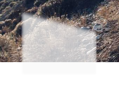
当我将模糊应用于多边形时,我会失去清晰的边缘!这就是它最终看起来像:
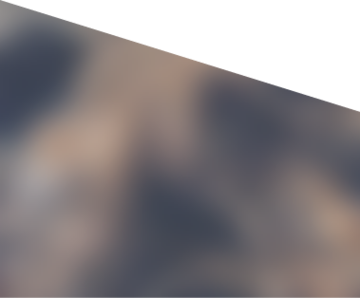
我真的希望它看起来更像:
这是否可以通过SVG进行,如果没有,我可以尝试下去另一条路径吗?
谢谢!
2 个答案:
答案 0 :(得分:2)
以下是应用于图像元素的剪辑路径和模糊滤镜的示例。
<svg viewBox="0 0 379 314" width="379" height="314"
     xmlns="http://www.w3.org/2000/svg"
     xmlns:xlink="http://www.w3.org/1999/xlink">
  <defs>
    <filter id="blur" x="0" y="0">
      <feGaussianBlur stdDeviation="10" />
    </filter>
    <clipPath id="c">
      <polygon points="379,100 379,314 0,314 0,0" />
    </clipPath>
  </defs>
  <image xlink:href="http://i.stack.imgur.com/E6Wyo.jpg"
         width="479" height="359" x="-50" y="-20"
         filter="url(#blur)" clip-path="url(#c)"/>
</svg>
答案 1 :(得分:1)
您可以使用clipPath删除模糊的边缘:
<svg version="1.1">
  <filter id="blur" x="0" y="0">
    <feGaussianBlur stdDeviation="10" />
  </filter>
  <clipPath id="mask">
    <polygon points="60,20 100,40 100,80 60,100 20,80 20,40"/>
  </clipPath>
  <image clip-path="url(#mask)" filter="url(#blur)" height="100" width="100" xlink:href="img.jpg" />
</svg>
相关问题
最新问题
- 我写了这段代码,但我无法理解我的错误
- 我无法从一个代码实例的列表中删除 None 值,但我可以在另一个实例中。为什么它适用于一个细分市场而不适用于另一个细分市场?
- 是否有可能使 loadstring 不可能等于打印?卢阿
- java中的random.expovariate()
- Appscript 通过会议在 Google 日历中发送电子邮件和创建活动
- 为什么我的 Onclick 箭头功能在 React 中不起作用?
- 在此代码中是否有使用“this”的替代方法?
- 在 SQL Server 和 PostgreSQL 上查询,我如何从第一个表获得第二个表的可视化
- 每千个数字得到
- 更新了城市边界 KML 文件的来源?