使用CSS制作响应式网格
我正在努力制作一个响应式主页。但是,我无法实现我的目标。我将用一些代码和图像更好地解释。
目前我的主页看起来像这样,
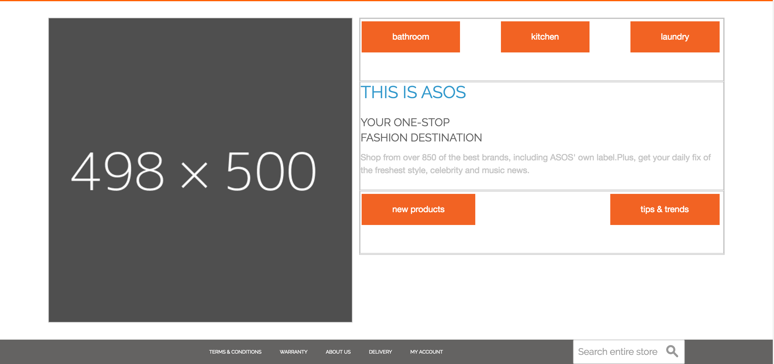
首先,我想让两个底部按钮与图像对齐,记住前三个按钮与图像的顶部对齐。
我尝试添加边距和填充,但它在响应式设计中打破了页面。我希望页面完整(resposive)至少1024p。我可以管理1024以下的其他东西(可能是从480p到1023p更改模板到套件)。


.HomeContent {
  float: left;
  width: 90%;
  height: 100%;
  color: #c4c4c4;
  margin: 1% 5%;
}

.HomeContent #LeftImageBox {
  float: left;
  width: 45%;
  height: 100%;
  border: solid 1px;
  margin-right: 1%;
}

.HomeContent #LeftImageBox img {
  float: right;
  display: block;
  width: 100%;
}

.HomeContent #RightContentBox {
  float: left;
  width: 54%;
  height: 100%;
  border: solid 1px;
}

.HomeContent #TopMenuBox,#WelcomeBox,#SubRightBox1 {
  float: left;
  width: 100%;
  height: 50%;
  border: solid 1px;
  margin: 0 1px 1px 0;
}

.HomeContent .tile-grid {
  text-align: justify;
}

.HomeContent .tile-grid li {
  display: inline-block;
  margin: 0;
}

.HomeContent .tile-grid: after {
  content: '';
  width: 100%; /* Ensures there are at least 2 lines of text, so justification works */
  display: inline-block;
}

.HomeContent .tile-grid span {
  background-color: #f26323;
  border: none;
  color: white;
  padding: 15px 50px;
  text-align: center;
  text-decoration: none;
  display: inline-block;
  font-size: 14px;
  margin: 4px 2px;
  cursor: pointer;
}

.HomeContent .tile-grid span: hover {
  background-color: white;
  color: #f26323;
}
<div class="HomeContent">
<div id="LeftImageBox">
<img alt="" src="http://dummyimage.com/498x500/4f4f4f/ffffff.png" />
</div>
<div id="RightContentBox">
<div id="TopMenuBox">
<ul class="tile-grid">
<li><a><span>bathroom</span></a></li>
<li><a><span>kitchen</span></a></li>
<li><a><span>laundry</span></a></li>
</ul>
</div>
<div id="WelcomeBox">
<h1><span>This is ASOS</span></h1>
<h3><span>YOUR ONE-STOP<br />FASHION DESTINATION</span></h3>
<p>Shop from over 850 of the best brands, including ASOS' own label.Plus, get your daily fix of the freshest style, celebrity and music news.</p>
</div>
<div id="SubRightBox1">
<ul class="tile-grid">
<li><a><span>new products</span></a></li>
<li><a><span>tips & trends</span></a></li>
</ul>
</div>
</div>
</div>
2 个答案:
答案 0 :(得分:1)
只要浏览器尺寸缩小,就可以使用@media进行更改。
例如:
@media (max-width: 1024px) {
    // Here is an example:
    // When the browser size shrinks down to 1024px or less,
    // The background-color of the body will change to red.
    body {
        background-color: red;
    }
}
当您调整大于1024px的浏览器大小时,红色背景颜色将被删除。
答案 1 :(得分:0)
谢谢大家。我通过在课堂上添加:: P标签并增加行高来做了一个解决方法。它按下了下面的按钮。它适用于1024p以上的任何东西。我将为1024P提供另一个媒体查询,并将移动版本设置为低于该级别。再次感谢您的所有贡献:)非常感谢。感谢那些决定不回答但是还是投票的仇敌。你真的把我解雇了。
相关问题
最新问题
- 我写了这段代码,但我无法理解我的错误
- 我无法从一个代码实例的列表中删除 None 值,但我可以在另一个实例中。为什么它适用于一个细分市场而不适用于另一个细分市场?
- 是否有可能使 loadstring 不可能等于打印?卢阿
- java中的random.expovariate()
- Appscript 通过会议在 Google 日历中发送电子邮件和创建活动
- 为什么我的 Onclick 箭头功能在 React 中不起作用?
- 在此代码中是否有使用“this”的替代方法?
- 在 SQL Server 和 PostgreSQL 上查询,我如何从第一个表获得第二个表的可视化
- 每千个数字得到
- 更新了城市边界 KML 文件的来源?