CSS Trick的响应数据表(带内联编辑模式)显示问题
我正在使用Chris在CSS-Tricks编写的指南(click here)来创建响应表。我也在尝试在表格中添加内联编辑。
-
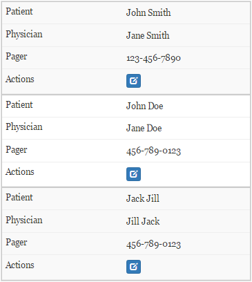
响应能力适用于移动屏幕模式。
-
在进入移动屏幕模式之前,内联编辑有效。

-
在移动屏幕模式下启用内联编辑时,这一切都会下降。

主要CSS:
/* Force table to not be like tables anymore */
table, thead, tbody, th, td, tr {
    display: block;
}
/* Hide table headers (but not display: none;, for accessibility) */
thead tr {
    position: absolute;
    top: -9999px;
    left: -9999px;
}
tr {
    border: 1px solid #ccc;
}
#demoTable td {
    /* Behave  like a "row" */
    border: none;
    border-bottom: 1px solid #eee;
    position: relative;
    padding-left: 50%;
}
td:before {
    /* Now like a table header */
    position: absolute;

    /* Top/left values mimic padding */
    top: 6px;
    left: 6px;
    width: 45%;
    padding-right: 10px;
    white-space: nowrap;
}
1 个答案:
答案 0 :(得分:1)
这是因为当你编辑代码td时col-xs-12 div有float:left,所以td没有达到合适的高度。
试试这段代码:
@media screen only and (max-width:767px){
   #demoTable td .col.col-xs-12 {
      float: none;
      padding: 0;
   }
}
相关问题
最新问题
- 我写了这段代码,但我无法理解我的错误
- 我无法从一个代码实例的列表中删除 None 值,但我可以在另一个实例中。为什么它适用于一个细分市场而不适用于另一个细分市场?
- 是否有可能使 loadstring 不可能等于打印?卢阿
- java中的random.expovariate()
- Appscript 通过会议在 Google 日历中发送电子邮件和创建活动
- 为什么我的 Onclick 箭头功能在 React 中不起作用?
- 在此代码中是否有使用“this”的替代方法?
- 在 SQL Server 和 PostgreSQL 上查询,我如何从第一个表获得第二个表的可视化
- 每千个数字得到
- 更新了城市边界 KML 文件的来源?