用波浪边框SVG路径填充div
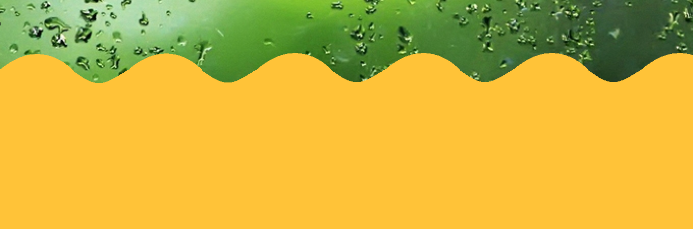
我想用颜色填充<div>并为边框添加阴影,但我的代码正在执行此操作。我实际上需要它以图像中显示的方式。
&#13;
&#13;
&#13;
&#13;
<svg height="125" width="1349">
  <path d="M -35 100 s 35 50 75 0" stroke="rgb(255, 195, 56)" stroke-width="5" fill="none" />
  <path d="M 40 100 s 75 -125 150 0" stroke="rgb(255, 195, 56)" stroke-width="5" fill="rgb(255, 195, 56)" />
  <path d="M 190 100 s 35 50 75 0" stroke="rgb(255, 195, 56)" stroke-width="5" fill="none" />
  <path d="M 265 100 s 75 -125 150 0" stroke="rgb(255, 195, 56)" stroke-width="5" fill="rgb(255, 195, 56)" />
  <path d="M 415 100 s 35 50 75 0" stroke="rgb(255, 195, 56)" stroke-width="5" fill="none" />
  <path d="M 490 100 s 75 -125 150 0" stroke="rgb(255, 195, 56)" stroke-width="5" fill="rgb(255, 195, 56)" />
  <path d="M 640 100 s 35 50 75 0" stroke="rgb(255, 195, 56)" stroke-width="5" fill="none" />
  <path d="M 715 100 s 75 -125 150 0" stroke="rgb(255, 195, 56)" stroke-width="5" fill="rgb(255, 195, 56)" />
  <path d="M 865 100 s 35 50 75 0" stroke="rgb(255, 195, 56)" stroke-width="5" fill="none" />
  <path d="M 940 100 s 75 -125 150 0" stroke="rgb(255, 195, 56)" stroke-width="5" fill="rgb(255, 195, 56)" />
  <path d="M 1090 100 s 35 50 75 0" stroke="rgb(255, 195, 56)" stroke-width="5" fill="none" />
  <path d="M 1165 100 s 75 -125 150 0" stroke="rgb(255, 195, 56)" stroke-width="5" fill="rgb(255, 195, 56)" />
  <path d="M 1315 100 s 35 50 75 0" stroke="rgb(255, 195, 56)" stroke-width="5" fill="none" />
  Sorry, your browser does not support inline SVG.
</svg>
2 个答案:
答案 0 :(得分:9)
对于这样的形状,您可以使用svg pattern并在图案中填充矩形宽度,如下例所示:
&#13;
&#13;
&#13;
&#13;
html,body{margin:0;padding:0;}
div{
  background: url('http://i.imgur.com/qi5FGET.jpg');
  background-size:cover;
  overflow:hidden;
}
svg{display:block;}
<div>
<h1>title</h1>
<p>whatever content<br/>with several lines</p>
<svg viewbox="0 0 60 10">
<pattern x="-7.5" id="waves" patternUnits="userSpaceOnUse" width="10" height="10">
<path d="M0 10 V5 Q2.5 2.5 5 5 T10 5 V10" fill="#FFC338" />
</pattern>
<rect x="0" y="0" width="60" height="10" fill="url(#waves)"/>
</svg>
</div>
答案 1 :(得分:7)
在您的代码中,您可以创建多个路径元素,其中每个元素都有一个curveTo子路径。相反,您需要一个具有多个curveTo子路径的路径元素。在您的场景中,更简单的二次贝塞尔曲线将很好地工作。在curveTo子路径之后,您将需要一些lineTo子路径来定义曲线下的区域。例如......
<svg height="150" width="880">
  <path d="M 0 100 q 40 -40 80 0 q 40 40 80 0 q 40 -40 80 0 q 40 40 80 0 q 40 -40 80 0 q 40 40 80 0 q 40 -40 80 0 q 40 40 80 0  q 40 -40 80 0 q 40 40 80 0 q 40 -40 80 0 l 0 50 l -880 0 z" stroke="rgb(255, 195, 56)" stroke-width="5" fill="rgb(255, 195, 56)"/>
</svg>
相关问题
最新问题
- 我写了这段代码,但我无法理解我的错误
- 我无法从一个代码实例的列表中删除 None 值,但我可以在另一个实例中。为什么它适用于一个细分市场而不适用于另一个细分市场?
- 是否有可能使 loadstring 不可能等于打印?卢阿
- java中的random.expovariate()
- Appscript 通过会议在 Google 日历中发送电子邮件和创建活动
- 为什么我的 Onclick 箭头功能在 React 中不起作用?
- 在此代码中是否有使用“this”的替代方法?
- 在 SQL Server 和 PostgreSQL 上查询,我如何从第一个表获得第二个表的可视化
- 每千个数字得到
- 更新了城市边界 KML 文件的来源?