响应式,双列布局:在其他列之间移动一列
我有一个响应式网站,在大型浏览器窗口中有两列布局。目前使用float实现了两列布局。在较小的屏幕上,我希望只有一列。另一列的内容应显示在主列的两个元素之间,如下所示:
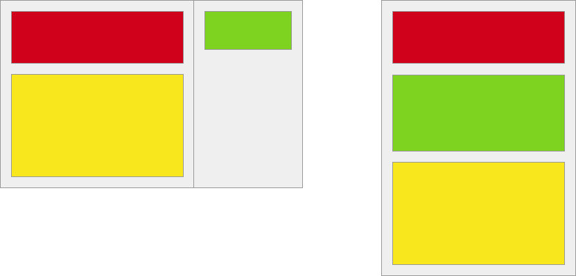
<div class="two-columns">
  <div class="main-column">
    <div class="red-element"></div>
    <div class="yellow-element"></div>
  </div>
  <div class="sidebar-column">
    <div class="green-element"></div>
  </div>
</div>
我尝试使用基于弹性框的方法,基本上the one described in this question,但flex-basis为flex-direction时,column似乎仍然不支持Safari。由于Safari是我访问者的主要浏览器,因此必须获得正确的Safari支持。
有没有办法只使用CSS就可以实现这一点,而无需在我的标记中放置两次绿色元素?
4 个答案:
答案 0 :(得分:2)
这是使用一个弹性容器的一般解决方案:
<div class="container">
    <div class="box"> ... </div><!-- red box -->
    <div class="box"> ... </div><!-- green box -->
    <div class="box"> ... </div><!-- yellow box -->
</div>
从小屏幕开始(无特殊原因),将它们堆叠在一列中:
.container {
    display: flex;
    flex-direction: column;
}

.box {
    height: 100px;
    width: 100%;
}
重新安排更宽屏幕的布局:
@media (min-width: 800px) {

   .container {
        flex-direction: row;
        flex-wrap: wrap;
    }

    .box {
        flex-basis: 45%;
    }
}
在宽度超过800px的屏幕上,容器将项目排成一行并启用包装。每个框都有足够宽的宽度(flex-basis),只有两个可以放在一条线上。
完整演示:
* {
    box-sizing: border-box;
}

.container {
    display: flex;
    flex-direction: column;
    padding: 5px 0;
    background-color: #f5f5f5;
    border: 1px solid #aaa;
}

.box1 { background-color: red; }
.box2 { background-color: lightgreen; }
.box3 { background-color: yellow; }

.box {
    height: 100px;   /* `flex-basis: 100px` would also work */
    width: calc(100% - 20px);
    margin: 5px 10px;
    border: 1px solid #ccc;
    display: flex;
    justify-content: center;
    align-items: center;
    font-size: 1.2em;
}

@media (min-width: 800px) {
    .container {
        flex-direction: row;
        flex-wrap: wrap;
    }
    .box {
        flex-basis: 45%;
    }
}
<div class="container">
<div class="box box1"><span>1</span></div>
<div class="box box2"><span>2</span></div>
<div class="box box3"><span>3</span></div>
</div>
jsFiddle
从你的问题:
...但
时,flex-basisflex-directioncolumn似乎在Safari中不受支持
我不确定这是否正确(caniuse.com)。
但是,您始终可以使用width或height属性代替flex-basis(更多详情:What are the differences between flex-basis and width?)。
答案 1 :(得分:1)
使用Bootstrap,
<div class="row">
    <div class="col-md-8">
        <div class="red-element"></div>
    </div>

    <div class="col-md-4">
        <div class="green-element"></div>
    </div>

    <div class="col-md-8">
        <div class="yellow-element"></div>
    </div>
    <div class="clearfix"></div>
</div>
这使用浮点方法,适用于所有浏览器。
答案 2 :(得分:0)
您需要更改一些html结构,然后才能执行此操作。
*,*:after,*:before {
	box-sizing:border-box;
}
.two-columns {
	position:relative;
	background:#EFEFEF;
	border:1px solid #000;
}
.red-element,
.green-element,
.yellow-element {
	margin-bottom:30px;
}
.red-element {
	height:70px;
	background:#FF0004;
}
.green-element {
	height:70px;
	background:#7ED321;
}
.yellow-element {
	height:100px;
	background:#F8E71C;
}
@media (min-width:767px) {
	.main-column {
		width:70%;
		padding:10px;
	}
	.sidebar-column {
		position:absolute;
		right:0;
		top:0;
		width:30%;
		padding:10px;
	}
}
<div class="two-columns">
<div class="main-column">
<div class="red-element"></div>
<div class="sidebar-column">
<div class="green-element"></div>
</div>
<div class="yellow-element"></div>
</div>
</div>
或者,如果您不想更改html结构,则必须使用仅在移动设备中显示的其他元素
*,*:after,*:before {
	box-sizing:border-box;
}
.two-columns {
    background: #EFEFEF;
    border: 1px solid #000;
    overflow: hidden;
}
.red-element,
.green-element,
.yellow-element {
	margin-bottom:30px;
}
.red-element {
	height:70px;
	background:#FF0004;
}
.green-element {
	height:70px;
	background:#7ED321;
}
.yellow-element {
	height:100px;
	background:#F8E71C;
}
.hideMobile{
	display:none;
}
@media (min-width:767px) {
	.main-column {
		width: 70%;
		float: left;
		padding: 10px;
	}

	.sidebar-column {
		float: right;
		width: 30%;
		padding: 10px;
	}
	.showMobile {
		display:none;
	}
	.hideMobile {
		display:block;
	}
}
<div class="two-columns">
<div class="main-column">
<div class="red-element"></div>
<div class="green-element showMobile"></div><!--only for mobile-->
<div class="yellow-element"></div>
</div>
<div class="sidebar-column hideMobile"><!--hide in mobile-->
<div class="green-element"></div>
</div>
</div>
答案 3 :(得分:-1)
您应该使用@media通过margin-top。在特定的屏幕宽度上(通过@media),将绿色元素的margin-top更改为-200%。并将黄色元素的margin-top更改为100%。他们改变了自己的位置非常好:)
请看这个链接:
- 我写了这段代码,但我无法理解我的错误
- 我无法从一个代码实例的列表中删除 None 值,但我可以在另一个实例中。为什么它适用于一个细分市场而不适用于另一个细分市场?
- 是否有可能使 loadstring 不可能等于打印?卢阿
- java中的random.expovariate()
- Appscript 通过会议在 Google 日历中发送电子邮件和创建活动
- 为什么我的 Onclick 箭头功能在 React 中不起作用?
- 在此代码中是否有使用“this”的替代方法?
- 在 SQL Server 和 PostgreSQL 上查询,我如何从第一个表获得第二个表的可视化
- 每千个数字得到
- 更新了城市边界 KML 文件的来源?