试图将注册表单置于页脚中间
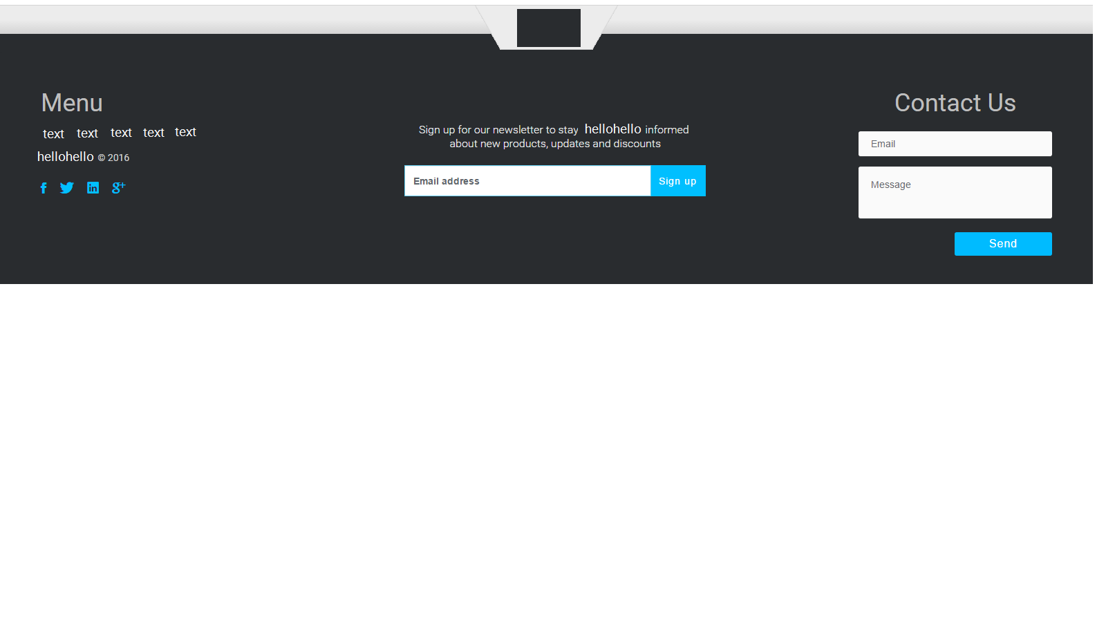
我试图让页脚中的注册表单正好位于页脚中间;在页脚的左侧和右侧之间。如果我尝试使用push,pull或offset类,则距离左侧太远。它似乎在一个方向上走得太远了。我正在使用html5,css3和bootstrap 3.上面,我附上了一张我希望它的样子。
<footer class="footer-distributed">
<div class="footer-left">
<h3>Menu</h3>
<p class="footer-links">
<a href="#">text</a> •
<a href="#"> text </a> •
<a href="#"> text </a> •
<a href="#"> text </a> •
<a href="#"> text </a>
</p>
<p class="footer-company-name"> <a href="http://www.hellohello.com">hellohello</a><span> © 2016</span></p>
<div class="footer-social">
<!-- Social Media -->
<ul class="social">
<li>
<a href="http://wwww.fb.com/hellohello" class="Facebook">
<i class="ion-social-facebook"></i>
</a>
</li>
<li>
<a href="http://wwww.twitter.com/ hellohello " class="Twitter">
<i class="ion-social-twitter"></i>
</a>
</li>
<li>
<a href="#" class="Linkedin">
<i class="ion-social-linkedin"></i>
</a>
</li>
<li>
<a href="http://wwww.fb.com/ hellohello " class="Google Plus">
<i class="ion-social-googleplus"></i>
</a>
</li>
</ul>
</div>
</div>
<div class="col-md-6 col-sm-6 col-xs-12 col-sm-push-center ">
<div class=" subscribe-foot section-wrapper">
<p class="subscribe-nowfoot">
Sign up for our newsletter to stay hellohello informed
<br>about new products, updates and discounts
</p>
<div class="col-md-8 col-sm-8 col-xs-12 col-sm-push-2">
<div class="input-group">
<input type="email" class="form-control border-radius" placeholder="Email address">
<span class="input-group-btn">
<button class="btn btn-form border-radius custom-sub-btn" type="button">Sign up</button>
</span>
</div>
<!-- /input-group -->
</div>
</div>
</div>
<div class="footer-right">
<p>Contact Us</p>
<form action="#" method="post">
<input type="text" name="email" placeholder="Email" />
<textarea name="message" placeholder="Message"></textarea>
<button>Send</button>
</form>
</div>
</footer>
CSS:
#footer {
  background-color: #292c2f;
}

.footer-distributed {
  background-color: #292c2f;
  box-shadow: 0 1px 1px 0 rgba(0, 0, 0, 0.12);
  box-sizing: border-box;
  width: 100%;
  font: bold 16px sans-serif;
  text-align: left;
  padding: 50px 60px 40px;
  margin-top: 0px;
  overflow: hidden;
}


/* Footer left */

.footer-distributed .footer-left {
  float: left;
}


/* The company logo */

.footer-distributed h3 {
  color: #bebebe;
  font: normal 36px 'roboto', sans-serif;
  margin: 0 0 10px;
}


/* Footer links */

.footer-distributed .footer-links {
  color: #00bfff;
  font-weight: 400;
  margin: 0 0 10px;
  padding: 0;
}

.footer-distributed .footer-links a {
  display: inline-block;
  line-height: 1.8;
  text-decoration: none;
  color: inherit;
}

.footer-distributed .footer-company-name {
  color: #00bfff;
  font-size: 14px;
  font-weight: normal;
  margin: 0;
}

.footer-distributed .footer-company-name span {
  color: #d1d1d1;
  font-size: 14px;
  font-weight: normal;
  margin: 0;
}

.footer-distributed .footer-company-name a {
  color: #00bfff;
}

.footer-distributed .subscribe-nowfoot {
  color: #eaeaea;
  font-size: 16px;
  line-height: 20px;
  text-align: center;
  margin-bottom: 20px;
  font-weight: 300;
  margin-left: 0px;
  margin-right: 0px;
  padding-right: 0px;
  padding-left: 0px;
}

.footer-distributed .btn-form:hover,
.footer-distributed .btn-form:active {
  border: 1px solid #00bfff;
  background-color: #fff;
  color: #00bfff;
}

.footer-distributed .custom-sub-btn {
  background-color: #00bfff;
  color: #fff;
  border-color: #00bfff;
  transition: all .4s ease-in-out;
  letter-spacing: 1px;
  margin-top: 1px;
}

.footer-distributed .custom-sub-btn:hover {
  color: #00bfff;
  background: #fff;
  border-color: #00bfff;
  font-weight: 500;
  letter-spacing: 1px;
}

.subscribe-foot {
  text-align: center;
  margin-top: 0px;
  padding-top: 0px;
}


/* Footer Right */

.footer-distributed .footer-right {
  float: right;
}

.footer-distributed .footer-right p {
  text-align: center;
  vertical-align: top;
  margin: 0px 0px 20px 0;
  color: #ffffff;
  color: #bebebe;
  font: normal 36px 'roboto', sans-serif;
}


/* The contact form */

.footer-distributed form {
  display: inline-block;
}

.footer-distributed form input,
.footer-distributed form textarea {
  display: block;
  border-radius: 3px;
  box-sizing: border-box;
  background-color: #fafafa;
  box-shadow: 0 1px 0 0 rgba(255, 255, 255, 0.1);
  border: none;
  resize: none;
  font: inherit;
  font-size: 14px;
  font-weight: normal;
  color: #969696;
  width: 280px;
  padding: 18px;
}

.footer-distributed::-webkit-input-placeholder {
  color: #5c666b;
}

.footer-distributed::-moz-placeholder {
  color: #00aaff;
  opacity: 1;
}

.footer-distributed:-ms-input-placeholder {
  color: #00aaff;
}

.footer-distributed form input {
  height: 20px;
  margin-bottom: 15px;
}

.footer-distributed form textarea {
  height: 75px;
  margin-bottom: 20px;
}

.footer-distributed form button {
  border-radius: 3px;
  background-color: #00bbff;
  color: #ffffff;
  border: 0;
  padding: 8px 50px;
  font-weight: 500;
  float: right;
  letter-spacing: 1px;
}

.footer-distributed form button:hover {
  border-radius: 3px;
  background-color: #ffffff;
  color: #00bbff;
  border: 2px solid #00bfff;
  padding: 8px 50px;
  font-weight: 500;
  float: right;
  letter-spacing: 1px;
}
1 个答案:
答案 0 :(得分:1)
这有点奇怪,因为在同一个div中你使用自己的定位(通过.footer-left和.footer-right)和引导网格系统(用于注册) DIV)。 (在我看来)坚持使用其中一个更好。
第一个选项,Bootstrap:
要使用bootstrap执行此操作,您需要:
- 从css中移除浮动
- 为左/右添加适当的类:
所以css基本保持不变(只需删除左右浮动),html有一些变化。这可以概括为:
<div class="footer-left col-sm-3 col-xs-12">
    <!-- Menu -->
</div>
<div class="col-md-6 col-sm-6 col-xs-12">
    <!-- Sign up -->
</div>
<div class="footer-right col-sm-3 col-xs-12">
    <!-- Contact -->
</div>
小提琴:https://jsfiddle.net/_Py_/3uybymtk/
第二个选项,没有Bootstrap:
如果没有bootstrap,我建议使用flex(有关详细信息,请参阅https://css-tricks.com/snippets/css/a-guide-to-flexbox/或https://developer.mozilla.org/en-US/docs/Web/CSS/CSS_Flexible_Box_Layout/Using_CSS_flexible_boxes)
要在我们的案例中正确使用它,它很简单:
- 左/右移除
- 删除注册div的引导代码
- 添加适当的css以使其弯曲。
所以html是:
<div class="footer-left>
    <!-- Menu -->
</div>
<div>
    <!-- Sign up -->
</div>
<div class="footer-right">
    <!-- Contact -->
</div>
并且css被修改为:
.footer-distributed {
  background-color: #292c2f;
  box-shadow: 0 1px 1px 0 rgba(0, 0, 0, 0.12);
  box-sizing: border-box;
  width: 100%;
  font: bold 16px sans-serif;
  text-align: left;
  padding: 50px 60px 40px;
  margin-top: 0px;
  overflow: hidden;
  display : flex;
  justify-content : space-between;
}
.footer-distributed > div {
  flex: 0 0 auto;
}
.footer-distributed .footer-left {
}
.footer-distributed .footer-right{
}
我将页脚左右页脚显示为现在没有任何内容。
这适用于:
- 在弹性显示中设置
.footer-distributed(display:flex) - 更改元素在此Flex容器中的显示方式(
justify-content : space-between将使第一个元素位于行的开头,最后一个元素位于行的末尾,其余元素在两者之间平均分布。即,我们的注册div将集中!)。 - 告诉他们
.footer-distributed的直接孩子,他们不会成长/缩小,他们的基本尺寸取决于他们的身高/宽度(flex: 0 0 auto;)
相关问题
最新问题
- 我写了这段代码,但我无法理解我的错误
- 我无法从一个代码实例的列表中删除 None 值,但我可以在另一个实例中。为什么它适用于一个细分市场而不适用于另一个细分市场?
- 是否有可能使 loadstring 不可能等于打印?卢阿
- java中的random.expovariate()
- Appscript 通过会议在 Google 日历中发送电子邮件和创建活动
- 为什么我的 Onclick 箭头功能在 React 中不起作用?
- 在此代码中是否有使用“this”的替代方法?
- 在 SQL Server 和 PostgreSQL 上查询,我如何从第一个表获得第二个表的可视化
- 每千个数字得到
- 更新了城市边界 KML 文件的来源?