Div float保持固定并且视口的高度为100%
我正在尝试为具有CSS的网站制作基本的响应结构。到目前为止,我已经设法制作了三个列div,一个菜单,一个侧边栏和一个内容。
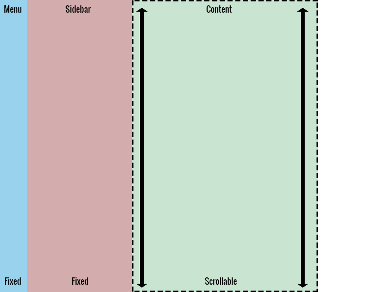
我现在想要实现的是将菜单和侧边栏设置为视口高度的100%并且固定,以便内容div是“可滚动”但菜单和侧边栏无论col content列中有多少内容,都会保持在最佳状态。当然,我不希望在媒体查询中发生这种情况。
如何使用CSS最有效地实现这一目标。我是否必须重新构建HTML中的div或者是否有任何方法可以通过CSS实现此目的?
/*  SECTIONS  */

.section {
  clear: both;
}
/*  COLUMN SETUP  */

.col {
  display: block;
  float: left;
}
/*  GRID OF THREE  */

.menu {
  width: 33%;
  background-color: #98D2ED
}
.sidebar {
  width: 33%;
  background-color: #D3ADAD
}
.content {
  width: 33%;
  background-color: #C9E4D1
}
/*  GO FULL WIDTH BELOW 480 PIXELS */

@media only screen and (max-width: 480px) {
  .menu {
    width: 100%;
  }
  .sidebar {
    width: 100%;
  }
  .content {
    width: 100%;
  }
}
<div class="section">
<div class="col menu">
<p>
Menu
</p>
I want this cloumn to be fixed and full height of the viewport when the screen size is above 480px.
</div>
<div class="col sidebar">
<p>
Sidebar
</p>
I want this cloumn to be fixed and full height of the viewport when the screen size is above 480px.
</div>
<div class="col content">
Content
</div>
</div>
我想要实现的目标:

2 个答案:
答案 0 :(得分:2)
您可以使用flexbox,对于已知/未知的宽度和高度元素,关键是将内容区域设置为overflow:auto,并在媒体查询中将flex-direction切换为column
<强> jsFiddle
html, body {
  height: 100%;
}
body {
  margin: 0;
  display: flex;
}
.content {
  flex: 1;
  overflow: auto;
}
.menu    { background: grey;   }
.sidebar { background: silver; }

@media (max-width: 480px) {
  body {
    flex-direction: column;
  }
}
<div class="menu">Menu</div>
<div class="sidebar">Sidebar</div>
<div class="content">
<!-- scroll test -->
<div style="height:1000px;">Content</div>
</div>
或者,将菜单和侧边栏设置为position:fixed的传统方式。
<强> jsFiddle
html, body {
  height: 100%;
  margin: 0;
}
body {
  margin-left: 200px;
}
.menu, .sidebar {
  position: fixed;
  top: 0;
  height: 100%;
  overflow: auto;
}
.menu {
  left: 0;
  width: 100px;
  background: grey;
}
.sidebar {
  left: 100px;
  width: 100px;
  background: silver;
}
.content {
  overflow: auto;
}
@media (max-width: 480px) {
  body {
    margin: 100px 0 0;
    overflow: hidden;
  }
  .menu, .sidebar {
    left: 0;
    width: 100%;
    height: 50px;
  }
  .sidebar {
    top: 50px;
  }
  .content {
    height: calc(100% - 100px);
  }
}
<div class="menu">Menu</div>
<div class="sidebar">Sidebar</div>
<div class="content">
<!-- scroll test -->
<div style="height:1000px;">Content</div>
</div>
答案 1 :(得分:2)
据我了解,您希望.menu和.sidebar在一个地方停留在屏幕上并让内容可滚动。并且还为其他东西添加了更多的代码,我知道这听起来很模糊,但写下所有东西都是浪费时间,因为我已经编辑了你我完成了复制,并且我有笔记解释了我所有的变化(和这样做的原因)在下面的代码中。
我删除了float及其class es,因为我认为这些不是必需的,并且float弊大于利。除了将.content移到中间列(.menu和.sidebar之间)之外。但是,如果您需要,请随时更改其中任何一项。
这是更新后的代码:(这里是一个JSFiddle:JSFiddle)
我知道.menu上面有一个奇怪的空间(当运行代码段和JSFiddle时),但我把它放在我的网站here上,它表现得非常好,并且使用了相同的代码。
* {
	margin: 0px; /* Added to remove margin from everything */
	padding: 0px; /* Added to remove margin from everything */
}

.section, .menu, .sidebar, .content {
	display:inline-block !important; /* Added so they will line up next to each other */
}

.section {width:100%;} /* Pretty self explanatory, added to set ".section" to a width of 100% */

/*  GRID OF THREE  */
.menu {
	width: 33%; /* Was already here */
	background-color: #98D2ED; /* Was already here */

	height:100vh; /* Makes it be 100% of the Viewport Height, or 100% of the browser window height */

	position: fixed; /* Makes it stay "fixed" to one place on the screen */
}

.sidebar {
	width: 33%; /* Was already here */
	background-color: #D3ADAD; /* Was already here */
	position:absolute; top:0px; left: 67%; /* To make the element in the right place, add the width of "menu" and "content" */

	height:100vh; /* Makes it be 100% of the Viewport Height, or 100% of the browser window height */

	position: fixed; /* Makes it stay "fixed" to one place on the screen */
}
.content {
	width: 34%; /* Was already here, but changed it to 34 to make the website fill the page */
	background-color: #C9E4D1; /* Was already here */

	position:absolute; top:0px; left:33%; /* To make the element in the right place, make this the width of "menu" */
}


/* The CSS below this was already here */

/*  GO FULL WIDTH BELOW 480 PIXELS */
@media only screen and (max-width: 480px) {
  .menu { width: 100%; }
  .sidebar { width: 100%; }
  .content { width: 100%; }
}
<head>
<link rel="stylesheet" type="text/css" href="style.css">
</head>
<div class="section">
<div class="menu">
Menu
</div>
<div class="content">
Content
</div>
<div class="sidebar">
Sidebar
</div>
</div>
真希望有所帮助!
- 我写了这段代码,但我无法理解我的错误
- 我无法从一个代码实例的列表中删除 None 值,但我可以在另一个实例中。为什么它适用于一个细分市场而不适用于另一个细分市场?
- 是否有可能使 loadstring 不可能等于打印?卢阿
- java中的random.expovariate()
- Appscript 通过会议在 Google 日历中发送电子邮件和创建活动
- 为什么我的 Onclick 箭头功能在 React 中不起作用?
- 在此代码中是否有使用“this”的替代方法?
- 在 SQL Server 和 PostgreSQL 上查询,我如何从第一个表获得第二个表的可视化
- 每千个数字得到
- 更新了城市边界 KML 文件的来源?