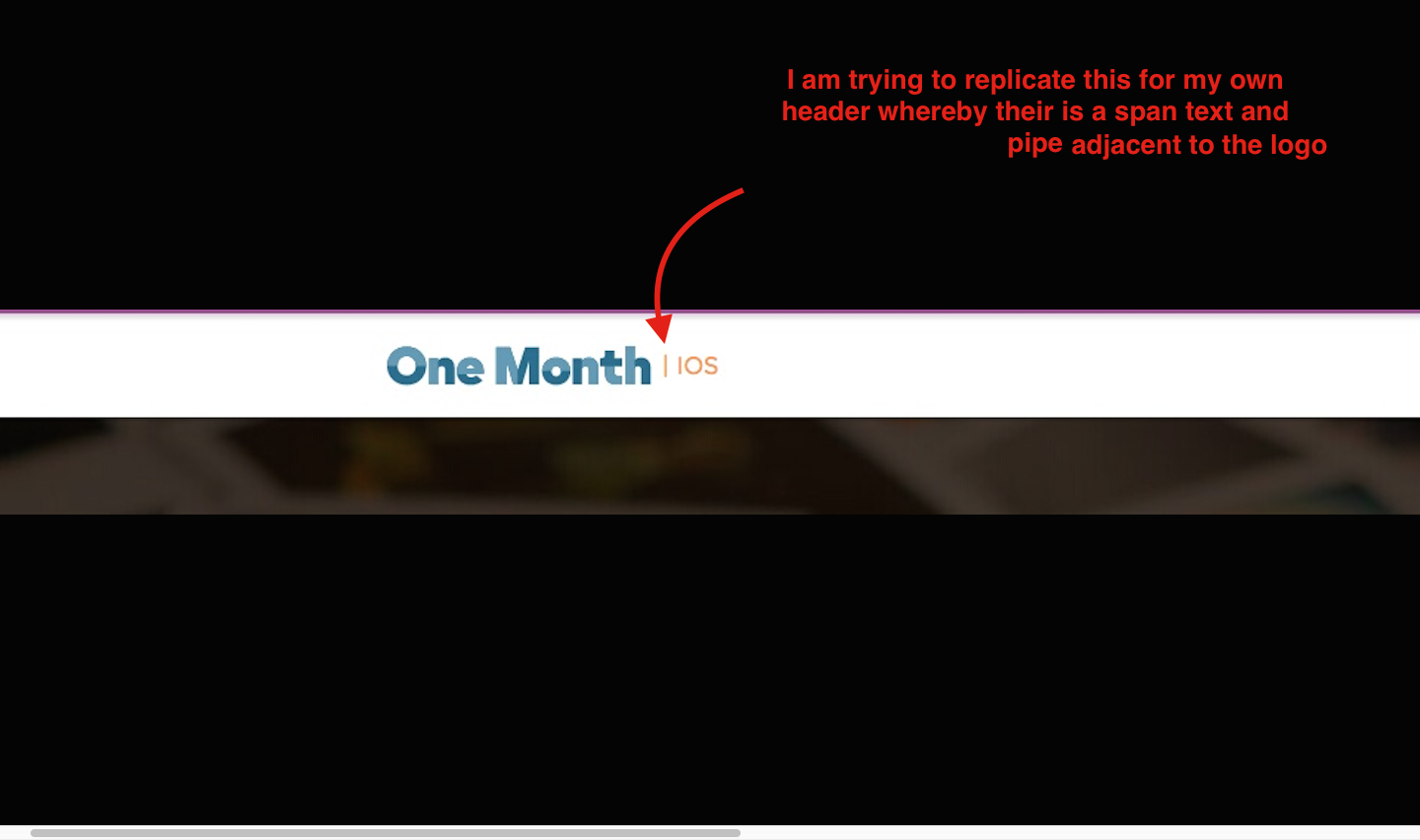
how do you code in a span style besides the logo element in the navbar
I am having difficult trying to copy a piece of styling for the header that I seen on another website whereby the logo sits adjacent to a span of smaller text with the pipe seperating the logo and the span text.
How can I achieve such. When I try this on my own code, the span text sits below the logo which looks aesthetically challenged.

header.html.erb
<nav class="navbar navbar-static-top navbar-default" role="navigation">
  <div class="container">
  <!-- Brand and toggle get grouped for better mobile display -->
  <div class="navbar-header">
    <button type="button" class="navbar-toggle" data-toggle="collapse" data-target=".navbar-ex1-collapse">
      <span class="sr-only">Toggle navigation</span>
      <span class="icon-bar"></span>
      <span class="icon-bar"></span>
      <span class="icon-bar"></span>
    </button>
    <a class="navbar-brand" href="/">
      <img alt="Nippon Beauty" class="navbar-brand-icon" src="assets/nippon.svg">
      <span style="color: #e94b48">| Japanese and South Korean Luxury Skincare</span>
    </a>

  </div>

  <!-- Collect the nav links, forms, and other content for toggling -->
  <div class="collapse navbar-collapse navbar-ex1-collapse">
    <ul class="nav navbar-nav navbar-right">
      <li><%= link_to "Home", root_path %></li>
      <li><%= link_to "About", about_path %></li>
      <li><%= link_to "Login", new_user_session_path %></li>
      <li><%= link_to "Signup", new_user_registration_path %></li>
      <% if user_signed_in? %>
        <li><%= link_to "Account Settings", edit_user_registration_path %></li>
        <li><%= link_to "Log out", destroy_user_session_path, method: :delete %></li>
      <% else %>
    <% end %>
    </ul>
  </div><!-- /.navbar-collapse -->
</nav>
Bootstrap_and_customization.css.scss
@import url(https://fonts.googleapis.com/css?family=Lato:400,700);

$body-bg:                          #ecf0f1;
$font-family-sans-serif:           'Lato', 'Helvetica Neue', Helvetica, Arial, sans-serif;
$navbar-height:                    70px;
$navbar-default-bg:                white;
$navbar-default-brand-color:       #c0392b;
$brand-primary:                    #c0392b;
$jumbotron-bg:                     white;

@import 'bootstrap';
@import 'bootstrap-sprockets';

.center {
     text-align: center;
}

.navbar-brand {
     font-weight: bold;
}


.btn-lg {
    padding: 18px 28px;
    font-size: 22px;
    border-radius: 8px;
    }


.jumbotron {
    width: 735px;
    padding-left: 30px;
    padding-right: 15px;
    padding-bottom: 20px;
    padding-top: 20px;
}

.navbar {
    min-height: 90px;
}

.container {
    width: 1270px;
}


.navbar-brand {
    float: left;
    padding: 10px 15px;
}
2 个答案:
答案 0 :(得分:1)
You need to change default bootstrap styles of .navbar-brand > img
A block-level element always starts on a new line, use inline-block.
See here: https://jsfiddle.net/1zfzd55m/
答案 1 :(得分:1)
It would be better if you'll provide some DEMO, but try this:
.navbar-brand img {
    display:inline-block;
}
.navbar-brand span {
    display:inline-block;
}
.navbar-brand {
    padding: 10px 15px
    float: left; // or delete float left or add following css:
    width: 500px // set some width to your parent div that will fit img and span widths
}
相关问题
最新问题
- 我写了这段代码,但我无法理解我的错误
- 我无法从一个代码实例的列表中删除 None 值,但我可以在另一个实例中。为什么它适用于一个细分市场而不适用于另一个细分市场?
- 是否有可能使 loadstring 不可能等于打印?卢阿
- java中的random.expovariate()
- Appscript 通过会议在 Google 日历中发送电子邮件和创建活动
- 为什么我的 Onclick 箭头功能在 React 中不起作用?
- 在此代码中是否有使用“this”的替代方法?
- 在 SQL Server 和 PostgreSQL 上查询,我如何从第一个表获得第二个表的可视化
- 每千个数字得到
- 更新了城市边界 KML 文件的来源?