子像素在浏览器中计算和呈现的方式不同
目的:
我正在处理与此类似的代码,以创建组件,其中输入字段具有嵌入式按钮:
http://codepen.io/anon/pen/pgwbWG?editors=110
正如您所看到的,按钮绝对位于top且bottom设置为0,以实现100%高度元素。
另外需要注意的是,文本输入的边框必须保持可见,并且还要包裹按钮。
为实现这一点,我在按钮中添加了margin: 1px,以便(应该)空间显示周围的文本输入红色边框(通常在输入字段内容无效)。
问题:
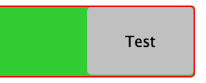
在Firefox上它(大部分)正确呈现,而在Chrome上(显然在最新的Safari上)它会在按钮底部 1px间隙
CSS似乎没问题,但它似乎是渲染中的计算/舍入问题,其中按钮的底部或顶部边距实际上不是1px(可以看到它检查元素)。 此外,输入的填充似乎也会影响到它。
在不同的缩放率下,它会在按钮的顶部或底部添加或删除1px的边距,从而产生1px间隙或覆盖边框
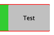
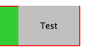
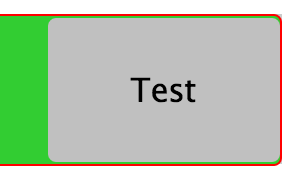
当我将按钮边距设置为0px时,底部边距是固定的,但我松开顶部的1px边距,完成覆盖文本的红色边框-input
示例:
可能我在解释它时并不清楚或过于冗长,所以这里有一些bug的截图,来自Chrome上的不同缩放(注意CSS总是相同的):
解决方案:
我无法找到跨浏览器解决方案。 如何处理它并获得一致的组件? (请不要使用Javascript)
2 个答案:
答案 0 :(得分:9)
正如您所知,问题源于浏览器之间的子像素演算的不同方法
例如,在Chrome中,边框可以具有小数尺寸,但边距处理不同(作为整数)。
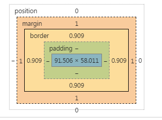
我没有Chrome团队提供有关它的文档,但这可以在开发工具中看到:
AFAIK,没有办法改变它。
相反,您可以将按钮中边距的使用转移到边框。
由于您需要为输入的1px边框获取空间,请在按钮中执行相同操作,设置1px边框(而不是边距),并将其设置为透明。
剩下的技巧是将background-clip属性设置为padding框,这样透明度不受背景影响
Chrome中还有另一个错误,当浏览器缩放时,以em表示的填充在此精度级别上不可靠。我在片段中更改了此内容。
由于我们使用边框按钮来获取尺寸,我们可以使用嵌入阴影来设置边框的样式。
* {
  margin: 0; padding: 0; box-sizing: border-box;
}
button, input, wrapper {
  display: inline-block; border-radius: 3px;
}

.wrapper {
  position: relative;

  width: 60%;
  margin: 1em;
  background-color: #ccc;
}

input {
  border: 1px solid red;
  width: 100%;

  background-color: limegreen;
  line-height: 3em;
/*  padding: 0.75em; */
  padding: 10px;
}

button {
  position: absolute;
  right: 0;
  top: 0;
  bottom: 0;
  border: 1px solid transparent;
  width: 7em;
  margin: 0px;
  background-clip: padding-box;
  box-shadow:  inset 0px 0px 0px 2px  black;
}
<div class="wrapper">
<input type="text">
<button>Test</button>
</div>
另一个例子,按钮有边框。但是我们需要一个包装器才能使尺寸正常。
* {
  margin: 0; padding: 0; box-sizing: border-box;
}
button, input, wrapper {
  display: inline-block; border-radius: 3px;
}

.wrapper {
  position: relative;

  width: 60%;
  margin: 1em;
  background-color: #ccc;
}

input {
  border: 1px solid red;
  width: 100%;

  background-color: limegreen;
  line-height: 3em;
/*  padding: 0.75em; */
  padding: 10px;
}

.buttonwrap {
  position: absolute;
  right: 0;
  top: 0;
  bottom: 0;
  border: 1px solid transparent;
  width: 7em;
  margin: 0px;
  background-clip: padding-box;
}
button {
  position: absolute;
  right: 0px;
  top: 0;
  bottom: 0;
  width: 100%;
  border: 2px solid blue;
  margin: 0px;
}
<div class="wrapper">
<input type="text">
<div class="buttonwrap">
<button>Test</button>
</div>
</div>
答案 1 :(得分:0)
使用http://autoprefixer.github.io/获取display:flex;
所需的跨浏览器支持button, input, wrapper {
display: inline-block; <----- Remove "display: inline-block;"
border-radius: 3px;
}
.wrapper {
position: relative;
display: -webkit-box;<----- Add "display: flex;"
display: -webkit-flex;<----- Add "display: flex;"
display: -ms-flexbox;<----- Add "display: flex;"
display: flex;<----- Add "display: flex;"
width: 60%;
margin: 1em;
background-color: #ccc;
}
额外的阅读和学习材料:
https://css-tricks.com/snippets/css/a-guide-to-flexbox/
https://philipwalton.github.io/solved-by-flexbox/demos/holy-grail/
http://www.sketchingwithcss.com/samplechapter/cheatsheet.html
注意:要覆盖flex规则,您需要使用flex速记而不是由于当前浏览器不足而导致的特定覆盖,例如。
.item {
  flex: 0 0 300px;
}

/* overide for some reason */

.item {
  flex: 1 0 300px;
}

/* NOT */

.item {
  flex-grow: 1;
}
您可能需要对ie11进行覆盖:
.ie11std .wrapper {
  display:table;
}

.ie11std .item {
  display:table-cell;
}
虽然这不会有回应。
- 我写了这段代码,但我无法理解我的错误
- 我无法从一个代码实例的列表中删除 None 值,但我可以在另一个实例中。为什么它适用于一个细分市场而不适用于另一个细分市场?
- 是否有可能使 loadstring 不可能等于打印?卢阿
- java中的random.expovariate()
- Appscript 通过会议在 Google 日历中发送电子邮件和创建活动
- 为什么我的 Onclick 箭头功能在 React 中不起作用?
- 在此代码中是否有使用“this”的替代方法?
- 在 SQL Server 和 PostgreSQL 上查询,我如何从第一个表获得第二个表的可视化
- 每千个数字得到
- 更新了城市边界 KML 文件的来源?