如何在CSS中创建边框角间距
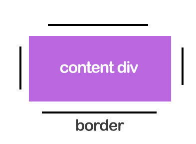
如何使用CSS创建边框边距,如下图所示?内容的高度不固定。
5 个答案:
答案 0 :(得分:9)
您不能仅使用border来执行此操作,但可以使用after和box-shadow
详细了解after和box-shadow
div {
  width: 200px;
  height: 100px;
  background: #BB67E0;
  position: relative;
  margin: 50px;
  text-align: center;
  line-height: 100px;
  font-size:30px;
  color:#fff;
}
div:after {
  position: absolute;
  content: "";
  width: 2px;
  height: 80px;
  background: black;
  left: -10px;
  top: 10px;
  box-shadow: 220px 0 0 0 black;
}
div:before {
  position: absolute;
  content: "";
  height: 2px;
  width: 180px;
  background: black;
  left: 10px;
  top: -10px;
  box-shadow: 0 120px 0 0 black;
}
<div>content div</div>
如果要使用相对高度,则必须删除底部边框,或者可以使用jquery更改box-shadow
注意:我已将contenteditable提供给div,以便在添加更多内容时查看更改
div {
  width: 200px;
  min-height: 100px;
  background: #BB67E0;
  position: relative;
  margin: 50px;
  text-align: center;
  line-height: 100px;
  font-size:30px;
  color:#fff;
}
div:after {
  position: absolute;
  content: "";
  width: 2px;
  height: 90%;
  background: black;
  left: -10px;
  top: 5%;
  box-shadow: 220px 0 0 0 black;
}
div:before {
  position: absolute;
  content: "";
  height: 2px;
  width: 90%;
  background: black;
  left: 10px;
  top: -10px;
}
<div contenteditable="true">content div</div>
编辑:这可以根据您的需要改变宽度和高度我从misterMansam的精彩answer获得了想法
div {
  width: 200px;
  min-height: 100px;
  background: #BB67E0;
  position: relative;
  margin: 50px;
  text-align: center;
  line-height: 100px;
  font-size:30px;
  font-size:30px;
  color:#fff;
  color:#fff;
}
div:after {
  position: absolute;
  content: "";
  width: 90%;
  left:5%;
  top:0;
  height:110%;
  top:-5%;
  border-top:2px solid black;
  border-bottom:2px solid black;
}
div:before {
  position: absolute;
  content: "";
  width: 110%;
  left:-5%;
  top:0%;
  height:100%;
  border-left:2px solid black;
  border-right:2px solid black;
}
<div contenteditable="true">Content</div>
答案 1 :(得分:5)
我承认这种方法很疯狂但是 - 作为一项实验 - 如果你只支持现代浏览器而且你使用clip-path属性玩一点(*)(用于切断角落)你可以试试这个:
http://codepen.io/anon/pen/qOBzJO
div {
  width: 300px;
  padding: 10px;
  margin: 50px;
  background: violet;
  background-clip: content-box;
  border: 3px #000 solid;

  clip-path: polygon(0 20%, 10px 20%, 10px 10px, 15% 10px, 15% 0,
     85% 0, 85% 10px, calc(100% - 10px) 10px, calc(100% - 10px) 20%, 100% 20%,
     100% 80%, calc(100% - 10px) 80%, calc(100% - 10px) calc(100% - 10px),
     85% calc(100% - 10px), 85% 100%, 15% 100%, 15% calc(100% - 10px),
     10px calc(100% - 10px), 10px 85%, 0 85%);

  -webkit-clip-path: polygon(0 20%, 10px 20%, 10px 10px, 15% 10px, 15% 0, 85% 0,
     85% 10px, -webkit-calc(100% - 10px) 10px, -webkit-calc(100% - 10px) 20%,
     100% 20%, 100% 80%, -webkit-calc(100% - 10px) 80%,
     -webkit-calc(100% - 10px) -webkit-calc(100% - 10px),
     85% -webkit-calc(100% - 10px), 85% 100%, 15% 100%, 15%
     -webkit-calc(100% - 10px), 10px -webkit-calc(100% - 10px), 10px 85%, 0 85%);

}
有些值是百分比,这就是为什么垂直线在较高的div中较短的原因(这可以使用固定值来解决),但正如您所看到的,高度不参与解决方案。这种方法的另一个好处是响应性(尝试拉伸编解码器输出面板)
(*):我骗了。它不仅仅是&#34;有点&#34; :)
答案 2 :(得分:4)
四面灵活
-
:before伪元素创建左右边框 -
:after伪元素创建顶部和底部边框 - 边框的间距由
top,right,bottom和left控制(左右属性都拉伸它们之间的元素,相同作为顶部和底部)
边框始终保持指定的偏移距离。
这是一种可视化伪元素如何布局的好方法:

实施例
div {
  background: purple;
  height: 50vh;
  width: 50vw;
  margin: 50px auto;
  position: relative;
  min-height: 200px;
  min-width: 200px;
}
div:before,
div:after {
  content: '';
  position: absolute;
  top: 60px;
  left: -20px;
  right: -20px;
  bottom: 60px;
  border: solid 4px #000;
}
div:before {
  border-top: none;
  border-bottom: none;
}
div:after {
  top: -20px;
  left: 60px;
  right: 60px;
  bottom: -20px;
  border-left: none;
  border-right: none;
}
<div></div>
答案 3 :(得分:4)
使用 border-image:
我们可以使用border-image在所有四个边上分配linear-gradient作为边框图像。我们需要一个伪元素(与父容器重叠),因为渐变只能在一个方向上进行。梯度可以支持基于百分比的值,因此可以适应不同的容器尺寸。这可以通过将鼠标悬停在代码段中的div来验证。
此方法的主要缺点是border-image属性具有low browser support。但是当仅需要支持IE11 +时它非常有用,因为与box-shadow不同,它不需要固定维度,不像clip-path那么复杂,并且还为其他潜在用途留下了备用伪元素。
.border-spacing{
  position: relative;
  height: 100px;
  width: 300px;
  padding: 10px;
  background: rgb(187, 103, 224);
  background-clip: content-box;
  border-image: linear-gradient(to bottom, transparent 25%, black 15%, black 75%, transparent 75%);
  border-image-slice: 4;
  border-image-width: 4px;
  border-image-repeat: round;

  /* Just for demo */
  text-align: center;
  line-height: 100px;
  color: white;
}
.border-spacing:after{
  position: absolute;
  content: '';
  top: -2px; /* half of border-image-slice */
  left: -2px; /* half of border-image-slice */
  height: calc(100% - 20px); /* 100% - 2 * padding */
  width: calc(100% - 20px); /* 100% - 2 * padding */
  padding: 10px;
  border-image: linear-gradient(to right, transparent 25%, black 15%, black 75%, transparent 75%);
  border-image-slice: 4;
  border-image-width: 4px;
  border-image-repeat: round;
}

/* Just for demo */

.border-spacing{
  transition: all 1s;
}
.border-spacing:hover{
  height: 150px;
  width: 450px;
  line-height: 150px;
}
<script src="https://cdnjs.cloudflare.com/ajax/libs/prefixfree/1.0.7/prefixfree.min.js"></script>
<div class="border-spacing">Content div</div>
使用 background-image:
我们可以使用background-image在所有四个边上分配linear-gradient作为边框图像。我们需要一个伪元素(与父容器重叠),因为渐变只能在一个方向上进行。梯度可以支持基于百分比的值,因此可以适应不同的容器尺寸。这可以通过将鼠标悬停在代码段中的div来验证。
这种方法的缺点也与前一种方法非常相似,只有IE10 +支持linear-gradient。优点与前面提到的相同。
.border-spacing{
  position: relative;
  height: 100px;
  width: 300px;
  padding: 10px;
  background-image: linear-gradient(to bottom, transparent 25%, black 15%, black 75%, transparent 75%), linear-gradient(to bottom, transparent 25%, black 15%, black 75%, transparent 75%), linear-gradient(to right, transparent 25%, black 15%, black 75%, transparent 75%), linear-gradient(to right, transparent 25%, black 15%, black 75%, transparent 75%);
  background-size: 4px 100%, 4px 100%, 100% 4px, 100% 4px;
  background-position: 0px 0px, 100% 0px, 0px 0px, 0px 100%;
  background-repeat: no-repeat;

  /* Just for demo */
  text-align: center;
  line-height: 100px;
  color: white;
}
.border-spacing:after{
  position: absolute;
  content: '';
  top: 10px;
  left: 10px;
  height: calc(100% - 20px);
  width: calc(100% - 20px);
  z-index: -1;
  background: rgb(187, 103, 224);
}


/* Just for demo */

.border-spacing{
  transition: all 1s;
}
.border-spacing:hover{
  height: 150px;
  width: 450px;
  line-height: 150px;
}
<script src="https://cdnjs.cloudflare.com/ajax/libs/prefixfree/1.0.7/prefixfree.min.js"></script>
<div class="border-spacing">Content div</div>
答案 4 :(得分:0)
单角空间 不好意思进行挖掘,但是我对@misterManSam解决方案做出了自己的解释:我想到达一个角落的可用空间,以将图标放在项目中。
div {
  background: purple;
  height: 200px;
  width: 200px;
  margin: 50px auto;
  position: relative;
  min-height: 200px; /* Just adjust as you wish */
  min-width: 200px; /* Just adjust as you wish */
}

div:before { /* Bottom half Borders */
  content: '';
  position: absolute;
  top: 60px; /* Height of left border */
             /* Higher value - smaller border line */
  left: -20px; /* Margin between div edge */
  right: -20px; /* Margin between div edge */
  bottom: -20px; /* Margin between div edge */
  border: solid 3px #000;
  border-top: none;
}

div:after { /* Top half Borders */
  content: '';
  position: absolute;
  top: -20px; /* Margin between div edge */
  left: 60px; /* Height of top border */
             /* Higher value - smaller border line */
  right: -20px; /* Margin between div edge */
  bottom: 60px;
  border: solid 3px #000;
  border-left: none;
  border-bottom: none;
}
HTML
<div></div>
纯HTML + CSS。 https://codepen.io/nigtellios/pen/LYZevGv
- 我写了这段代码,但我无法理解我的错误
- 我无法从一个代码实例的列表中删除 None 值,但我可以在另一个实例中。为什么它适用于一个细分市场而不适用于另一个细分市场?
- 是否有可能使 loadstring 不可能等于打印?卢阿
- java中的random.expovariate()
- Appscript 通过会议在 Google 日历中发送电子邮件和创建活动
- 为什么我的 Onclick 箭头功能在 React 中不起作用?
- 在此代码中是否有使用“this”的替代方法?
- 在 SQL Server 和 PostgreSQL 上查询,我如何从第一个表获得第二个表的可视化
- 每千个数字得到
- 更新了城市边界 KML 文件的来源?