使Bootstrap 3更加移动友好的问题
我正在创建一个个人网站,使用Twitter Bootstrap 3.4.3作为前端,使用Python / Django 1.5.4作为后端。我目前在尝试使网站进入更适合移动设备的模式时遇到了很多问题。我正在使用我网站的封面和博客模板。 封面模板是有问题的。
以下是笔记本电脑上我网站主页的摘录 -

这就是我的智能手机上的样子 -

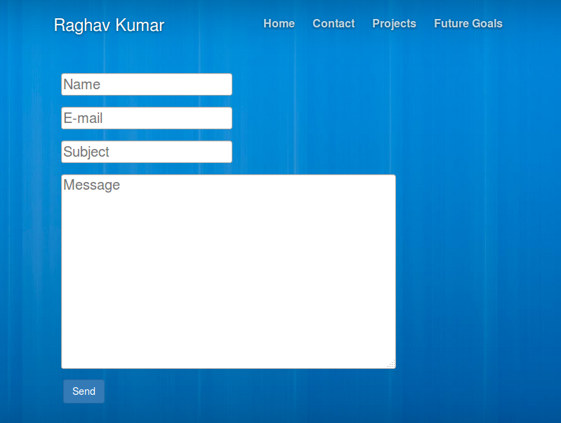
以下是我的笔记本电脑上的联系页面 -
这就是我的智能手机上的样子 -

正如您在移动版中看到的那样,背景并未围绕所有元素,图片和文本框未正确定位。
我正在使用标准的Twitter Bootstrap cover.css文件来处理主页和联系页面的所有样式。这是我用于主体的一些示例代码 -
html,
body {
height: 100%;
width: 100%;
background: url("../background-2.jpg") center no-repeat;
background-size:cover;
}
如何更改样式以使我的网站适合移动设备?
1 个答案:
答案 0 :(得分:0)
您应用于表单的类在任何自定义CSS之前都是重要的:.form-control。 Bootstrap 3 Forms
<script src="https://ajax.googleapis.com/ajax/libs/jquery/2.1.1/jquery.min.js"></script>
<script src="https://maxcdn.bootstrapcdn.com/bootstrap/3.3.5/js/bootstrap.min.js"></script>
<link href="https://maxcdn.bootstrapcdn.com/bootstrap/3.3.5/css/bootstrap.min.css" rel="stylesheet" />
<div class="container">
  <form id="email_form" method="POST" action="/home/contact/">
    <div class="row">
      <input type='hidden' name='csrfmiddlewaretoken' value='uusHSjnOjeCLfyaCwmUC3eKH3EXIH9iX' />
      <div class="col-md-6">
        <div class="form-group">
          <input id="id_name" maxlength="200" name="name" placeholder="Name" type="text" class="form-control" />
        </div>
      </div>
      <div class="col-md-6">
        <div class="form-group">
          <input id="id_email" name="email" placeholder="E-mail" type="text" class="form-control" />
        </div>
      </div>
      <div class="col-md-12">
        <div class="form-group">
          <input id="id_subject" maxlength="100" name="subject" placeholder="Subject" type="text" class="form-control" />
        </div>
      </div>
      <div class="col-md-12">
        <div class="form-group">
          <textarea cols="40" id="id_message" name="message" placeholder="Message" rows="10" class="form-control"></textarea>
        </div>
      </div>
    </div>
    <button class="btn btn-primary" type="submit" name="send">Send</button>
  </form>
</div>
你有两个不同的样式表,除了这些规则之外实际上是相同的(你实际上只需要这两个文件之一):
cover.css 有这个规则,而且mobile.css缺少可能导致背景问题的高度和宽度。
 html, body {
    height: 100%;
    width: 100%;
    background: url("http://www.raghavkumar.work/static/background-2.jpg") center no-repeat;
    background-size:cover;
}
mobile.css 有这个规则,cover.css没有。
.img-responsive {
 display: block;
 height: auto;
 max-width: 100%;
}
此外,两者都有此错误:底部拼写错误。 padding-bottom
.helptext {
    padding-bottm: 2px;
    font-size: 15px;
}
相关问题
最新问题
- 我写了这段代码,但我无法理解我的错误
- 我无法从一个代码实例的列表中删除 None 值,但我可以在另一个实例中。为什么它适用于一个细分市场而不适用于另一个细分市场?
- 是否有可能使 loadstring 不可能等于打印?卢阿
- java中的random.expovariate()
- Appscript 通过会议在 Google 日历中发送电子邮件和创建活动
- 为什么我的 Onclick 箭头功能在 React 中不起作用?
- 在此代码中是否有使用“this”的替代方法?
- 在 SQL Server 和 PostgreSQL 上查询,我如何从第一个表获得第二个表的可视化
- 每千个数字得到
- 更新了城市边界 KML 文件的来源?