Android CollapsingToolbarLayout标题背景
我正在使用新Android设计支持库中的CollapsingToolbarLayout。
我设置了它的标题并且它工作正常,我仍然唯一的问题是当你滚动时,文本会丢失,具体取决于背景中的图像。
我想做的是设置CollapsingToolbarLayout标题的背景,但我找不到办法。
无论如何要实现这个目标吗?
谢谢!
布局:
<android.support.design.widget.CoordinatorLayout
android:id="@+id/main_content"
xmlns:android="http://schemas.android.com/apk/res/android"
xmlns:app="http://schemas.android.com/apk/res-auto"
android:layout_width="match_parent"
android:layout_height="match_parent"
android:fitsSystemWindows="true">

<android.support.design.widget.AppBarLayout
    android:id="@+id/appbar"
    android:layout_width="match_parent"
    android:layout_height="@dimen/detail_backdrop_height"
    android:fitsSystemWindows="true"
    android:theme="@style/ThemeOverlay.AppCompat.Dark.ActionBar">

    <android.support.design.widget.CollapsingToolbarLayout
        android:id="@+id/collapsing_toolbar"
        android:layout_width="match_parent"
        android:layout_height="match_parent"
        android:fitsSystemWindows="true"
        app:contentScrim="?attr/colorPrimary"
        app:expandedTitleMarginEnd="64dp"
        app:expandedTitleMarginStart="48dp"
        app:layout_scrollFlags="scroll|exitUntilCollapsed">

        <ImageView
            android:id="@+id/ivBigImage"
            android:layout_width="match_parent"
            android:layout_height="match_parent"
            android:fitsSystemWindows="true"
            android:scaleType="centerCrop"
            app:layout_collapseMode="parallax"/>

        <android.support.v7.widget.Toolbar
            android:id="@+id/toolbar"
            android:layout_width="match_parent"
            android:layout_height="?attr/actionBarSize"
            app:layout_collapseMode="pin"
            app:popupTheme="@style/ThemeOverlay.AppCompat.Light"/>

    </android.support.design.widget.CollapsingToolbarLayout>

</android.support.design.widget.AppBarLayout>

<android.support.v4.widget.NestedScrollView
    android:layout_width="match_parent"
    android:layout_gravity="fill_vertical"
    android:layout_height="match_parent"
    app:layout_behavior="@string/appbar_scrolling_view_behavior">

    <LinearLayout
        android:layout_width="match_parent"
        android:layout_height="match_parent"
        android:orientation="vertical"
        android:paddingTop="24dp">

        <android.support.v7.widget.CardView
            android:id="@+id/cvDescription"
            android:layout_width="match_parent"
            android:layout_height="wrap_content"
            android:layout_margin="10dp">

            <LinearLayout
                style="@style/Image.Info.CardContent"
                android:layout_width="match_parent"
                android:layout_height="wrap_content">

                <TextView
                    android:layout_width="match_parent"
                    android:layout_height="wrap_content"
                    android:text="@string/description"
                    android:textAppearance="@style/TextAppearance.AppCompat.Title"/>

                <TextView
                    android:id="@+id/tvDescription"
                    android:layout_width="match_parent"
                    android:layout_height="wrap_content"
                    android:text=""/>

            </LinearLayout>

        </android.support.v7.widget.CardView>


    </LinearLayout>

</android.support.v4.widget.NestedScrollView>
在活动中设置CollapsingToolbarLayout标题:
CollapsingToolbarLayout collapsingToolbar =
            (CollapsingToolbarLayout) findViewById(R.id.collapsing_toolbar);
    collapsingToolbar.setTitle("Some title here");
编辑:
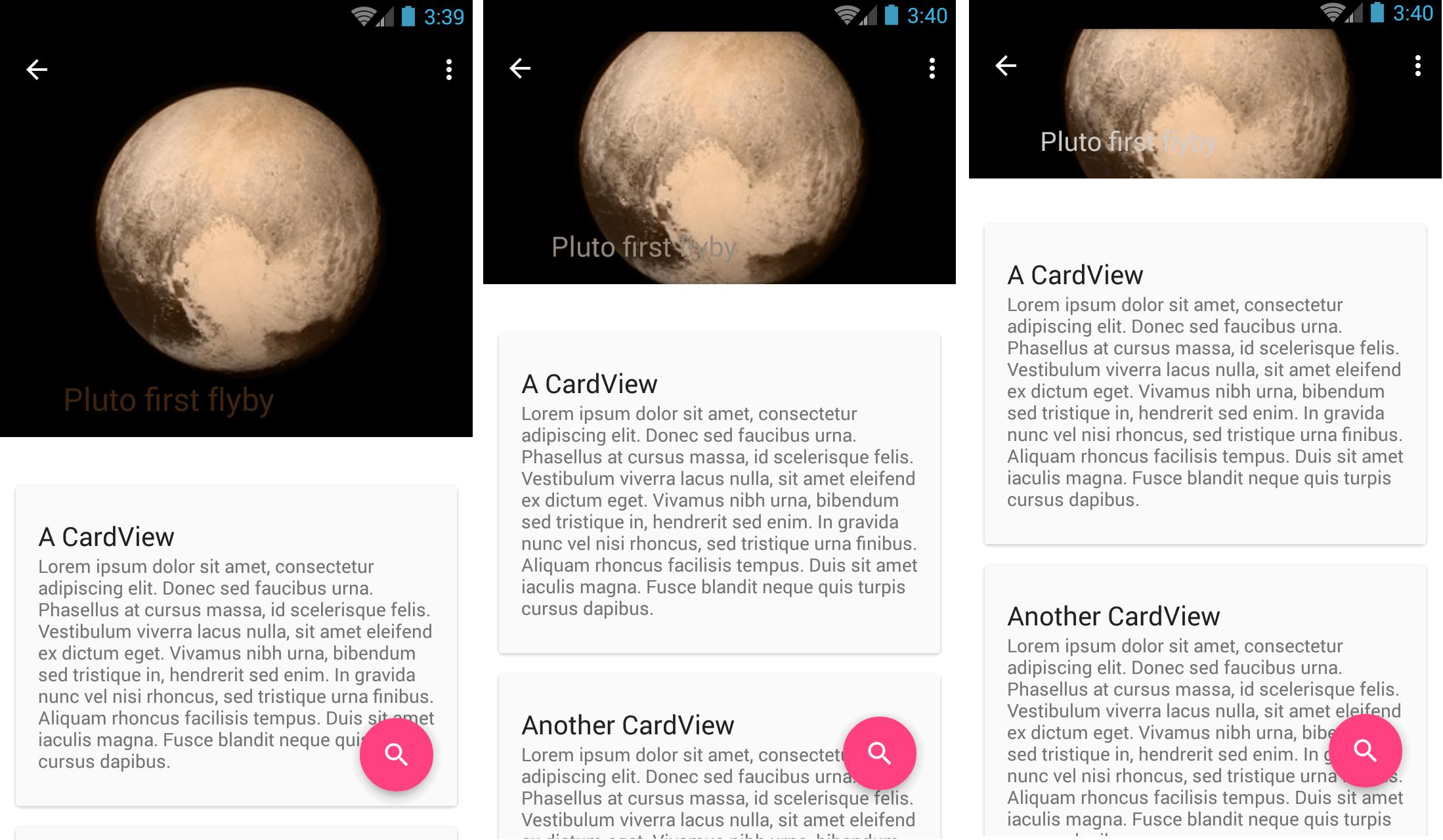
在折叠工具栏时,您可以看到一系列图像。您可以看到标题文本的可读性。问题是我没有控制我显示的图像,所以对于某些图像看起来没问题,但对于其他人来说,就像这个例子一样,它看起来并不好看,而且不可读。我想到的可能是在文本中添加某种背景,因此文本背面总是有相同的颜色,并且它总是可读的。
4 个答案:
答案 0 :(得分:74)
使用text protection scrim(向下滚动一下)。我的示例假设标题文本为白色,因此可能需要进行一些调整以优化您的案例。
在CollapsingToolbarLayout内,在ivBigImage之后添加以下内容:
<View
    android:layout_width="match_parent"
    android:layout_height="@dimen/sheet_text_scrim_height_top"
    android:background="@drawable/scrim_top"
    app:layout_collapseMode="pin"/>

<View
    android:layout_width="match_parent"
    android:layout_height="@dimen/sheet_text_scrim_height_bottom"
    android:layout_gravity="bottom"
    android:layout_alignBottom="@+id/image"
    android:background="@drawable/scrim_bottom"/>
在Drawable文件夹中,添加:
scrim_top.xml
<shape xmlns:android="http://schemas.android.com/apk/res/android">
<gradient
    android:angle="270"
    android:startColor="@color/translucent_scrim_top"
    android:centerColor="@color/translucent_scrim_top_center"
    android:endColor="@android:color/transparent"/>
</shape>
和scrim_bottom.xml
<shape xmlns:android="http://schemas.android.com/apk/res/android">
<gradient
    android:angle="90"
    android:startColor="@color/translucent_scrim_bottom"
    android:centerColor="@color/translucent_scrim_bottom_center"
    android:endColor="@android:color/transparent"/>
</shape>
对于颜色,你应该在初始测试中使这些颜色变暗,这样你就可以更明显地使用它了,但是对于生产我使用过:
<color name="translucent_scrim_top">#26000000</color>
<color name="translucent_scrim_top_center">#0C000000</color>
<color name="translucent_scrim_bottom">#2A000000</color>
<color name="translucent_scrim_bottom_center">#0D000000</color>
对于尺寸,我使用了88dp的高度。
答案 1 :(得分:18)
使用Amagi82示例中的文字保护网格,并添加CollapsingToolbarLayout app:expandedTitleTextAppearance参数。
<android.support.design.widget.CollapsingToolbarLayout
    android:id="@+id/collapsing_toolbar"
    android:layout_width="match_parent"
    android:layout_height="match_parent"
    .
    app:expandedTitleTextAppearance="@style/TextAppearance.Design.CollapsingToolbar.Expanded.Shadow"
    .
    .
    app:layout_scrollFlags="scroll|exitUntilCollapsed">
例如,在你的样式xml上添加它:
<style name="TextAppearance.Design.CollapsingToolbar.Expanded.Shadow">
    <item name="android:shadowDy">0</item>
    <item name="android:shadowDx">0</item>
    <item name="android:shadowRadius">8</item>
    <item name="android:shadowColor">@android:color/black</item>
</style>
答案 2 :(得分:4)
编辑:
如果要在工具栏缩小&#34;后更改工具栏的颜色,则需要将折叠工具栏布局的contentScrim属性设置为该颜色:
<android.support.design.widget.CollapsingToolbarLayout
        app:contentScrim="@color/[color you want]"
        ...>
根据我的理解,将此属性的值指向您希望工具栏变为的颜色将解决您的问题。
希望能回答你的问题!
答案 3 :(得分:3)
通过编写大量代码,很多工作都可以实现。 我通过两种方式实现了这一目标。
1使用带有TransparentBlack颜色的View 的简单解决方法 CODE&GT;&GT;
代码说明:
1 CollapsingToolbarLayout的样式只有文字大小。
2默认的CollapsingToolbarLayout边距底部被覆盖为16dp。我们带有parallax collapseMode的标题是一个带有ImaveView和View的RelativeLayout。这个简单的视图在顶部标题的底部有一个BG相对布局与对比色(这里是#77000000),作为CollapsingToolbarLayout的白色折叠标题的BG。
  <android.support.design.widget.CollapsingToolbarLayout
        android:id="@+id/redeem_detail_collapsing_toolbar"
        android:layout_width="match_parent"
        android:layout_height="match_parent"
        android:background="@color/color_window_background"
        android:fitsSystemWindows="true"
        app:expandedTitleMarginBottom="16dp"
        app:expandedTitleTextAppearance="@style/CollapsingTitleStyle"
        app:layout_scrollFlags="scroll|exitUntilCollapsed">

        <!--header view-->
        <RelativeLayout
            android:layout_width="match_parent"
            android:layout_height="match_parent"
            app:layout_collapseMode="parallax">

            <ImageView
                android:id="@+id/redeem_detail_top_bg"
                android:layout_width="match_parent"
                android:layout_height="match_parent"
                android:fitsSystemWindows="true"
                android:scaleType="centerCrop"
                android:src="@drawable/splash" />

            <!--A view that draws a semi tranparent black overlay so that title is visible once expanded -->
            <View
                android:layout_width="match_parent"
                android:layout_height="48dp"
                android:layout_alignParentBottom="true"
                android:background="@color/black_transparent" />

        </RelativeLayout>

        <android.support.v7.widget.Toolbar
            android:id="@+id/redeem_detail_toolbar"
            android:layout_width="match_parent"
            android:layout_height="?attr/actionBarSize"
            app:layout_collapseMode="pin"
            app:popupTheme="@style/ThemeOverlay.AppCompat.Light"
            app:title="Redeem" />

    </android.support.design.widget.CollapsingToolbarLayout>
样式1的图像:
a)当CollapsingToolbarLayout标题完全展开时:

b)当CollapsingToolbarLayout标题在向上滚动时缩小:

2 回答above
Joao Ferreira已经提到了方法。
以下是shadowRadius = 16的样子:注意阴影

PS请更新或询问更多是否有任何混淆:)
- 展开时,CollapsingToolbarLayout标题已消失
- CollapsingToolbarLayout信息涵盖标题
- Android CollapsingToolbarLayout标题背景
- 仅在折叠时显示CollapsingToolbarLayout标题
- CollapsingToolbarLayout + TabLayout,奇怪的工具栏标题边距
- CollapsingToolbarLayout未显示标题
- 用于RTL语言的CollapsingToolbar标题填充
- 标题文本与CollapsingToolbarLayout中的标题后退按钮重叠
- 在CollapsingToolbarLayout之后隐藏标题
- CollapsingToolbarLayout折叠标题位置错误
- 我写了这段代码,但我无法理解我的错误
- 我无法从一个代码实例的列表中删除 None 值,但我可以在另一个实例中。为什么它适用于一个细分市场而不适用于另一个细分市场?
- 是否有可能使 loadstring 不可能等于打印?卢阿
- java中的random.expovariate()
- Appscript 通过会议在 Google 日历中发送电子邮件和创建活动
- 为什么我的 Onclick 箭头功能在 React 中不起作用?
- 在此代码中是否有使用“this”的替代方法?
- 在 SQL Server 和 PostgreSQL 上查询,我如何从第一个表获得第二个表的可视化
- 每千个数字得到
- 更新了城市边界 KML 文件的来源?