围绕div的CSS3渐变边框
是否可以使用纯CSS在div周围创建这样的边框,或者我是否必须使用图像?
3 个答案:
答案 0 :(得分:1)
我建议使用border-image属性
.top-to-bottom {
  border-bottom: 10px solid trasparent;
  border-width: 10px;
  border-style: solid;
  -webkit-border-image: -webkit-gradient(linear, 0 0, 0 100%, from(black), to(rgba(0, 0, 0, 0))) 1 100%;
  -webkit-border-image: -webkit-linear-gradient(#FBCDEA, rgba(0, 0, 0, 0)) 1 1;
  -moz-border-image: -moz-linear-gradient(#FBCDEA, rgba(0, 0, 0, 0)) 1 1;
  -o-border-image: -o-linear-gradient(#FBCDEA, rgba(0, 0, 0, 0)) 1 1;
  border-image: linear-gradient(to bottom, #FBCDEA, rgba(0, 0, 0, 0)) 1 1;
  height: 100px;
  width: 97%;
  border-top: 10px solid #FBCDEA;
}
.bottom-to-top {
  border-top: 10px solid trasparent;
  border-width: 10px;
  border-style: solid;
  -webkit-border-image: -webkit-gradient(linear, 0 100%, 0 0, from(#FBCDEA), to(rgba(0, 0, 0, 0))) 1 1;
  -webkit-border-image: -webkit-linear-gradient(bottom, black, rgba(0, 0, 0, 0)) 1 1;
  -moz-border-image: -moz-linear-gradient(bottom, #FBCDEA, rgba(0, 0, 0, 0)) 1 1;
  -o-border-image: -o-linear-gradient(bottom, #FBCDEA, rgba(0, 0, 0, 0)) 1 1;
  border-image: linear-gradient(to top, #FBCDEA, rgba(0, 0, 0, 0)) 1 1;
  border-bottom: 10px solid #FBCDEA;
  height: 100%;
  width: 98%
}
<div class="bottom-to-top">
<div class="top-to-bottom">
</div>
</div>
答案 1 :(得分:1)
既然你想要纯css ,这就是一种方式:
.dblgradbox {
	margin: auto;
	padding: 15px;
	width: 275px;
	height: 200px;
	border: 15px solid transparent;
	border-top: 10px solid transparent;
	border-image: linear-gradient(to bottom, transparent, #FBCDEA) 3 100%;
	box-shadow: 0 15px 0 0 #FBCDEA, 0 -5px 0 0 #F7FCFF,  inset 0px 15px 0 0 #FBCDEA;
	background-image:  linear-gradient(#FBCDEA, transparent), linear-gradient(#FBCDEA, transparent);
	background-size: 15px 100%;
	background-position: 0 0, 100% 0;
	background-repeat: no-repeat;
	border-radius: 7px;
}
<div class="dblgradbox">
x3ns
</div>
运行代码段后查看“整页”。我没有包含任何跨浏览器属性,因为这是一个例子。
此方法通常通过应用渐变边框,并使用盒阴影插入技术来帮助完成元素内的效果 - 因此还需要填充以适合其中的内容。背景图像仅在插图的两侧显示两个渐变条。
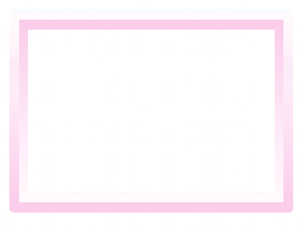
答案 2 :(得分:0)
也许是这样?
*{
    box-sizing: border-box;
}

.wrap{
    width: 300px;
    height: 300px;
    padding: 20px;
    margin: 25px auto;
    border-radius: 10px;
    background: rgb(254,249,253); /* Old browsers */
background: -moz-linear-gradient(top, rgb(254,249,253) 0%, rgb(253,230,246) 50%, rgb(253,204,234) 100%); /* FF3.6+ */
background: -webkit-gradient(linear, left top, left bottom, color-stop(0%,rgb(254,249,253)), color-stop(50%,rgb(253,230,246)), color-stop(100%,rgb(253,204,234))); /* Chrome,Safari4+ */
background: -webkit-linear-gradient(top, rgb(254,249,253) 0%,rgb(253,230,246) 50%,rgb(253,204,234) 100%); /* Chrome10+,Safari5.1+ */
background: -o-linear-gradient(top, rgb(254,249,253) 0%,rgb(253,230,246) 50%,rgb(253,204,234) 100%); /* Opera 11.10+ */
background: -ms-linear-gradient(top, rgb(254,249,253) 0%,rgb(253,230,246) 50%,rgb(253,204,234) 100%); /* IE10+ */
background: linear-gradient(to bottom, rgb(254,249,253) 0%,rgb(253,230,246) 50%,rgb(253,204,234) 100%); /* W3C */
filter: progid:DXImageTransform.Microsoft.gradient( startColorstr='#fef9fd', endColorstr='#fdccea',GradientType=0 ); /* IE6-9 */
}
.wrap div{
    width: 100%;
    height: 100%;
    padding: 20px;
}
.wrap .inner{
    background: rgb(253,204,234); /* Old browsers */
background: -moz-linear-gradient(top,  rgb(253,204,234) 0%, rgb(253,230,246) 50%, rgb(254,249,253) 100%); /* FF3.6+ */
background: -webkit-gradient(linear, left top, left bottom, color-stop(0%,rgb(253,204,234)), color-stop(50%,rgb(253,230,246)), color-stop(100%,rgb(254,249,253))); /* Chrome,Safari4+ */
background: -webkit-linear-gradient(top,  rgb(253,204,234) 0%,rgb(253,230,246) 50%,rgb(254,249,253) 100%); /* Chrome10+,Safari5.1+ */
background: -o-linear-gradient(top,  rgb(253,204,234) 0%,rgb(253,230,246) 50%,rgb(254,249,253) 100%); /* Opera 11.10+ */
background: -ms-linear-gradient(top,  rgb(253,204,234) 0%,rgb(253,230,246) 50%,rgb(254,249,253) 100%); /* IE10+ */
background: linear-gradient(to bottom,  rgb(253,204,234) 0%,rgb(253,230,246) 50%,rgb(254,249,253) 100%); /* W3C */
filter: progid:DXImageTransform.Microsoft.gradient( startColorstr='#fdccea', endColorstr='#fef9fd',GradientType=0 ); /* IE6-9 */
}
.wrap .item{
    background: #fff;
}
<div class="wrap">
<div class="inner">
<div class="item"></div>
</div>
</div>
相关问题
最新问题
- 我写了这段代码,但我无法理解我的错误
- 我无法从一个代码实例的列表中删除 None 值,但我可以在另一个实例中。为什么它适用于一个细分市场而不适用于另一个细分市场?
- 是否有可能使 loadstring 不可能等于打印?卢阿
- java中的random.expovariate()
- Appscript 通过会议在 Google 日历中发送电子邮件和创建活动
- 为什么我的 Onclick 箭头功能在 React 中不起作用?
- 在此代码中是否有使用“this”的替代方法?
- 在 SQL Server 和 PostgreSQL 上查询,我如何从第一个表获得第二个表的可视化
- 每千个数字得到
- 更新了城市边界 KML 文件的来源?