Bootstrap / CSS - 为什么这里需要.clearfix
尝试使用Bootstrap 3在固定位置的DIV中放置一些<input/>元素时遇到了问题。似乎容器DIV的宽度增加以容纳输入(位于col-*内部容器)没有明显的原因。这是一个演示代码:
    <div class="dropdown-menu" style="top: 10px; left: 400px; position: fixed; display: block;">
      <div class="col-xs-12">
        <div class="col-xs-12">
          <div class="radio">
            <label> <input type="radio" name="st" value="0">Bark</label>
          </div>
          <div class="radio">
            <label> <input type="radio" name="st" value="1">Roll over</label>
          </div>
          <div class="radio">
            <label> <input type="radio" name="st" value="2">Find bone and bury it underground</label>
          </div>
        </div>
        <div class="col-xs-12 whyyyyyyyyyyyyyyyyyyyyyy">
          <div class="col-xs-3">
            <input class="form-control" />
          </div>
          <div class="col-xs-3">
            <input class="form-control" />
          </div>
          <div class="col-xs-3">
            <input class="form-control" />
          </div>
          <div class="col-xs-3">
            <input class="form-control" />
          </div>
        </div>
      </div>
    </div>
以上是以下内容:

这是没有输入的:

检查宽度和最小宽度后,我发现仅在所有.clearfix元素之间使用col-*解决了问题,如下所示:
<div class="dropdown-menu" style="top: 10px; left: 400px; position: fixed; display: block;">
<div class="col-xs-12">
<div class="col-xs-12">
<div class="radio">
<label> <input type="radio" name="st" value="0">Bark</label>
</div>
<div class="radio">
<label> <input type="radio" name="st" value="1">Roll over</label>
</div>
<div class="radio">
<label> <input type="radio" name="st" value="2">Find bone and bury it underground</label>
</div>
</div>
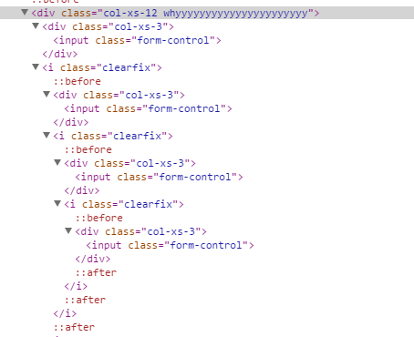
<i class="clearfix" />
<div class="col-xs-12 whyyyyyyyyyyyyyyyyyyyyyy">
<div class="col-xs-3">
<input class="form-control" />
</div>
<i class="clearfix" />
<div class="col-xs-3">
<input class="form-control" />
</div>
<i class="clearfix" />
<div class="col-xs-3">
<input class="form-control" />
</div>
<i class="clearfix" />
<div class="col-xs-3">
<input class="form-control" />
</div>
</div>
</div>
</div>
以上是这样的:

其中一个.clearfix - es缺失,我的容器尺寸可怕。
我试过通过阅读.clearfix,例如,从这里开始:https://stackoverflow.com/a/9543569/964053但是,在这种情况下,我没有看到.clearfix更改的内容。
我的意思是,我案例中的所有元素/内容都已浮动。为什么容器会像那样增长?.clearfix如何设法修复它?引用的答案是floats do not impart shape to its container和What clearfix does is to force content after the floats or the container containing the floats to render below it。如果在我的情况下浮动元素本身不会导致容器增长,那么黑客做了什么?他们之间的空间?
除了在整个地方使用clearfix元素之外,还有更好的解决方法吗?
更新:
嗯...在第二个代码片段中,我的解决方案代码的HTML中似乎存在无效内容。这是自我关闭的<i>元素。这是解决Bootply中的问题,但不是在它之外。以下是我在Bootply中获得的内容:
1 个答案:
答案 0 :(得分:0)
@Override
public int getItemViewType(int position) {
// Define a way to determine which layout to use, here it's just evens and   odds.
return position % 2;
 }

  @Override
public int getViewTypeCount() {
return 2; // Count of different layouts
}
容器的总宽度为input。所以他们会尝试使用那12个列空间。所以你可以在父母身上使用较小的col - * - #:
col-xs-12但是,您的列设置方式可能会遇到更大的问题。例如,作为另一个<div class="col-xs-6">
<div class="col-xs-3">
<input class="form-control" />
</div>
<div class="col-xs-3">
<input class="form-control" />
</div>
<div class="col-xs-3">
<input class="form-control" />
</div>
<div class="col-xs-3">
<input class="form-control" />
</div>
</div>
的直接后代的列col-xs-12是多余的。您还应该使用col-xs-12个容器。
请参阅网格上的boostrap documentation。
此外,永远不要将.row等块级元素与<div> 等内联元素包装在一起,除非其显示属性设置为<i>或{{1} }。或者您的页面将呈现意外结果。
- 我写了这段代码,但我无法理解我的错误
- 我无法从一个代码实例的列表中删除 None 值,但我可以在另一个实例中。为什么它适用于一个细分市场而不适用于另一个细分市场?
- 是否有可能使 loadstring 不可能等于打印?卢阿
- java中的random.expovariate()
- Appscript 通过会议在 Google 日历中发送电子邮件和创建活动
- 为什么我的 Onclick 箭头功能在 React 中不起作用?
- 在此代码中是否有使用“this”的替代方法?
- 在 SQL Server 和 PostgreSQL 上查询,我如何从第一个表获得第二个表的可视化
- 每千个数字得到
- 更新了城市边界 KML 文件的来源?