如何更改TextInputLayout的浮动标签颜色
参考Google发布的新TextInputLayout,如何更改浮动标签文字颜色?
在样式中设置colorControlNormal,colorControlActivated,colorControlHighLight无济于事。
这就是我现在所拥有的:
25 个答案:
答案 0 :(得分:336)
尝试使用以下正常状态下的代码
 <android.support.design.widget.TextInputLayout
     android:layout_width="match_parent"
     android:layout_height="wrap_content"
     android:theme="@style/TextLabel">

     <android.support.v7.widget.AppCompatEditText
         android:layout_width="match_parent"
         android:layout_height="wrap_content"
         android:hint="Hiiiii"
         android:id="@+id/edit_id"/>

 </android.support.design.widget.TextInputLayout>
在样式文件夹TextLabel代码中
 <style name="TextLabel" parent="TextAppearance.AppCompat">
    <!-- Hint color and label color in FALSE state -->
    <item name="android:textColorHint">@color/Color Name</item>
    <item name="android:textSize">20sp</item>
    <!-- Label color in TRUE state and bar color FALSE and TRUE State -->
    <item name="colorAccent">@color/Color Name</item>
    <item name="colorControlNormal">@color/Color Name</item>
    <item name="colorControlActivated">@color/Color Name</item>
 </style>
设置为应用程序的主要主题,仅适用于仅显示状态
<item name="colorAccent">@color/Color Name</item>
更新:
UnsupportedOperationException:无法转换为颜色:api 16或更低版本中的type = 0x2
答案 1 :(得分:95)
<style name="TextAppearance.App.TextInputLayout" parent="@android:style/TextAppearance">
    <item name="android:textColor">@color/red</item>
    <item name="android:textSize">14sp</item>
</style>

<android.support.design.widget.TextInputLayout
    android:layout_width="match_parent"
    android:layout_height="wrap_content"
    android:textColorHint="@color/gray"  //support 23.0.0
    app:hintTextAppearance="@style/TextAppearence.App.TextInputLayout" >

    <android.support.v7.widget.AppCompatEditText
        android:layout_width="match_parent"
        android:layout_height="wrap_content"
        android:hint="@string/hint" />
</android.support.design.widget.TextInputLayout>
答案 2 :(得分:69)
找到答案,使用android.support.design:hintTextAppearance属性设置自己的浮动标签外观。
示例:
<android.support.design.widget.TextInputLayout
android:layout_width="match_parent"
android:layout_height="wrap_content"
xmlns:app="http://schemas.android.com/apk/res-auto"
app:hintTextAppearance="@style/TextAppearance.AppCompat">
<EditText
android:id="@+id/password"
android:layout_width="match_parent"
android:layout_height="wrap_content"
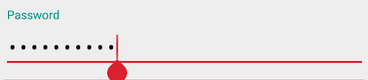
android:hint="@string/prompt_password"/>
</android.support.design.widget.TextInputLayout>
答案 3 :(得分:19)
您不需要使用android:theme="@style/TextInputLayoutTheme"来更改浮动标签颜色,因为它会影响用作标签的小TextView的整个主题。相反,您可以使用app:hintTextAppearance="@style/TextInputLayout.HintText"其中:
<style name="TextInputLayout.HintText">
  <item name="android:textColor">?attr/colorPrimary</item>
  <item name="android:textSize">@dimen/text_tiny_size</item>
  ...
</style>
如果解决方案有效,请告诉我: - )
答案 4 :(得分:10)
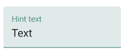
如何更改浮动标签文本的颜色?
通过Material Components library,您可以使用TextInputLayout自定义提示文本颜色(需要版本1.1.0)
-
在布局中:
-
app:hintTextColor属性:标签折叠时的颜色以及文本字段处于活动状态 -
android:textColorHint属性:所有其他文本字段状态(例如静止和禁用)中标签的颜色
-
<com.google.android.material.textfield.TextInputLayout
     app:hintTextColor="@color/mycolor"
     android:textColorHint="@color/text_input_hint_selector"
     .../>
- 扩展material style
Widget.MaterialComponents.TextInputLayout.*:
<style name="MyFilledBox" parent="Widget.MaterialComponents.TextInputLayout.FilledBox">
    <item name="hintTextColor">@color/mycolor</item>
    <item name="android:textColorHint">@color/text_input_hint_selector</item>
</style>

android:textColorHint的默认选择器是:
<selector xmlns:android="http://schemas.android.com/apk/res/android">
  <item android:alpha="0.38" android:color="?attr/colorOnSurface" android:state_enabled="false"/>
  <item android:alpha="0.6" android:color="?attr/colorOnSurface"/>
</selector>
答案 5 :(得分:4)
好的,所以,我发现这个答案非常有用,感谢所有贡献的人。只是为了增加一些东西。接受的答案确实是正确的答案......但是......在我的情况下,我希望用EditText在app:errorEnabled="true"小部件下面实现错误消息,这条单线让我的生活变得困难。这似乎覆盖了我为android.support.design.widget.TextInputLayout选择的主题,android:textColorPrimary具有由EditText定义的不同文本颜色。
最后,我将文本颜色直接应用于styles.xml小部件。我的代码看起来像这样:
<item name="colorPrimary">@color/my_yellow</item>
<item name="colorPrimaryDark">@color/my_yellow_dark</item>
<item name="colorAccent">@color/my_yellow_dark</item>
<item name="android:textColorPrimary">@android:color/white</item>
<item name="android:textColorSecondary">@color/dark_gray</item>
<item name="android:windowBackground">@color/light_gray</item>
<item name="windowNoTitle">true</item>
<item name="windowActionBar">false</item>
<item name="android:textColorHint">@color/dark_gray</item>
<item name="android:colorControlNormal">@android:color/black</item>
<item name="android:colorControlActivated">@android:color/white</item>
<android.support.design.widget.TextInputLayout
        android:id="@+id/log_in_layout_name"
        android:layout_width="match_parent"
        android:layout_height="wrap_content"
        app:errorEnabled="true">

        <EditText
            android:id="@+id/log_in_name"
            android:layout_width="match_parent"
            android:layout_height="wrap_content"
            android:layout_gravity="center_horizontal"
            android:textColor="@android:color/black"
            android:ems="10"
            android:hint="@string/log_in_name"
            android:inputType="textPersonName" />
</android.support.design.widget.TextInputLayout>
我的小部件:
textColorPrimary现在它显示黑色文字颜色而不是Set rng = Range(tmpSheet.Cells(1,1), tmpSheet.Cells(lastrow,1))
白色。
答案 6 :(得分:3)
我建议您为TextInputLayout制作样式主题并仅更改强调色。将父级设置为您的应用基础主题:
 <style name="MyTextInputLayout" parent="MyAppThemeBase">
     <item name="colorAccent">@color/colorPrimary</item>
 </style>

 <android.support.design.widget.TextInputLayout
  android:layout_width="fill_parent"
  android:layout_height="wrap_content"
  android:theme="@style/MyTextInputLayout">
答案 7 :(得分:2)
就我而言,我在TextInputLayout小部件中添加了此“ app:hintTextAppearance="@color/colorPrimaryDark"”。
答案 8 :(得分:2)
在最新版本的支持库(23.0.0+)中,TextInputLayout采用XML中的以下属性来编辑浮动标签颜色:android:textColorHint="@color/white"
答案 9 :(得分:2)
而不是Brahmam Yamani回答我更喜欢使用Widget.Design.TextInputLayout作为父级。这确保了所有必需的项目都存在,即使并非所有项目都被覆盖。在Yamanis的回答中,如果调用setErrorEnabled(true),应用程序将以无法解析的资源崩溃。
只需将样式更改为以下内容:
<style name="TextLabel" parent="Widget.Design.TextInputLayout">
    <!-- Hint color and label color in FALSE state -->
    <item name="android:textColorHint">@color/Color Name</item>
    <item name="android:textSize">20sp</item>
    <!-- Label color in TRUE state and bar color FALSE and TRUE State -->
    <item name="colorAccent">@color/Color Name</item>
    <item name="colorControlNormal">@color/Color Name</item>
    <item name="colorControlActivated">@color/Color Name</item>
 </style>
答案 10 :(得分:1)
更改提示颜色并编辑文本下划线颜色:colorControlActivated
更改字符计数器颜色:textColorSecondary
更改错误消息颜色:colorControlNormal
更改密码可见性按钮色调:colorForeground
有关TextInputLayout的详细信息,请阅读http://www.zoftino.com/android-textinputlayout-tutorial
<style name="MyAppTheme" parent="Theme.AppCompat.Light.DarkActionBar">
    <item name="colorPrimary">@color/colorPrimary</item>
    <item name="colorPrimaryDark">@color/colorPrimaryDark</item>
    <item name="colorControlActivated">#e91e63</item>
    <item name="android:colorForeground">#33691e</item>
    <item name="colorControlNormal">#f57f17</item>
    <item name="android:textColorSecondary">#673ab7</item>
</style>
答案 11 :(得分:0)
它为我工作..... 在TextInputLayout中添加提示颜色
    <android.support.design.widget.TextInputLayout
        android:textColorHint="#ffffff"
        android:id="@+id/input_layout_password"
        android:layout_width="match_parent"
        android:layout_height="wrap_content">
        <EditText
            android:id="@+id/edtTextPassword"
            android:layout_width="match_parent"
            android:layout_height="wrap_content"
            android:layout_marginTop="15dp"
            android:hint="Password"
            android:inputType="textPassword"
            android:singleLine="true"
            />
    </android.support.design.widget.TextInputLayout>
答案 12 :(得分:0)
在聚焦时更改文本标签的颜色。即输入它。你必须添加指定
<item name="android:textColorPrimary">@color/yourcolorhere</item>
请注意: 您必须将所有这些实现添加到主题中。
答案 13 :(得分:0)
我尝试在android.support.design.widget.TextInputLayout中使用android:textColorHint,它运行正常。
        <android.support.design.widget.TextInputLayout
            android:layout_width="match_parent"
            android:layout_height="wrap_content"
            android:textColorHint="@color/colorAccent">

            <EditText
                android:layout_width="match_parent"
                android:layout_height="wrap_content"
                android:hint="Hello"
                android:imeActionLabel="Hello"
                android:imeOptions="actionUnspecified"
                android:maxLines="1"
                android:singleLine="true"/>

        </android.support.design.widget.TextInputLayout>
答案 14 :(得分:0)
  <style name="AppTheme2" parent="AppTheme">
    <!-- Customize your theme here. -->
    <item name="colorControlNormal">#fff</item>
    <item name="colorControlActivated">#fff</item></style>
将此添加到样式并将TextInputLayout Theam设置为App2并且它将起作用;)
答案 15 :(得分:0)
我解决了这个问题。 这是布局:
 <android.support.design.widget.TextInputLayout
           android:id="@+id/til_username"
           android:layout_width="match_parent"
           android:layout_height="wrap_content"
           android:hint="@string/username"
           >

           <android.support.v7.widget.AppCompatEditText android:id="@+id/et_username"
               android:layout_width="match_parent"
               android:layout_height="wrap_content"
               android:singleLine="true"
               />
       </android.support.design.widget.TextInputLayout>
这是Style:
<style name="AppBaseTheme" parent="Theme.AppCompat.Light.DarkActionBar">
        <!--
            Theme customizations available in newer API levels can go in
            res/values-vXX/styles.xml, while customizations related to
            backward-compatibility can go here.
        -->
    </style>
<!-- Application theme. -->


 <style name="AppTheme" parent="AppBaseTheme">
        <!-- All customizations that are NOT specific to a particular API-level can go here. -->
        <item name="colorAccent">@color/pink</item>
        <item name="colorControlNormal">@color/purple</item>
        <item name="colorControlActivated">@color/yellow</item>
    </style>
您应该在申请中使用您的主题:
<application
        android:allowBackup="true"
        android:icon="@drawable/ic_launcher"
        android:label="@string/app_name"
        android:theme="@style/AppTheme" >
</application>
答案 16 :(得分:0)
现在,只需使用colorAccent和colorPrimary即可。
答案 17 :(得分:0)
<com.google.android.material.textfield.TextInputLayout
    android:hint="Hint"
    android:layout_width="match_parent"
    android:layout_height="wrap_content"
    android:theme="@style/TextInputLayoutHint">

    <androidx.appcompat.widget.AppCompatEditText
        android:layout_width="match_parent"
        android:layout_height="wrap_content"
        android:inputType="text"
        android:maxLines="1"
        android:paddingTop="@dimen/_5sdp"
        android:paddingBottom="@dimen/_5sdp"
        android:textColor="#000000"
        android:textColorHint="#959aa6" />

</com.google.android.material.textfield.TextInputLayout>
res / values / styles.xml
<style name="TextInputLayoutHint" parent="">
    <item name="android:textColorHint">#545454</item>
    <item name="colorControlActivated">#2dbc99</item>
    <item name="android:textSize">11sp</item>
</style>
答案 18 :(得分:0)
你应该在这里改变颜色
<style name="Base.Theme.DesignDemo" parent="Theme.AppCompat.Light.NoActionBar">
        <item name="colorPrimary">#673AB7</item>
        <item name="colorPrimaryDark">#512DA8</item>
        <item name="colorAccent">#FF4081</item>
        <item name="android:windowBackground">@color/window_background</item>
    </style>
答案 19 :(得分:0)
如果使用app:hintTextColor,可以使用com.google.android.material.textfield.TextInputLayout,请尝试
 <com.google.android.material.textfield.TextInputLayout
     android:layout_width="match_parent"
     android:layout_height="wrap_content"
     android:hint="@string/app_name"
     app:hintTextColor="@android:color/white">

     <com.google.android.material.textfield.TextInputEditText
        android:layout_width="match_parent"
        android:layout_height="wrap_content"
        />
 </com.google.android.material.textfield.TextInputLayout>
答案 20 :(得分:0)
通过编程,您可以使用:
int yourColorWhenEnabled = ContextCompat.getColor(getContext(), R.color.your_color_enabled);
int yourColorWhenDisabled = ContextCompat.getColor(getContext(), R.color.your_color_disabled);
int[][] states = new int[][]{new int[]{android.R.attr.state_enabled}, new int[]{-android.R.attr.state_enabled}};

myTextInputLayout.setDefaultHintTextColor(new ColorStateList(states, new int[]{yourColorWhenEnabled, yourColorWhenDisabled})
答案 21 :(得分:0)
尝试下面的代码可在正常状态下工作
<android.support.design.widget.TextInputLayout
 android:layout_width="match_parent"
 android:layout_height="wrap_content"
 android:theme="@style/TextLabel">

 <android.support.v7.widget.AppCompatEditText
     android:layout_width="match_parent"
     android:layout_height="wrap_content"
     android:hint="Hiiiii"
     android:id="@+id/edit_id"/>


</android.support.design.widget.TextInputLayout>
在样式文件夹TextLabel代码中
 <style name="TextLabel" parent="TextAppearance.AppCompat">
<!-- Hint color and label color in FALSE state -->
<item name="android:textColorHint">@color/Color Name</item>
<item name="android:textSize">20sp</item>
<!-- Label color in TRUE state and bar color FALSE and TRUE State -->
<item name="colorAccent">@color/Color Name</item>
<item name="colorControlNormal">@color/Color Name</item>
<item name="colorControlActivated">@color/Color Name</item>
 </style>
答案 22 :(得分:0)
从文档中:
提示应该在TextInputLayout而不是EditText上设置。如果以XML形式在子EditText上指定了提示,则TextInputLayout可能仍然可以正常工作; TextInputLayout将使用EditText的提示作为其浮动标签。但是,将来的修改提示的调用不会更新TextInputLayout的提示。为避免意外行为,请在TextInputLayout而不是EditText上调用setHint(CharSequence)和getHint()。
因此,我在android:hint上设置了app:hintTextColor和TextInputLayout,而不是在TextInputEditText上设置了它。
答案 23 :(得分:0)
因为必须将import requests
from bs4 import BeautifulSoup as soup
my_url = 'https://www.gu-global.com/tw/store/goods/325571'
r = requests.get(my_url).content
soup = soup(r, 'html.parser')
soup.find(id = 'msgProdStockOut')
#None
soup.find(id = 'prodMainImg ').text
#u'/n'
,colorControlNormal,colorControlActivated项添加到主要应用程序主题:
colorControlHighLight答案 24 :(得分:0)
这很简单,但由于在不同的配置/名称空间中具有相同属性的多个视图,开发人员感到困惑。
在使用TextInputLayout的情况下,每次使用TextInputEditText或直接使用TextInputLayout时,都会有不同的视图和参数。
我正在使用以上所有修复程序: 但是我发现我在使用
app:textColorHint="@color/textcolor_black"
实际上我应该使用
android:textColorHint="@color/textcolor_black"
作为TextinputLayout的属性
textcolor_black.xml
<?xml version="1.0" encoding="utf-8"?>
<selector xmlns:android="http://schemas.android.com/apk/res/android">
    <item android:color="@color/black_txt" android:state_enabled="true" />
    <item android:color="@color/black_txt" android:state_selected="true" />
    <item android:color="@color/txtColorGray" android:state_selected="false" />
    <item android:color="@color/txtColorGray" android:state_enabled="false" />
</selector>
- 我写了这段代码,但我无法理解我的错误
- 我无法从一个代码实例的列表中删除 None 值,但我可以在另一个实例中。为什么它适用于一个细分市场而不适用于另一个细分市场?
- 是否有可能使 loadstring 不可能等于打印?卢阿
- java中的random.expovariate()
- Appscript 通过会议在 Google 日历中发送电子邮件和创建活动
- 为什么我的 Onclick 箭头功能在 React 中不起作用?
- 在此代码中是否有使用“this”的替代方法?
- 在 SQL Server 和 PostgreSQL 上查询,我如何从第一个表获得第二个表的可视化
- 每千个数字得到
- 更新了城市边界 KML 文件的来源?