еҰӮдҪ•д»ҘдёҚеҗҢзҡ„ж–№ејҸе®үжҺ’3дёӘdivз”ЁдәҺе“Қеә”ејҸи®ҫи®Ў
жҲ‘жӯЈеңЁиҝӣиЎҢеҢ…еҗ«3 div sзҡ„йЎөйқўйҮҚж–°и®ҫи®ЎпјҢжҲ‘жғіи®©е®ғе…·жңүе“Қеә”жҖ§гҖӮ
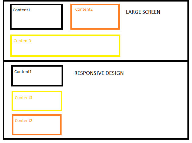
жҲ‘йҒҮеҲ°зҡ„й—®йўҳжҳҜеӨ§еұҸ幕зҡ„divжҢүз…§ 1,2,3 зҡ„йЎәеәҸжҺ’еҲ—гҖӮдҪҶжҳҜпјҢеҜ№дәҺе“Қеә”ејҸи®ҫи®ЎпјҢжҲ‘жғіе°Ҷи®ўеҚ•жӣҙж”№дёә 1,3,2 пјҡ
жҲ‘е°қиҜ•дәҶдёҚеҗҢзҡ„ж–№жі•пјҢдҫӢеҰӮе°Ҷpositionжӣҙж”№дёәrelative / absolute / staticжҲ–дҪҝз”Ёе…¶д»–CSSд»Јз Ғжӣҙж”№divзҡ„йЎәеәҸпјҢдҪҶжІЎжңүиҜҒжҳҺеҲ°зӣ®еүҚдёәжӯўе·ҘдҪңгҖӮ
жҲ‘жҳҜеҰӮдҪ•е®һзҺ°иҝҷдёҖзӣ®ж Үзҡ„пјҹ
.one {
  float: left;
  width: 150px;
  border: solid 2px #eaeaea;
  position: relative;
  z-index: 0;
  margin-bottom: 20px;
  height: 100px;
}
.two {
  float: left;
  margin: 0 0 0 24px;
  width: 150px;
  border: solid 2px #eaeaea;
  height: 100px;
}
.three {
  float: left;
  width: 900px;
  border: solid 2px #eaeaea;
  height: 100px;
}
@media only screen and (max-width: 500px) {
  .one {
    width: 93%;
    padding: 3%;
  }
  .two {
    width: 100%;
    margin-left: 0px;
  }
  .three {
    width: 100%;
    margin: 0px;
  }
}
<div class="one">Content1</div>
<div class="two">Content2</div>
<div class="three">Content3</div>
<div class="500markup">This box is 500px</div>
4 дёӘзӯ”жЎҲ:
зӯ”жЎҲ 0 :(еҫ—еҲҶпјҡ1)
https://jsfiddle.net/fehrda1c/4/
<div class="container">
    <div id="one">Content1</div><!--
    !--><div id="three">Content3</div>
    <div id="two">Content2</div>

</div>

.container {
    padding: 5px;
    position: relative;
}

#one, #two {
    width: 50%;
    display: inline-block;
    box-sizing: border-box;
}

#two {
    position: absolute;
    top: 0;
    right: 0;
}

#one {
    position: absolute;
    top: 0;
    left: 0;
}

#three {
    position: absolute;
    top: 200px;
    left: 0;
    box-sizing: border-box;
}

#one, #two, #three {
    margin: 0;
    height: 200px;
    border: 1px solid black;
}

#three {
    width: 100%;
}

@media (max-width: 600px) {
    #one, #two, #three {
        width: 100%;
        position: initial;
        top: default;
    }
}
зӯ”жЎҲ 1 :(еҫ—еҲҶпјҡ1)
иҝҷеҸҜд»ҘдҪҝз”Ёflexboxпјҡ
- е°Ҷ
divи®ҫзҪ®дёә#containerеҢ…еҗ«display: flex;пјҢиҝҷе°Ҷе‘ҠиҜүеӯ©еӯҗdivдҪҝз”ЁflexboxжЁЎеһӢ - е°Ҷ
flex: 1;ж·»еҠ еҲ°.oneе’Ң.twoпјҢе‘ҠиҜү他们еҰӮжһңйңҖиҰҒеўһй•ҝ - е°Ҷ
flex-basis: 100%;ж·»еҠ еҲ°.threeд»ҘзЎ®дҝқеҚ жҚ®е®№еҷЁзҡ„ж•ҙдёӘе®ҪеәҰ - е°Ҷ
order: *n*;ж·»еҠ еҲ°.oneпјҢ.twoе’Ң.threeпјҢд»ҘдҫҝеңЁйҖӮеә”иҫғе°Ҹзҡ„еұҸ幕е°әеҜёж—¶дёәе…¶жҸҗдҫӣжүҖйңҖзҡ„йЎәеәҸ
#container {
  display: flex;
  flex-wrap: wrap;
  width: 100%;
}
.one {
  border: solid 2px #eaeaea;
  flex: 1;
  height: 100px;
  margin-bottom: 20px;
}
.two {
  border: solid 2px #eaeaea;
  flex: 1;
  height: 100px;
  margin-bottom: 20px;
}
.three {
  border: solid 2px #eaeaea;
  flex-basis: 100%;
  height: 100px;
  margin-bottom: 20px;
}
@media only screen and (max-width: 500px) {
  .one {
    flex-basis: 100%;
    order: 1;
  }
  .two {
    flex-basis: 100%;
    order: 3;
  }
  .three {
    flex-basis: 100%;
    order: 2;
  }
}
<div id="container">
<div class="one">Content1</div>
<div class="two">Content2</div>
<div class="three">Content3</div>
</div>
зӯ”жЎҲ 2 :(еҫ—еҲҶпјҡ1)
> db.authenticationToken.find().pretty()
{
    "_id" : ObjectId("5565b4d444ae3b1a9228be87"),
    "_class" : "com.samepinch.domain.user.AuthenticationToken",
    "token" : "545c1d10-d769-41cf-a47c-2d698ec4df72",
    "user" : {
        "_id" : ObjectId("5565b4d444ae3b1a9228be86"),
        "age" : 0,
        "username" : "dinesh.dhiman@oodlestechnologies.com",
        "firstName" : "Dinesh Dhiman",
        "email" : "dinesh.dhiman@oodlestechnologies.com",
        "gender" : "male",
        "createdDate" : ISODate("2015-05-27T12:13:08.562Z"),
        "updatedDate" : ISODate("2015-05-27T12:13:08.562Z")
    },
    "createdDate" : ISODate("2015-05-27T12:13:08.605Z"),
    "updatedDate" : ISODate("2015-05-27T12:13:26.436Z")
}
еҸҜд»ҘеҒҡеҲ°иҝҷдёҖзӮ№гҖӮ
Flexbox* {
-webkit-box-sizing: border-box;
-moz-box-sizing: border-box;
box-sizing: border-box;
}
.container div {
height: 150px;
border: 1px solid red;
margin-bottom: 10px;
}
.container {
padding: 5px;
position: relative;
display: flex;
flex-wrap: wrap;
justify-content: space-between;
width: 500px;
border: 1px solid grey;
}
#one,
#two {
width: 220px;
}
#three {
width: 500px;
}
@media (max-width: 600px) {
#one {
order: 1;
width: 500px;
}
#two {
order: 3;
width: 500px;
}
#three {
order: 2;
}
зӯ”жЎҲ 3 :(еҫ—еҲҶпјҡ0)
дҪ еҸҜд»Ҙиҝҷж ·еҒҡпјҡ
@media only screen and (max-width:500px)
{
   .one{width: 93%; padding: 3%;}
   .two{width: 100%; margin-left: 0px; margin-bottom: 10px; position:absolute; top:320px;}
   .three{width: 100%; margin: 0px;}
}
жЈҖжҹҘFiddle Here.
- жңүжІЎжңүеҠһжі•еңЁе“Қеә”ејҸзҪ‘з«ҷдёӯе®һзҺ°show hide divпјҹ
- е“Қеә”жө®еҠЁзҡ„div
- еҰӮдҪ•еңЁжҲ‘зҡ„жғ…еҶөдёӢи®ҫзҪ®е“Қеә”divпјҹ
- жҲ‘еҰӮдҪ•еңЁе“Қеә”ејҸзҪ‘ж јдёӯе®үжҺ’divпјҹ пјҲWolfram.comйЈҺж јпјү
- еҰӮдҪ•д»ҘдёҚеҗҢзҡ„ж–№ејҸе®үжҺ’3дёӘdivз”ЁдәҺе“Қеә”ејҸи®ҫи®Ў
- еҰӮдҪ•еңЁTwitter Bootstrapдёӯйҡҗи—Ҹ/жҳҫзӨәDIVд»ҘиҺ·еҸ–е“Қеә”ејҸз«ҷзӮ№
- HTMLдёӯзҡ„е“Қеә”йғЁй—Ё
- д»Ҙе“Қеә”зҡ„ж–№ејҸе®ҡдҪҚеөҢеҘ—зҡ„div
- д»Ҙзү№е®ҡжЁЎејҸжҺ’еҲ—дёҚеҗҢеӨ§е°Ҹзҡ„div
- д»ҘеҜ№еә”зҡ„ж–№ејҸеҜ№и§’ең°еёғзҪ®дёӨдёӘеҪјжӯӨзӣёеҜ№зҡ„еӣҫеғҸ
- жҲ‘еҶҷдәҶиҝҷж®өд»Јз ҒпјҢдҪҶжҲ‘ж— жі•зҗҶи§ЈжҲ‘зҡ„й”ҷиҜҜ
- жҲ‘ж— жі•д»ҺдёҖдёӘд»Јз Ғе®һдҫӢзҡ„еҲ—иЎЁдёӯеҲ йҷӨ None еҖјпјҢдҪҶжҲ‘еҸҜд»ҘеңЁеҸҰдёҖдёӘе®һдҫӢдёӯгҖӮдёәд»Җд№Ҳе®ғйҖӮз”ЁдәҺдёҖдёӘз»ҶеҲҶеёӮеңәиҖҢдёҚйҖӮз”ЁдәҺеҸҰдёҖдёӘз»ҶеҲҶеёӮеңәпјҹ
- жҳҜеҗҰжңүеҸҜиғҪдҪҝ loadstring дёҚеҸҜиғҪзӯүдәҺжү“еҚ°пјҹеҚўйҳҝ
- javaдёӯзҡ„random.expovariate()
- Appscript йҖҡиҝҮдјҡи®®еңЁ Google ж—ҘеҺҶдёӯеҸ‘йҖҒз”өеӯҗйӮ®д»¶е’ҢеҲӣе»әжҙ»еҠЁ
- дёәд»Җд№ҲжҲ‘зҡ„ Onclick з®ӯеӨҙеҠҹиғҪеңЁ React дёӯдёҚиө·дҪңз”Ёпјҹ
- еңЁжӯӨд»Јз ҒдёӯжҳҜеҗҰжңүдҪҝз”ЁвҖңthisвҖқзҡ„жӣҝд»Јж–№жі•пјҹ
- еңЁ SQL Server е’Ң PostgreSQL дёҠжҹҘиҜўпјҢжҲ‘еҰӮдҪ•д»Һ第дёҖдёӘиЎЁиҺ·еҫ—第дәҢдёӘиЎЁзҡ„еҸҜи§ҶеҢ–
- жҜҸеҚғдёӘж•°еӯ—еҫ—еҲ°
- жӣҙж–°дәҶеҹҺеёӮиҫ№з•Ң KML ж–Ү件зҡ„жқҘжәҗпјҹ