溢出:隐藏不适用于Chrome中的伪元素
我正在制作一个“灰色主题” - 虽然还有一些调整要做,但我对它很满意。
但我似乎偶然发现了Chrome中的按钮(其他浏览器似乎没问题)这里的问题,其中悬停效果似乎会产生不必要的结果。
如果我将鼠标悬停在菜单上,然后继续悬停“测试按钮”,则伪元素不会粘附到边框半径,在hover上显示方角。
我会寻找坚持边界半径的伪元素。
按钮的代码是:
+ function() {
  var to;
  $(".wrap").on('mouseenter', function() {
    var circles = $(this).find(".circle");
    var degree = (2 * Math.PI) / circles.length; //calc delta angle
    var transforms = [];

    // Calculate the position for each circle
    circles.each(function(index) {
        var x = 100 * Math.cos(-0.5 * Math.PI + degree * (-1 * index - 0.5));
        var y = 100 * Math.sin(-0.5 * Math.PI + degree * (-1 * index - 0.5));

      transforms.push('translate(' + x + 'px,' + y + 'px)');
    });

    // Function to moves all the circles
    // We'll pop a circle each time and than call this function recursively
    function moveCircles() {
      var transform = transforms.shift();
      circles.css('transform', transform);

      circles.splice(0, 1);
      if (circles.length) to = setTimeout(moveCircles, 400);
    }

    moveCircles();
  });

  $(".wrap").on('mouseleave', function() {
    var circles = $(this).children().css('transform', '');
    clearTimeout(to);
  });
}();
html, body {
background:darkgray
}
/*****************Radial Menu (plus bit of button)***********************/
.wrap {
height:300px;
width:300px;
position:relative;
transform-origin: center center;
transition:all 0.8s;
}
.circle {
transition:all 0.8s;
position:absolute;
height:5px;
width:5px;
text-align: center;
line-height: 15px;
top: calc(50% - 2px);
left: calc(50% - 2px);
border-radius: 50%;
overflow:hidden;
}
.parent{
transition:all 0.8s;
position:absolute;
background:gray;
height:50px;
width:50px;
text-align: center;
line-height: 25px;
top: calc(50% - 25px);
left: calc(50% - 25px);
border-radius: 50%;
z-index:8;
box-shadow: inset 2px 2px 10px black, inset 0 0 15px black, 0 0 15px black;
}
.parent:before,.parent:after{
content:"";
position:absolute;
transition:all 0.8s;
height:5px;
width:25px;
top:22px;
left:12px;
background:black;
opacity:1;
}
.parent:before{
top:15px;
box-shadow: 0 14px 0 black;
}
.parent:hover:before,.parent:hover:after{
transform:translate(0,20px);
color:gray;
opacity:0;
box-shadow: 0 14px 0 none;
}
.wrap:hover .parent,.wrap:hover .parent:before,.wrap:hover .parent:after{
background:darkgray;
}
.wrap:hover .parent:before{
box-shadow:none;
}
.wrap:hover .circle {
height:50px;
width:50px;
line-height: 25px;
top: calc(50% - 25px);
left: calc(50% - 25px);
box-shadow: inset 2px 2px 10px black, inset 0 0 15px black, 0 0 15px black;
}
.circle img {
position:absolute;
height:100%;
width:100%;
left:0;
top:0;
}
.circle:before {
border-radius:50%;
transition:all 0.8s;
content:"";
position:absolute;
height:100%;
width:100%;
top:0;
left:0;
z-index:8;
}
.circle:after,button:after {
transition:all 0.8s;
border-radius:50%;
content:"";
position:absolute;
height:200%;
width:200%;
top:50%;
left:200%;
z-index:8;
background: -moz-linear-gradient(left, rgba(255, 255, 255, 0) 0%, rgba(255, 255, 255, 0.4) 50%, rgba(255, 255, 255, 0) 100%);
background: -webkit-gradient(linear, left top, right top, color-stop(0%, rgba(255, 255, 255, 0)), color-stop(50%, rgba(255, 255, 255, 0.4)), color-stop(100%, rgba(255, 255, 255, 0)));
background: -webkit-linear-gradient(left, rgba(255, 255, 255, 0) 0%, rgba(255, 255, 255, 0.4) 50%, rgba(255, 255, 255, 0) 100%);
background: -o-linear-gradient(left, rgba(255, 255, 255, 0) 0%, rgba(255, 255, 255, 0.4) 50%, rgba(255, 255, 255, 0) 100%);
background: -ms-linear-gradient(left, rgba(255, 255, 255, 0) 0%, rgba(255, 255, 255, 0.4) 50%, rgba(255, 255, 255, 0) 100%);
background: linear-gradient(to right, rgba(255, 255, 255, 0) 0%, rgba(255, 255, 255, 0.4) 50%, rgba(255, 255, 255, 0) 100%);
filter: progid:DXImageTransform.Microsoft.gradient(startColorstr='#00ffffff', endColorstr='#00ffffff', GradientType=1);
}
.circle:hover:after,button:hover:after {
left:-200%;
top:-50%;
}
.circle:hover:before {
box-shadow: inset 2px 2px 10px black, inset 0 0 15px black, 0 0 15px black;
}
/********************Button************************/
button {
margin:5px;
position:relative;
background:gray;
outline:0;
border:0;
padding:10px;
border-radius:10px;
box-shadow: inset 2px 2px 10px transparent, inset 0 0 15px transparent, 0 0 15px black;
background:rgba(0, 0, 0, 0.2);
transition:all 0.4s;
overflow:hidden;
}
button:active {
box-shadow: inset 2px 2px 8px black, inset 0 0 10px black, 0 0 18px black;
}<script src="https://ajax.googleapis.com/ajax/libs/jquery/2.1.1/jquery.min.js"></script>
<hr/>
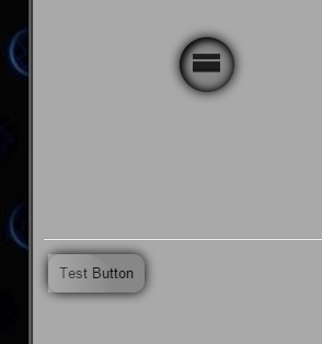
hover near the menu to open
<div class="wrap">
<div class="parent"></div>
<div class="circle">
<img src="http://placekitten.com/g/300/300" />
</div>
<div class="circle">
<img src="http://placekitten.com/g/200/300" />
</div>
<div class="circle">
<img src="http://cdn.flaticon.com/png/256/56729.png" />
</div>
<div class="circle">
<img src="http://cdn.flaticon.com/png/256/54976.png" />
</div>
<div class="circle">Just Text</div>
<div class="circle">
<img src="http://cdn.flaticon.com/png/256/56582.png" />
</div>
</div>
<hr/>
then hover button
<button>Test Button</button>
有没有办法阻止按钮的伪出现在实际元素边框半径的前面(效果是生成'闪耀')?
重现说明
- 以Chrome格式运行代码段
- 悬停放射状菜单
- 现在悬停按钮
- 在动画结束时,查看按钮的'方角'。
我目前得到的是什么:
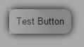
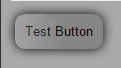
我希望得到什么
我在最新版本的Chrome中遇到了这个问题(似乎)。
注意事项
完全在径向菜单上使用同样的效果,所以我不确定为什么它会出现在按钮实例上?
有没有办法确保在生产中不会出现这种情况,这样就不会出现这个“方角”(仅在最新的镀铬中出现问题)?
更新
- 另一位用户已报告;
右键单击按钮,左键单击inspect元素并在开发工具打开之前将鼠标悬停=&gt; bug(也是“悬停”效果有错误)
将重现此问题。
- 而另一位用户根本无法重现此问题(在V.24上)
1 个答案:
答案 0 :(得分:1)
也许我们都应该阅读有关css will-change属性的更多内容,您可以找到一篇有用的文章here。这是一项实验性技术,目前由Chrome,Firefox和Opera支持。
will-change CSS属性为作者提供了一种提示方式 浏览器关于元素上预期的变化类型,所以 浏览器可以提前设置适当的优化 在元素实际更改之前。这些优化 可以通过潜在的方式提高页面的响应能力 在实际需要之前提前做昂贵的工作。
通过在转换发生之前准备图层,它可以帮助您的浏览器使用GPU渲染元素转换。在这种情况下,我们只需要小心设置此属性。我们不应该将will-change设置为页面上的每个元素,而应该在转换即将发生的时刻定位特定元素。这就是我们应该在父元素上使用:hover状态的原因:
.will_change:hover *,
.will_change:hover *:before,
.will_change:hover *:after {
    will-change: transform, opacity;
}
.will-change是父元素的类,您可以在updated CodePen here上看到详细信息。
如果我们想分析Chrome中发生这种情况的时间和原因,我可以告诉您注意到的内容:
- 它不会像上面boltclock所写的那样随机发生,而只是在浏览器同时呈现其他转换时。只有在将菜单悬停在上方之后(当动画仍未完成时)我们才会在按钮上开始新的动画。在您的示例中,如果您将按钮从下方或侧面悬停,则不会出现任何故障。
- 我的猜测是:使用
will-change强制图形加速并节省CPU出错。-webkit-transform: translateZ(0px)的类似技巧有助于Chrome上的文字呈现。
- 我写了这段代码,但我无法理解我的错误
- 我无法从一个代码实例的列表中删除 None 值,但我可以在另一个实例中。为什么它适用于一个细分市场而不适用于另一个细分市场?
- 是否有可能使 loadstring 不可能等于打印?卢阿
- java中的random.expovariate()
- Appscript 通过会议在 Google 日历中发送电子邮件和创建活动
- 为什么我的 Onclick 箭头功能在 React 中不起作用?
- 在此代码中是否有使用“this”的替代方法?
- 在 SQL Server 和 PostgreSQL 上查询,我如何从第一个表获得第二个表的可视化
- 每千个数字得到
- 更新了城市边界 KML 文件的来源?