带边框和顶部/右侧,底部/左侧透明边缘的Div
有人知道如何编码框的边框(右上角和左下角)(下图)?
希望您能够帮助我。
提前致谢!
这是HTML
<div class="carouselle">
   <div class="carousel-item">
       <div class="xx_b">
          <p>«  Lorem ipsum dolor sit amet, feugiat delicata liberavisse id
           cum, no quo maiorum intellegebat, liber regione eu sit.
            Mea cu case ludus integre, vide viderer eleifend ex mea. His ay
            diceret, cum et atqui placerat... »</p>
        </div>
         <span class="t_author">Tom Cruz</span>
         <span class="t_occupation">Famous Movie Star</span>
      </div>
</div>
这是CSS
.carouselle .carousel-item .xx_b:after {
  -moz-border-bottom-colors: none;
  -moz-border-left-colors: none;
  -moz-border-right-colors: none;
  -moz-border-top-colors: none;
  border-color: #eee transparent transparent;
  border-image: none;
  border-right: 10px solid transparent;
  border-style: solid;
  border-width: 10px;
  bottom: -20px;
  content: "";
  margin-left: -10px;
  position: absolute;
 }

.carouselle .carousel-item .xx_b {
  background: none repeat scroll 0 0 #eee;
  border: 15px solid #cccccc;
  box-sizing: border-box;
  float: left;
  height: 100%;
  margin-bottom: 30px;
  padding: 50px 150px;
  position: relative;
  width: 100%;
 }
4 个答案:
答案 0 :(得分:5)
最好使用box-shadow来创建上述效果而不是伪元素和边框。我们需要两个框阴影,一个用于顶部和左侧区域,另一个(inset框阴影)用于右侧和底部区域。
可以通过修改框阴影的大小来调整边界区域的厚度。
&#13;
&#13;
&#13;
&#13;
.carouselle .carousel-item .xx_b {
  background: none repeat scroll 0 0 #eee;
  box-shadow: -15px -15px 0px #cccccc, inset -15px -15px 0px #cccccc;
  box-sizing: border-box;
  float: left;
  height: 100%;
  margin: 10px 0px 30px 10px;
  padding: 50px 150px;
  position: relative;
  width: 100%;
}
<div class="carouselle">
<div class="carousel-item">
<div class="xx_b">
<p>« Lorem ipsum dolor sit amet, feugiat delicata liberavisse id cum, no quo maiorum intellegebat, liber regione eu sit. Mea cu case ludus integre, vide viderer eleifend ex mea. His ay diceret, cum et atqui placerat... »</p>
</div>
<span class="t_author">Tom Cruz</span>
<span class="t_occupation">Famous Movie Star</span>
</div>
</div>
答案 1 :(得分:2)
要获得此效果,我们可以将border与box-shadow结合使用。 border属性将用于两个边框(顶部和右侧或左侧,或底部和右侧或左侧),box-shadow将用于其他两个。
最后,我们需要在边缘上引入一个边距,该边距有阴影来抵消元素的宽度,因为box-shadow不会影响元素的宽度。元件。
div {
    border-top: 15px solid #cccccc;
    border-right: 15px solid #cccccc;
    box-shadow: 15px 15px 0 1px #cccccc;
    margin: 0 15px 15px 0;
}
最终结果

演示
&#13;
&#13;
&#13;
&#13;
div {
  background: #eee;
  height: 100px;

  border-top: 15px solid #cccccc;
  border-left: 15px solid #cccccc;

  box-shadow: 15px 15px 0 1px #cccccc;

  margin: 0 15px 15px 0;
}
<div></div>
答案 2 :(得分:2)
这是使用两个叠加的伪元素作为背景的另一种方法。在以下示例中,&#34; border&#34;响应:
&#13;
&#13;
&#13;
&#13;
p {
  position: relative;
  width: 80%;
  margin: 50px auto;
  padding: 4%;
  text-align: center; color: #fff;
}
p:before,p:after {
  content: '';
  position: absolute;
  top: 0; left: 0;
  width: 100%; height: 100%;
  background: grey;
  opacity: 0.5;
  z-index: -1;
}
p:before {
  margin: -0.5% 0 0 -0.5%;
}
p:after {
  margin: 0.5% 0 0 0.5%;
}
<p>
Lorem ipsum dolor sit amet, consectetur adipiscing elit. Duis ultrices commodo ligula, sed venenatis metus sollicitudin nec. Maecenas vestibulum porttitor tempus.
</p>
如jbutler483所述,使用一个伪元素和rgba()颜色可以实现相同的输出,用于背景透明度:
&#13;
&#13;
&#13;
&#13;
p{
    width:80%;
    margin:50px auto;
    padding:5% 4% 4% 5%;
    position:relative;
    text-align:center;
    color:#fff;
    background: rgba(0, 0, 0, 0.2);
}
p:before{
    content:'';
    position:absolute;
    background:inherit;
    width:100%; height:100%;
    left:0; top:0;
    margin: 1% 0 0 1%;
    z-index:-1;
}
<p>
Lorem ipsum dolor sit amet, consectetur adipiscing elit. Duis ultrices commodo ligula, sed venenatis metus sollicitudin nec. Maecenas vestibulum porttitor tempus.
</p>
答案 3 :(得分:1)
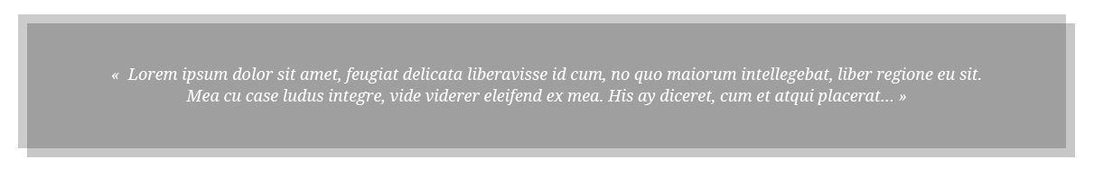
.container {
    width:600px;
}
p {
    background: #A1A1A1;
    padding:25px;
    font-size:12px;
    box-shadow: -5px -5px 0px #ccc, inset -5px -5px 0px #ccc;
    color:#fff;
}
<div class="container">
<p>« Lorem ipsum dolor sit amet, feugiat delicata liberavisse id
cum, no quo maiorum intellegebat, liber regione eu sit.
Mea cu case ludus integre, vide viderer eleifend ex mea. His ay
diceret, cum et atqui placerat... »</p>
</div>
相关问题
最新问题
- 我写了这段代码,但我无法理解我的错误
- 我无法从一个代码实例的列表中删除 None 值,但我可以在另一个实例中。为什么它适用于一个细分市场而不适用于另一个细分市场?
- 是否有可能使 loadstring 不可能等于打印?卢阿
- java中的random.expovariate()
- Appscript 通过会议在 Google 日历中发送电子邮件和创建活动
- 为什么我的 Onclick 箭头功能在 React 中不起作用?
- 在此代码中是否有使用“this”的替代方法?
- 在 SQL Server 和 PostgreSQL 上查询,我如何从第一个表获得第二个表的可视化
- 每千个数字得到
- 更新了城市边界 KML 文件的来源?