Android:使用xml定义创建一个三角形的按钮(可绘制)
我希望使用XML定义创建此按钮(TextView):

在我的活动布局中:
    <TextView
        android:layout_width="wrap_content"
        android:layout_height="wrap_content"
        android:background="@drawable/button_arrow" <!-- I NEED IMPLEMENT THIS -->
        android:clickable="true"
        android:drawablePadding="7dp"
        android:gravity="center"
        android:drawableLeft="@drawable/music_cloud"
        android:onClick="exportSong"
        android:padding="20dp"
        android:text="@string/export_upload"
        android:textAppearance="?android:attr/textAppearanceMedium"
        android:textColor="@color/dark_yellow_text_color"
        android:textStyle="bold" />
我创立了几个帖子:
making-a-triangle-shape-using-xml-definitions
Android triangle (arrow) defined as an XML shape
或Android - make an arrow shape with xml
我尝试修改了几个XML定义,但没有什么是好的。如何实现这种形状有一些简单的方法吗?它也应该有一个透明的背景。
3 个答案:
答案 0 :(得分:8)
如果有人仍然遇到此问题:
-
的xml:
<item android:top="45dp"> <shape> <size android:height="100dp" android:width="90dp"/> <solid android:color="@android:color/holo_orange_light" /> </shape> </item> <item android:top="36dp" android:left="11dp"> <rotate android:fromDegrees="45" android:toDegrees="0" android:pivotX="80%" android:pivotY="20%" > <shape> <size android:width="40dp" android:height="30dp"/> <stroke android:color="@android:color/holo_orange_light" android:width="1dp"/> <solid android:color="@android:color/holo_orange_light" /> </shape> </rotate> </item> </layer-list> -
覆盖TextView并在布局中使用它:
public class CustomTextView extends TextView {

    private int mWidth;
    private int mHeight;


    public CustomTextView(Context context, AttributeSet attrs)  {
        super(context, attrs);

    }

    @Override
    protected void onDraw(Canvas canvas) {

       super.onDraw(canvas);
        Paint mPaint = new Paint();
        int color = getResources().getColor(R.color.YourColor);

        mPaint.setColor(color);
        Path mPath = new Path();
        mPath.moveTo(.0f, this.getHeight());
        mPath.lineTo(0.8f * this.getWidth(), this.getHeight());
        mPath.lineTo(this.getWidth(), 0.5f * this.getHeight());
        mPath.lineTo(0.8f * this.getWidth(), .0f);
        mPath.lineTo(.0f, .0f);
        mPath.lineTo(.0f, this.getHeight());

        canvas.clipPath(mPath);
        canvas.drawPath(mPath,mPaint);


    }
}
关于xml示例:有两个矩形重叠。您必须大量使用这些值,这使得难以在不同的视图上使用。我认为在这种情况下使用自定义视图是最佳解决方案。
答案 1 :(得分:1)
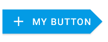
您也可以使用材料组件库中包含的MaterialButton来实现。
在布局中添加MaterialButton,然后:
- 使用
app:icon属性在左侧添加图标 - 应用图书馆提供的style
Widget.MaterialComponents.Button.Icon - 使用
app:shapeAppearanceOverlay属性定义自定义形状(需要v.1.1.0)
类似的东西:
   <com.google.android.material.button.MaterialButton
        style="@style/Widget.MaterialComponents.Button.Icon"
        app:icon="@drawable/ic_add_24px"
        android:text="..."
        app:shapeAppearanceOverlay="@style/CustomShapeAppearanceOverlay.Button"
        .../>
在您的shapeAppearanceOverlay中定义了styles.xml的地方:
  <style name="CustomShapeAppearanceOverlay.Button" parent="">
    <item name="cornerFamily">rounded</item>
    <item name="cornerSizeTopLeft">0dp</item>
    <item name="cornerSizeBottomLeft">0dp</item>

    <item name="cornerFamilyTopRight">cut</item>
    <item name="cornerFamilyBottomRight">cut</item>
    <item name="cornerSizeTopRight">18dp</item>
    <item name="cornerSizeBottomRight">18dp</item>
  </style>
最终结果:
答案 2 :(得分:0)
<item>
    <inset android:insetBottom="2dp" >
        <selector xmlns:android="http://schemas.android.com/apk/res/android" >
            <item android:state_pressed="true">
                <shape android:shape="rectangle" >
                    <corners android:radius="3dip" />

                    <stroke
                        android:width="1dip"
                        android:color="#5e7974" />

                    <gradient
                        android:angle="-90"
                        android:centerColor="#ECEFF1"
                        android:endColor="#FFAB00"
                        android:startColor="#FFAB00" />
                </shape>
            </item>
            <item android:state_focused="true">
                <shape android:shape="rectangle" >
                    <corners android:radius="3dip" />

                    <stroke
                        android:width="1dip"
                        android:color="#5e7974" />

                    <gradient
                        android:angle="-90"
                        android:centerColor="#ECEFF1"
                        android:endColor="#FFAB00"
                        android:startColor="#FFAB00" />
                </shape>
            </item>
            <item>
                <shape android:shape="rectangle" >
                    <corners android:radius="3dip" />

                    <stroke
                        android:width="1dip"
                        android:color="#5e7974" />

                    <gradient
                        android:angle="-90"
                        android:centerColor="#ECEFF1"
                        android:endColor="#FFD600"
                        android:startColor="#FFD600" />
                </shape>
            </item>
        </selector>
    </inset>
</item>
<item
    android:bottom="65dp"
    android:right="-129dp"
    android:top="-40dp">
    <rotate android:fromDegrees="50" >
        <shape android:shape="rectangle" >
            <solid android:color="@color/background_color_light_yellow" />
        </shape>
    </rotate>
</item>
<item
    android:bottom="-40dp"
    android:right="-129dp"
    android:top="65dp">
    <rotate android:fromDegrees="-50" >
        <shape android:shape="rectangle" >
            <solid android:color="@color/background_color_light_yellow" />
        </shape>
    </rotate>
</item>
相关问题
最新问题
- 我写了这段代码,但我无法理解我的错误
- 我无法从一个代码实例的列表中删除 None 值,但我可以在另一个实例中。为什么它适用于一个细分市场而不适用于另一个细分市场?
- 是否有可能使 loadstring 不可能等于打印?卢阿
- java中的random.expovariate()
- Appscript 通过会议在 Google 日历中发送电子邮件和创建活动
- 为什么我的 Onclick 箭头功能在 React 中不起作用?
- 在此代码中是否有使用“this”的替代方法?
- 在 SQL Server 和 PostgreSQL 上查询,我如何从第一个表获得第二个表的可视化
- 每千个数字得到
- 更新了城市边界 KML 文件的来源?