控制虚线边框行程长度和笔画之间的距离
是否可以在CSS中控制虚线边框笔划之间的长度和距离?
以下示例在浏览器之间显示不同:
div {
  border: dashed 4px #000;
  padding: 20px;
  display: inline-block;
}
<div>I have a dashed border!</div>
差异很大:IE 11 / Firefox / Chrome
是否有任何方法可以更好地控制虚线边框的外观?
9 个答案:
答案 0 :(得分:129)
原生的虚线边框属性值不能控制短划线本身......所以请带上border-image属性!
使用border-image
创建自己的边框
兼容性:它提供great browser support(IE 11和所有现代浏览器)。可以将普通边框设置为旧浏览器的后备。
让我们创建这些
这些边框将显示完全相同的跨浏览器!
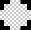
步骤1 - 创建合适的图像
此示例宽15像素,高15像素,间隙目前为5像素宽。这是一个透明的.png。
这是放大照片时在photoshop中的样子:
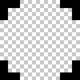
这就是扩展的样子:

控制间隙和行程长度
要创建更宽/更短的间隙或笔划,请加宽/缩短图像中的间隙或笔划。
这是一张10px宽的图像:
 正确缩放=
正确缩放= 
第2步 - 创建CSS - 此示例需要4个基本步骤
-
border-image-source:url("http://i.stack.imgur.com/wLdVc.png"); -
可选 - 定义border-image-width:
border-image-width: 1;默认值为1.也可以使用像素值,百分比值或另一个倍数(1x,2x,3x等)进行设置。这会覆盖任何
border-width集。 -
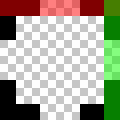
在此示例中,图像的顶部,右侧,底部和左侧边框的厚度为2px,并且它们之外没有间隙,因此我们的切片值为2:
border-image-slice: 2;切片看起来像这样,从顶部,右侧,底部和左侧2个像素:
-
在这个例子中,我们希望模式在div周围均匀重复。所以我们选择:
border-image-repeat: round;
写简写
上述属性可以单独设置,也可以使用border-image简写:
border-image: url("http://i.stack.imgur.com/wLdVc.png") 2 round;
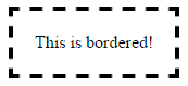
完整示例
请注意border: dashed 4px #000后备广告。不支持的浏览器将收到此边框。
.bordered {
display: inline-block;
padding: 20px;
/* Fallback dashed border
- the 4px width here is overwritten with the border-image-width (if set)
- the border-image-width can be omitted below if it is the same as the 4px here
*/
border: dashed 4px #000;
/* Individual border image properties */
border-image-source: url("http://i.stack.imgur.com/wLdVc.png");
border-image-slice: 2;
border-image-repeat: round;
/* or use the shorthand border-image */
border-image: url("http://i.stack.imgur.com/wLdVc.png") 2 round;
}
/*The border image of this one creates wider gaps*/
.largeGaps {
border-image-source: url("http://i.stack.imgur.com/LKclP.png");
margin: 0 20px;
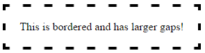
}<div class="bordered">This is bordered!</div>
<div class="bordered largeGaps">This is bordered and has larger gaps!</div>
答案 1 :(得分:74)
除border-image属性外,还有一些其他方法可以创建虚线边框,控制笔划的长度和它们之间的距离。它们如下所述:
方法1:使用SVG
我们可以使用path或polygon元素并设置stroke-dasharray属性来创建虚线边框。该属性采用两个参数,其中一个定义破折号的大小,另一个确定它们之间的空间。
<强>优点:
- SVG本质上是可扩展的图形,可以适应任何容器尺寸。
- 即使涉及
border-radius,也能很好地工作。我们只需将path替换为this answer中的circle,或将path转换为圆圈。 - Browser support for SVG非常好,可以使用VML for IE8提供后备 - 。
- 当容器的尺寸不成比例地改变时,路径倾向于缩放,导致破折号的大小和它们之间的空间发生变化(尝试将鼠标悬停在代码片段中的第一个框上)。这可以通过添加
vector-effect='non-scaling-stroke'来控制(如第二个框中所示),但IE中对此属性的浏览器支持为nil。 - 即使容器的尺寸是动态的,也可以扩展并且可以适应。
- 不使用任何额外的伪元素,这意味着可以将它们放在一边以备其他任何潜在用途。
- Browser support for linear gradients相对较低,如果您想支持IE 9,这是不可取的。即使像CSS3 PIE这样的库也不支持在IE8中创建渐变模式 - 。
- 涉及
border-radius时无法使用,因为背景不会基于border-radius曲线。他们被修剪了。 - 可以通过更改伪元素的尺寸来控制破折号的尺寸。可以通过修改每个阴影之间的间距来控制间距。
- 通过为每个盒子阴影添加不同的颜色,可以产生非常独特的效果。
- 由于我们必须手动设置短划线的尺寸和间距,因此当父框的尺寸是动态时,这种方法并不好。
- IE8及更低版本不support box shadow。但是,这可以通过使用CSS3 PIE等库来克服。
- 可以与
border-radius一起使用,但如果必须在圆圈上找到点(甚至可能transform),定位它们会非常棘手。
<强>缺点:
.dashed-vector {
  position: relative;
  height: 100px;
  width: 300px;
}
svg {
  position: absolute;
  top: 0px;
  left: 0px;
  height: 100%;
  width: 100%;
}
path{
  fill: none;
  stroke: blue;
  stroke-width: 5;
  stroke-dasharray: 10, 10;
}
span {
  position: absolute;
  top: 0px;
  left: 0px;
  padding: 10px;
}


/* just for demo */

div{
  margin-bottom: 10px;
  transition: all 1s;
}
div:hover{
  height: 100px;
  width: 400px;
}
<div class='dashed-vector'>
<svg viewBox='0 0 300 100' preserveAspectRatio='none'>
<path d='M0,0 300,0 300,100 0,100z' />
</svg>
<span>Some content</span>
</div>
<div class='dashed-vector'>
<svg viewBox='0 0 300 100' preserveAspectRatio='none'>
<path d='M0,0 300,0 300,100 0,100z' vector-effect='non-scaling-stroke'/>
</svg>
<span>Some content</span>
</div>
方法2:使用渐变
我们可以使用多个linear-gradient背景图像并适当地定位它们以创建虚线边框效果。这也可以使用repeating-linear-gradient完成,但由于使用重复渐变而没有太大改进,因为我们需要每个渐变仅在一个方向上重复。
.dashed-gradient{
  height: 100px;
  width: 200px;
  padding: 10px;
  background-image: linear-gradient(to right, blue 50%, transparent 50%), linear-gradient(to right, blue 50%, transparent 50%), linear-gradient(to bottom, blue 50%, transparent 50%), linear-gradient(to bottom, blue 50%, transparent 50%);
  background-position: left top, left bottom, left top, right top;
  background-repeat: repeat-x, repeat-x, repeat-y, repeat-y;
  background-size: 20px 3px, 20px 3px, 3px 20px, 3px 20px;
}

.dashed-repeating-gradient {
  height: 100px;
  width: 200px;
  padding: 10px;
  background-image: repeating-linear-gradient(to right, blue 0%, blue 50%, transparent 50%, transparent 100%), repeating-linear-gradient(to right, blue 0%, blue 50%, transparent 50%, transparent 100%), repeating-linear-gradient(to bottom, blue 0%, blue 50%, transparent 50%, transparent 100%), repeating-linear-gradient(to bottom, blue 0%, blue 50%, transparent 50%, transparent 100%);
  background-position: left top, left bottom, left top, right top;
  background-repeat: repeat-x, repeat-x, repeat-y, repeat-y;
  background-size: 20px 3px, 20px 3px, 3px 20px, 3px 20px;
}

/* just for demo */

div {
  margin: 10px;
  transition: all 1s;
}
div:hover {
  height: 150px;
  width: 300px;
}
<script src="https://cdnjs.cloudflare.com/ajax/libs/prefixfree/1.0.7/prefixfree.min.js"></script>
<div class='dashed-gradient'>Some content</div>
<div class='dashed-repeating-gradient'>Some content</div>
<强>优点:
<强>缺点:
方法3:Box Shadows
我们可以使用伪元素创建一个小条(以短划线的形状),然后创建它的多个box-shadow版本以创建边框,如下面的代码段所示。
如果破折号是方形,那么单个伪元素就足够了,但如果它是一个矩形,我们需要一个伪元素用于顶部+底部边框,另一个用于左边框和右边框。这是因为顶部边框上的破折号的高度和宽度将与左侧的破折号不同。
<强>优点:
<强>缺点:
.dashed-box-shadow{
  position: relative;
  height: 120px;
  width: 120px;
  padding: 10px;
}
.dashed-box-shadow:before{ /* for border top and bottom */
  position: absolute;
  content: '';
  top: 0px;
  left: 0px;
  height: 3px; /* height of the border top and bottom */
  width: 10px; /* width of the border top and bottom */
  background: blue; /* border color */
  box-shadow: 20px 0px 0px blue, 40px 0px 0px blue, 60px 0px 0px blue, 80px 0px 0px blue, 100px 0px 0px blue, /* top border */
    0px 110px 0px blue, 20px 110px 0px blue, 40px 110px 0px blue, 60px 110px 0px blue, 80px 110px 0px blue, 100px 110px 0px blue; /* bottom border */
}
.dashed-box-shadow:after{ /* for border left and right */
  position: absolute;
  content: '';
  top: 0px;
  left: 0px;
  height: 10px; /* height of the border left and right */
  width: 3px; /* width of the border left and right */
  background: blue; /* border color */
  box-shadow: 0px 20px 0px blue, 0px 40px 0px blue, 0px 60px 0px blue, 0px 80px 0px blue, 0px 100px 0px blue, /* left border */
    110px 0px 0px blue, 110px 20px 0px blue, 110px 40px 0px blue, 110px 60px 0px blue, 110px 80px 0px blue, 110px 100px 0px blue; /* right border */
}
<div class='dashed-box-shadow'>Some content</div>
答案 2 :(得分:22)
Css渲染是特定于浏览器的,我不知道对它进行任何微调,你应该按照Ham的建议使用图像。 参考:http://www.w3.org/TR/CSS2/box.html#border-style-properties
答案 3 :(得分:18)
简短的一句:不,不是。您将不得不使用图像。
答案 4 :(得分:14)
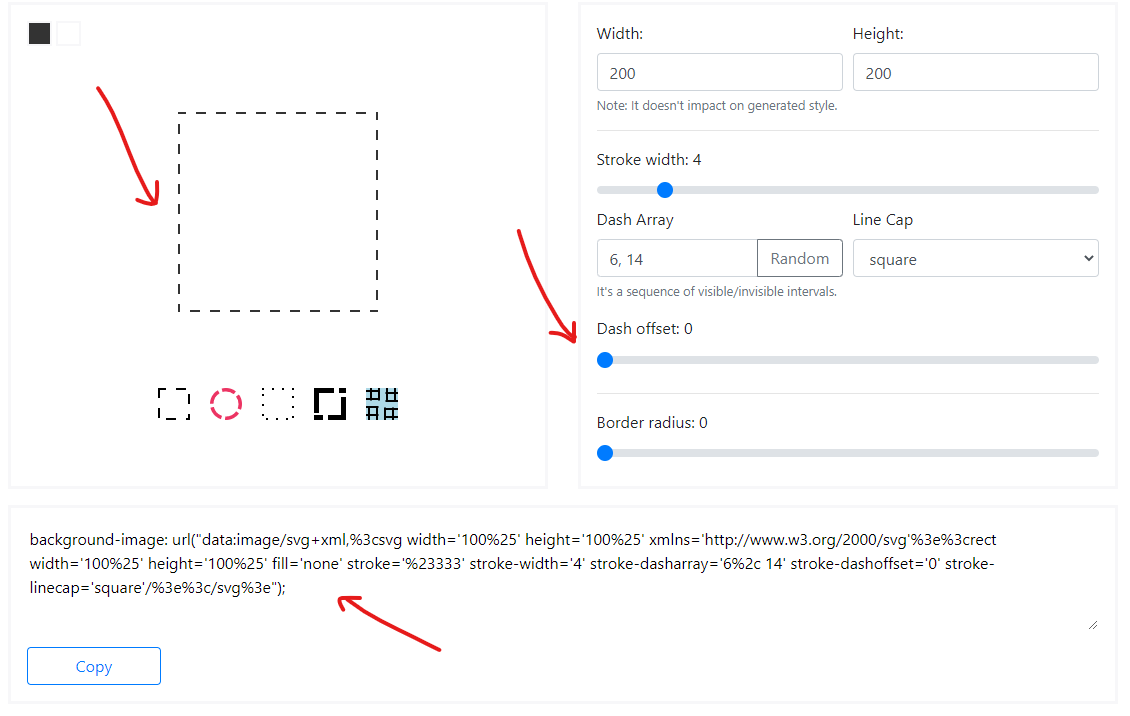
@kovart制造了一个很酷的工具,称为dashed border generator。
它使用svg作为背景图像,可以设置所需的笔划破折号数组,非常方便。
然后,您只需将其用作元素的背景属性即可代替边框:
div {
  background-image: url("data:image/svg+xml,%3csvg width='100%25' height='100%25' xmlns='http://www.w3.org/2000/svg'%3e%3crect width='100%25' height='100%25' fill='none' stroke='black' stroke-width='4' stroke-dasharray='6%2c 14' stroke-dashoffset='0' stroke-linecap='square'/%3e%3c/svg%3e");
  padding: 20px;
  display: inline-block;
}
答案 5 :(得分:3)
更新 感谢 kovart 为这个伟大的工具尝试它 https://kovart.github.io/dashed-border-generator/
我的回答是:
我最近遇到了同样的问题。 我已经解决了这个问题,希望对某人有所帮助。
HTML + 顺风
<div class="dashed-border h-14 w-full relative rounded-lg">
    <div class="w-full h-full rounded-lg bg-page z-10 relative">
        Content goes here...
    <div>
</div>
CSS
.dashed-border::before {
  content: '';
  position: absolute;
  top: 50%;
  left: 0;
  width: 100%;
  height: calc(100% + 4px);
  transform: translateY(-50%);
  background-image: linear-gradient(to right, #333 50%, transparent 50%);
  background-size: 16px;
  z-index: 0;
  border-radius: 0.5rem;
}
.dashed-border::after {
  content: '';
  position: absolute;
  left: 50%;
  top: 0;
  height: 100%;
  width: calc(100% + 4px);
  transform: translateX(-50%);
  background-image: linear-gradient(to bottom, #333 50%, transparent 50%);
  background-size: 4px 16px;
  z-index: 1;
  border-radius: 0.5rem;
}
答案 6 :(得分:0)
这将使用div上的class =“ myclass”形成橙色和灰色边框。
def change_plan(subscription:, to_plan:, coupon: nil)
  require_args(subscription: subscription, to_plan: to_plan)
  events = []
  begin
    from_plan = subscription.plan
    api_sub = update_subscription_plan(subscription: subscription, to_plan: to_plan,
                                           coupon: coupon, proration_date: get_proration_date, prorate: true)
    events<<'api_updated'
    subscription.update!(plan:           to_plan,
                         coupon:         coupon,
                         item_api_id: api_sub.items.data[0].id)
    events<<'db_updated'
    invoice = create_invoice(subscription)
    events<<'created_invoice'

    invoice = invoice.pay
    events<<'invoice_paid'

  rescue Stripe::StripeError => e
    subscription.errors[:base] << e.message
    if events.include?('api_updated')
      stripe_sub = update_subscription_plan(subscription: subscription, to_plan: from_plan,
                                             coupon: coupon, proration_date: get_proration_date, prorate: false)
    end
    if events.include?('db_updated')
    subscription.update!(plan:           from_plan,
                         coupon:         coupon,
                         item_api_id: api_sub.items.data[0].id)
    end

    if events.include?('created_invoice')
      void_invoice(invoice.id)
    end
    subscription.errors[:base] << "Upgrade failed, please contact us."
  end
  subscription
end
答案 7 :(得分:0)
行程长度取决于行程宽度。您可以通过增加宽度来增加长度,并通过内部元素隐藏边框的一部分。
.thin {
    background: #F4FFF3;
    border: 2px dashed #3FA535;
    position: relative;
}

.thin:after {
    content: '';
    position: absolute;
    left: -1px;
    top: -1px;
    right: -1px;
    bottom: -1px;
    border: 1px solid #F4FFF3;
}
答案 8 :(得分:0)
我最近有同样的问题。
我设法用两个绝对定位的div来解决这个问题,这些div带有边框(一个用于水平,一个用于垂直),然后对其进行转换。 外盒只需要相对放置即可。
<div class="relative">
    <div class="absolute absolute--fill overflow-hidden">
        <div class="absolute absolute--fill b--dashed b--red"
            style="
                border-width: 4px 0px 4px 0px;
                transform: scaleX(2);
        "></div>
        <div class="absolute absolute--fill b--dashed b--red"
            style="
                border-width: 0px 4px 0px 4px;
                transform: scaleY(2);
        "></div>
    </div>

    <div> {{Box content goes here}} </div>
</div>
注意:在本示例中,我使用了tachyons,但是我想这些类是不言自明的。
- 我写了这段代码,但我无法理解我的错误
- 我无法从一个代码实例的列表中删除 None 值,但我可以在另一个实例中。为什么它适用于一个细分市场而不适用于另一个细分市场?
- 是否有可能使 loadstring 不可能等于打印?卢阿
- java中的random.expovariate()
- Appscript 通过会议在 Google 日历中发送电子邮件和创建活动
- 为什么我的 Onclick 箭头功能在 React 中不起作用?
- 在此代码中是否有使用“this”的替代方法?
- 在 SQL Server 和 PostgreSQL 上查询,我如何从第一个表获得第二个表的可视化
- 每千个数字得到
- 更新了城市边界 KML 文件的来源?