两个元素的CSS背景混合模式
让我们假设我有一个 div ,并将渐变应用为背景 -property。 我现在想要覆盖黑色PNG(较小尺寸)并将PNG设置为具有叠加的背景混合模式。不幸的是我不知道如何实现这个目标。
当我使用PNG图像将渐变渲染到Div的CSS中时,我知道我可以使用 background-blend-mode :
background: url(../img/plus.png), linear-gradient(to bottom, #24cae4 0%, #1f81e3 100%);
background-blend-mode: overlay;
然而,这会导致渐变与实际的PNG一样小,这不是一个理想的效果,如下所示:

我想要实现的是纯CSS(如果可能):
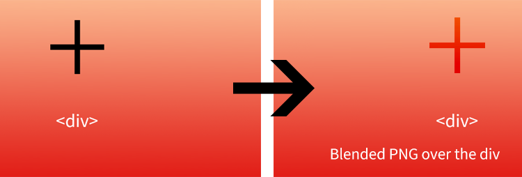
这里有一个Codepen来说明我要做的事情:http://codepen.io/anon/pen/zxOXGP 注意黑色图标。我想叠加这个。
2 个答案:
答案 0 :(得分:4)
尝试使用mix-blend-mode代替background-blend-mode并切换到加号的简单文字或更多自定义数字的网页。
Example Codepen以下内容:
.placeholder {
  position: relative;
  width: 400px;
  height: 300px;
  background-image: -moz-linear-gradient(#ff0000, #0000ff);
  background-image: -webkit-linear-gradient(#ff0000, #0000ff);
  background-image: linear-gradient(#ff0000, #0000ff);
}
.center {
  position: absolute;
  top: 25%;
  width: 100%;
  font-size: 120px;
}
.center span {
  display: block;
  text-align: center;
  color: red;
  mix-blend-mode: screen;
}
<div class="placeholder">
<div class="center"><span>+</span>
</div>
</div>
答案 1 :(得分:1)
渐变三明治
成分
-
:before与z-index: 1形成底层z层,完全不透明 -
.contentdiv与z-index: 2形成填充的中心z层。它需要position: relative来获取其z-index。 -
:after与z-index: 3形成顶层z层并完成我们的午餐项目。这是一半不透明。
这是美味的结果:

完整示例
为了简单起见,我删除了除标准CSS3渐变以外的所有内容。在支持的浏览器中查看。
&#13;
&#13;
&#13;
&#13;
.gradient {
  position: relative;
  height: 200px;
  padding: 20px;
}
.gradient:before,
.gradient:after {
  position: absolute;
  top: 0;
  left: 0;
  width: 100%;
  height: 100%;
  content: '';
  display: block;
  background-size: 100%;
  background-image: linear-gradient(to bottom, #24cae4 0%, #1f81e3 100%);
  opacity: 0.5;
}
.gradient:before {
  opacity: 1;
  z-index: 1;
}
.gradient:after {
  z-index: 3;
}
.overlayed_image {
  position: relative;
  width: 64px;
  height: 64px;
  display: block;
  margin: auto;
  background-size: contain;
  background-repeat: no-repeat;
  background-position: 50% 50%;
  background-image: url(http://cdn.flaticon.com/png/256/9029.png);
}

.content {
  position: relative;
  z-index: 2;
}
<div class="gradient">
<div class="content">
You can see me!
<div class="overlayed_image"></div>
</div>
</div>
相关问题
最新问题
- 我写了这段代码,但我无法理解我的错误
- 我无法从一个代码实例的列表中删除 None 值,但我可以在另一个实例中。为什么它适用于一个细分市场而不适用于另一个细分市场?
- 是否有可能使 loadstring 不可能等于打印?卢阿
- java中的random.expovariate()
- Appscript 通过会议在 Google 日历中发送电子邮件和创建活动
- 为什么我的 Onclick 箭头功能在 React 中不起作用?
- 在此代码中是否有使用“this”的替代方法?
- 在 SQL Server 和 PostgreSQL 上查询,我如何从第一个表获得第二个表的可视化
- 每千个数字得到
- 更新了城市边界 KML 文件的来源?