CSS / CSS3切换元素的位置
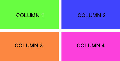
我在桌面视图中有4列用于HTML。 当我们切换到移动视图时,我们显示2列和2行(请参阅附图以供参考)。
代码是:
<div class="sections">
    <div class="one-fourth-col">Column 1</div>
    <div class="one-fourth-col">Column 2</div>
    <div class="one-fourth-col">Column 3</div>
    <div class="one-fourth-col">Column 4</div>
</div>
我在移动版中获得的视图是:
我想要以下观点:
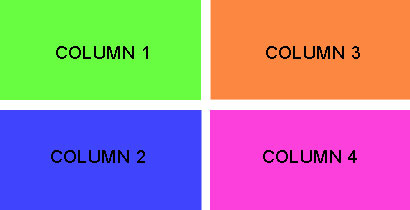
基本上,我想在左侧的第一列中显示#1和#2。 右侧第二列是#3和#4。
我在css中使用float:right属性。 我想通过不移动HTML中的元素来处理这个问题。
感谢您的帮助。
2 个答案:
答案 0 :(得分:5)
如果使用CSS Flexible Box Layout是一个选项,您可以通过order移动屏幕上的弹性项目(通过@media查询)来实现这一目标:
<强> Example Here
.sections { display: flex; flex-wrap: wrap; }

.one-fourth-col {
  flex: 1;
  margin: 0 1%;
}

@media (max-width: 767px) {
  .one-fourth-col {
    flex: 1 48%; /* Actually it should be 50%
                    but there's a margin of 1%
                    around the columns, hence 50%-2(1%) = 48% */
  }

  .sections > :nth-child(1) { order: 1; }
  .sections > :nth-child(2) { order: 3; }
  .sections > :nth-child(3) { order: 2; }
  .sections > :nth-child(4) { order: 4; }
}
(由于简洁而省略了供应商前缀)
对于供应商前缀,请单击演示中的“Toggle Compiled View”(感谢Autoprefixer)。
最后但并非最不重要的是,如果您不熟悉CSS Flexible Box Layout,可以参考以下资源:
答案 1 :(得分:3)
你可以通过css transform和@media查询来做到这一点: - 不是很优雅,但效果很好。
JSFiddle - DEMO或Full Screen
<强> HTML:
<div class="sections">
    <div style="background-color: #ADFF2F;" class="one-fourth-col div-1">Column 1</div>
    <div style="background-color: #0066FF;" class="one-fourth-col div-2">Column 2</div>
    <div style="background-color: #FFA500;" class="one-fourth-col transform div-3">Column 3</div>
    <div style="background-color: #FF00FF;" class="one-fourth-col transform div-4">Column 4</div>
</div>
<强> CSS:
body {
    margin: 0px;
}
.sections {
    margin-top: 50px;
}
.one-fourth-col {
    width: 20%;
    margin: 2.5%;
    padding: 25px 0px;
    text-align: center;
    float: left;
}
@media (max-width: 767px) {
    .one-fourth-col {
        float: none;
        width: 40%;
        margin-right: 0px;
        margin-bottom: 0px;
    }
    .transform {
        -webkit-transform: translate(100%, -200%);
        -moz-transform: translate(100%, -200%);
        -ms-transform: translate(100%, -200%);
        -o-transform: translate(100%, -200%);
        transform: translate(100%, -200%);

        margin-left: 15%; /* 3 X Value of div-1 and div-2 margin-left */
    }
    .div-1 {
        margin-left: 5%;
    }
    .div-2 {
        margin-left: 5%;
        margin-top: 50px; /* margin between rows */
    }
    .div-3 {
        margin-top: -50px; /* negative value of .div-2 margin-top */
    }
    .div-4 {
        margin-top: 50px; /* same value of .div-2 margin-top */
    }
}
更多信息 - CSS转换:
相关问题
最新问题
- 我写了这段代码,但我无法理解我的错误
- 我无法从一个代码实例的列表中删除 None 值,但我可以在另一个实例中。为什么它适用于一个细分市场而不适用于另一个细分市场?
- 是否有可能使 loadstring 不可能等于打印?卢阿
- java中的random.expovariate()
- Appscript 通过会议在 Google 日历中发送电子邮件和创建活动
- 为什么我的 Onclick 箭头功能在 React 中不起作用?
- 在此代码中是否有使用“this”的替代方法?
- 在 SQL Server 和 PostgreSQL 上查询,我如何从第一个表获得第二个表的可视化
- 每千个数字得到
- 更新了城市边界 KML 文件的来源?