嵌套表宽度问题
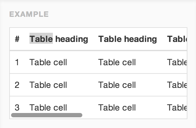
我遇到嵌套表宽度问题。我需要将表作为响应。喜欢以下图片。这是我的代码 DEMO
HTML
<div class="layout">
  <div class="left">Left</div>
  <div class="right">
    <div class="table-responsive">
      <table>
        <tr>
          <th>Sample Headding</th>
          ...
        </tr>
        <tr>
          <td>Sample Headding</td>
          ...
        </tr>
        </table>
    </div>
  </div>
</div>
CSS
.layout {
  width: 800px;
  display: table;
}
.layout .left, .layout .right {
  display: table-cell;
}
.layout .left {
  width: 25%;
  background: #eee;
}

.table-responsive {
  width: 100%;
  margin-bottom: 15;
  overflow-y: hidden;
  overflow-x: scroll;
  -ms-overflow-style: -ms-autohiding-scrollbar;
  border: 1px solid #CCC;
  -webkit-overflow-scrolling: touch;
}

.table-responsive > .table > thead > tr > th,
.table-responsive > .table > thead > tr > td,
.table-responsive > .table > tbody > tr > th,
.table-responsive > .table > tbody > tr > td,
.table-responsive > .table > tfoot > tr > th,
.table-responsive > .table > tfoot > tr > td {
  white-space: nowrap;
}
2 个答案:
答案 0 :(得分:1)
您是否尝试过“table-layout:fixed;”属性?
JSFIDDLE:http://jsfiddle.net/manublueheart/c6CdL/3/
.layout {
 width: 800px;
 display: table;
 table-layout:fixed;
}
答案 1 :(得分:0)
尽管我知道桌子无法做出响应。而不是表使用div并给它们以%为单位的响应宽度。
相关问题
最新问题
- 我写了这段代码,但我无法理解我的错误
- 我无法从一个代码实例的列表中删除 None 值,但我可以在另一个实例中。为什么它适用于一个细分市场而不适用于另一个细分市场?
- 是否有可能使 loadstring 不可能等于打印?卢阿
- java中的random.expovariate()
- Appscript 通过会议在 Google 日历中发送电子邮件和创建活动
- 为什么我的 Onclick 箭头功能在 React 中不起作用?
- 在此代码中是否有使用“this”的替代方法?
- 在 SQL Server 和 PostgreSQL 上查询,我如何从第一个表获得第二个表的可视化
- 每千个数字得到
- 更新了城市边界 KML 文件的来源?