Bootstrap 3模态在打开时创建滚动条
我第一次尝试使用Bootstrap,并且遇到了模态对话框的问题。使用this page上的示例代码,当打开模态时,会出现一个滚动条,它也会将页面上的内容移到左侧。
代码:
<!-- Button trigger modal -->
<button class="btn btn-primary btn-lg" data-toggle="modal" data-target="#myModal">
Launch demo modal
</button>
<!-- Modal -->
<div class="modal fade" id="myModal" tabindex="-1" role="dialog" aria-labelledby="myModalLabel" aria-hidden="true">
<div class="modal-dialog">
<div class="modal-content">
<div class="modal-header">
<button type="button" class="close" data-dismiss="modal" aria-hidden="true">×</button>
<h4 class="modal-title" id="myModalLabel">Modal title</h4>
</div>
<div class="modal-body">
...
</div>
<div class="modal-footer">
<button type="button" class="btn btn-default" data-dismiss="modal">Close</button>
<button type="button" class="btn btn-primary">Save changes</button>
</div>
</div><!-- /.modal-content -->
</div><!-- /.modal-dialog -->
</div><!-- /.modal -->
JSFIDDLE:http://jsfiddle.net/WqRBP/
我正在寻找的很多网站都使用Bootstrap而且他们没有这个问题,所以有什么问题可以解决这个问题吗?
编辑:滚动条出现在Chrome和IE中,我还没有在其他浏览器中测试过。
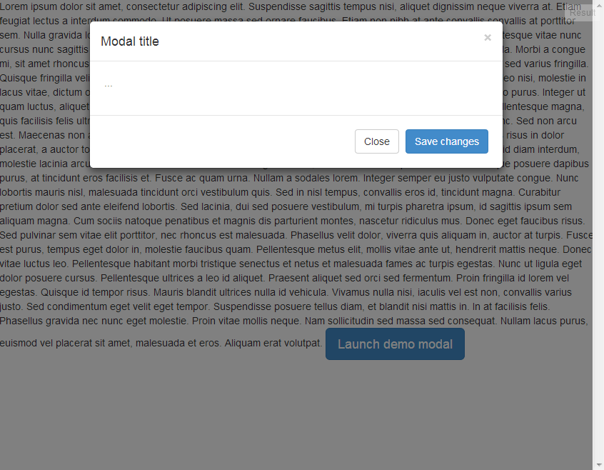
以下是我在JSFIDDLE中看到的内容:

13 个答案:
答案 0 :(得分:34)
LVarayut的回答让我朝着正确的方向前进,我最终使用的是:
body.modal-open, .modal-open .navbar-fixed-top, .modal-open .navbar-fixed-bottom {
    margin-right: 0;
}

.modal {
    overflow-y: auto;
}
答案 1 :(得分:16)
出现问题是因为Twitter Bootstrap总是在打开模态时将页面向左移15px。您可以通过将页面向右移动来解决此问题 - margin-right: -15px。这可以通过使用show.bs.modal提供的事件hidden.bs.modal和Bootstrap's modal来完成。
$('#myModal').bind('hidden.bs.modal', function () {
  $("html").css("margin-right", "0px");
});
$('#myModal').bind('show.bs.modal', function () {
  $("html").css("margin-right", "-15px");
});
<强>供参考:
show.bs.modal:调用show实例方法时会立即触发此事件。如果由单击引起,则单击的元素可用作事件的relatedTarget属性。
hidden.bs.modal:当模态完成对用户隐藏时将触发此事件(将等待CSS转换完成)。
答案 2 :(得分:4)
这是我的解决方案:
.modal {
 margin-right: -15px;
}`
并添加此内容
body.modal-open {
    margin-right: 0 !important;
}
希望这对你有所帮助。
答案 3 :(得分:4)
这很简单,只需添加到你的css:
body.modal-open{overflow:hidden!important;}

/*Optional:*/
.modal-open, .modal{padding-right:0!important}
答案 4 :(得分:2)
这是我的解决方案
#myModal{
    overflow:hidden;
}
body {
    overflow-y: scroll !important;
}
这样,您将强制您的页面有一个滚动条。
答案 5 :(得分:2)
此issue已于2014年6月23日发布的Bootstrap 3.2.0版中解决。
感谢@roadsunknown提供链接(在问题评论中)。
答案 6 :(得分:1)
这项工作对我而言。它应该工作正常
body.modal-open {
  padding-right: 0 !important;
  overflow-y: scroll;
}
答案 7 :(得分:0)
尝试使用以下css:
.modal{
    overflow:auto;
}
我已经通过这种方式解决了我的问题。
答案 8 :(得分:0)
这对我来说很有把戏
$('html').bind('hidden.bs.modal', function () {
   console.log('hidden');
   $("html").css("margin-right", "0px");
});

$('html').bind('hide.bs.modal', function () {
   console.log('hiding');
   $("html").css("margin-right", "-15px");
});

$('html').bind('show.bs.modal', function () {
   console.log('shown');
   $("html").css("margin-right", "-15px");
});
答案 9 :(得分:0)
在这种情况下,您可以使用自己的css覆盖bootstrap main css,因为某些时候可能会影响其他css。所以这是简单的代码工作
body.modal-open .modal {
    margin-right: -15px !important;
}

body.modal-open {
    margin-right: 0 !important;
}
如果您想更改主引导程序css,请更新此
body.modal-open, .modal-open .navbar-fixed-top, .modal-open .navbar-fixed-bottom {
    margin-right: 0 !important;
}
答案 10 :(得分:0)
试一下
  .modal-open {
         overflow-y: auto
     }
答案 11 :(得分:0)
就我而言,是由我自己的样式引起的:
html {
    overflow-y: scroll;
}
您可以将html更改为body,因此只有一个滚动条:
body {
    overflow-y: scroll;
}
答案 12 :(得分:-2)
主要是由于使用了CDN ...从您的页面中删除了CDN https://maxcdn.bootstrapcdn.com/bootstrap/3.3.5/js/bootstrap.min.js“,问题解决了。我已经完成了。
- 我写了这段代码,但我无法理解我的错误
- 我无法从一个代码实例的列表中删除 None 值,但我可以在另一个实例中。为什么它适用于一个细分市场而不适用于另一个细分市场?
- 是否有可能使 loadstring 不可能等于打印?卢阿
- java中的random.expovariate()
- Appscript 通过会议在 Google 日历中发送电子邮件和创建活动
- 为什么我的 Onclick 箭头功能在 React 中不起作用?
- 在此代码中是否有使用“this”的替代方法?
- 在 SQL Server 和 PostgreSQL 上查询,我如何从第一个表获得第二个表的可视化
- 每千个数字得到
- 更新了城市边界 KML 文件的来源?