左侧内侧透明箭头
4 个答案:
答案 0 :(得分:4)
使用单个元素你可以做到这一点我必须去上班希望这个帮助
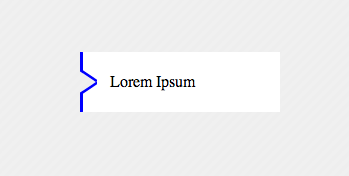
<div>Lorem Ipsum</div>
风格:
   div{
        width:200px;
        height:60px;
        margin:100px;
        background-color:transparent;
        color:black;
        position:relative;
        text-indent:30px;
        line-height:60px;
        box-shadow:inset 20px 0 0 200px white;
        overflow:hidden;
        -webkit-box-shadow: inset -164px 0 0 20px white;
        -moz-box-shadow: inset -164px 0 0 20px white;
        box-shadow: inset -164px 0 0 20px white;
    }
    div:before{
        content: '';
    position: absolute;
    left: 0px;
    top: 4px;
    width: 14px;
    border-bottom: 3px solid blue;
    border-left: 3px solid blue;
    height: 18px;
        background-color:white;
    -webkit-transform: skew(0deg,34deg);
        -moz-transform: skew(0deg,34deg);
    transform: skew(0deg,34deg);
    }
    div:after{
    content: '';
    position: absolute;
        background-color:white;
    left: 0px;
    bottom: 4px;
    width: 14px;
    border-top: 3px solid blue;
    border-left: 3px solid blue;
    height: 18px;
    -webkit-transform: skew(0deg,-34deg);
        -moz-transform: skew(0deg,-34deg);
    transform: skew(0deg,-34deg);
    }
    body{
        background-color: #EEEEEE;
        khtml-background-size: 10px 10px;
    -webkit-background-size: 10px 10px;
    -moz-background-size: 10px 10px;
    -ms-background-size: 10px 10px;
    -o-background-size: 10px 10px;
    background-size: 10px 10px;
    background-image: -khtml-linear-gradient(135deg, rgba(255, 255, 255, .15) 25%, transparent 25%, transparent 50%, rgba(255, 255, 255, .15) 50%, rgba(255, 255, 255, .15) 75%, transparent 75%, transparent);
    background-image: -webkit-gradient(linear, left top, right bottom, color-stop(.25, rgba(255, 255, 255, .15)), color-stop(.25, transparent), color-stop(.5, transparent), color-stop(.5, rgba(255, 255, 255, .15)), color-stop(.75, rgba(255, 255, 255, .15)), color-stop(.75, transparent), to(transparent));
    background-image: -webkit-linear-gradient(135deg, rgba(255, 255, 255, .15) 25%, transparent 25%, transparent 50%, rgba(255, 255, 255, .15) 50%, rgba(255, 255, 255, .15) 75%, transparent 75%, transparent);
    background-image: -moz-linear-gradient(135deg, rgba(255, 255, 255, .15) 25%, transparent 25%, transparent 50%, rgba(255, 255, 255, .15) 50%, rgba(255, 255, 255, .15) 75%, transparent 75%, transparent);
    background-image: -ms-linear-gradient(135deg, rgba(255, 255, 255, .15) 25%, transparent 25%, transparent 50%, rgba(255, 255, 255, .15) 50%, rgba(255, 255, 255, .15) 75%, transparent 75%, transparent);
    background-image: -o-linear-gradient(135deg, rgba(255, 255, 255, .15) 25%, transparent 25%, transparent 50%, rgba(255, 255, 255, .15) 50%, rgba(255, 255, 255, .15) 75%, transparent 75%, transparent);
    background-image: linear-gradient(135deg, rgba(255, 255, 255, .15) 25%, transparent 25%, transparent 50%, rgba(255, 255, 255, .15) 50%, rgba(255, 255, 255, .15) 75%, transparent 75%, transparent);
        width:100%;
        height:100%;

    }
答案 1 :(得分:0)
背景不牢固,这使得它很难。 特别是因为你的箭头不是90度,我想这不会那么顺利。 但看看这个问题:
答案 2 :(得分:0)
使用创建具有div透明边框的三角形的技术。 两次尝试可能对你有所帮助,
HTML
<div class="button">
    <div class="wrapper">
        <div class=" top-side "></div>
        <div class="arrow-right "></div>
        <div class="arrow-right2 "></div>
        <div class="bottom-side "></div>
    </div>
</div>
CSS
.button {
    width: 400px;
    background-color:orange;
}
.wrapper{
    background-color:blue;
    width:2px;
}
.arrow-right {
    width: 0;
    height: 0;
    border-top: 5px solid transparent;
    border-bottom: 5px solid transparent;
    border-left: 15px solid white;
    position:absolute;
    z-index:2;
}
.arrow-right2 {
    position:relative;
    top:-1px;
    z-index:1;
    width: 0;
    height: 0;
    border-top: 6px solid transparent;
    border-bottom: 6px solid transparent;
    border-left: 18px solid blue;
}
.top-side {
    height:7px;
    width:2px;
    background-color:blue;
}
.bottom-side {
    height:7px;
    width:2px;
    background-color:blue;
}
还检查 http://jsfiddle.net/FkPYb/1/
通过调整它们可能会得到更好的结果。
答案 3 :(得分:0)
以下是@ kougiland's的简化版本。
div {
    width:200px;
    height:60px;
    position:relative;
    text-indent:30px;
    line-height:60px;
}
div:before{
    content: '';
    position: absolute;
    top: 14px;
    left: 0px;
    width: 17px;
    border-bottom: 1px solid blue;
    border-left: 1px solid blue;
    -webkit-transform: skew(0deg,60deg);
    -moz-transform: skew(0deg,60deg);
    transform: skew(0deg,60deg);
}
div:after{
    content: '';
    position: absolute;
    left: 0px;
    bottom: 14px;
    width: 17px;
    border-top: 1px solid blue;
    border-left: 1px solid blue;
    -webkit-transform: skew(0deg,-60deg);
    -moz-transform: skew(0deg,-60deg);
    transform: skew(0deg,-60deg);
}
相关问题
最新问题
- 我写了这段代码,但我无法理解我的错误
- 我无法从一个代码实例的列表中删除 None 值,但我可以在另一个实例中。为什么它适用于一个细分市场而不适用于另一个细分市场?
- 是否有可能使 loadstring 不可能等于打印?卢阿
- java中的random.expovariate()
- Appscript 通过会议在 Google 日历中发送电子邮件和创建活动
- 为什么我的 Onclick 箭头功能在 React 中不起作用?
- 在此代码中是否有使用“this”的替代方法?
- 在 SQL Server 和 PostgreSQL 上查询,我如何从第一个表获得第二个表的可视化
- 每千个数字得到
- 更新了城市边界 KML 文件的来源?