iPad上的CSS灵活盒子布局
我正在尝试使用在iPad上运行的flex模型进行非常简单的布局。
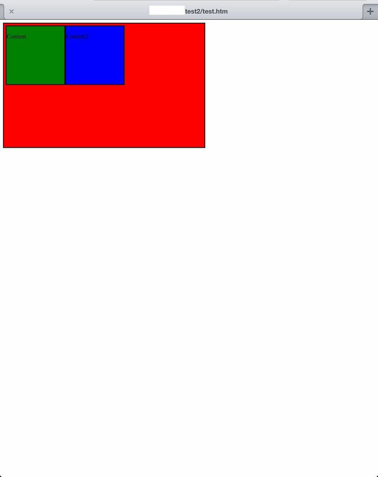
我有一个包含div,它应该以内容div为中心。
示例代码按照预期在iPad(视网膜)上的所有浏览器和平台上执行。
在线使用各种iPad模拟器不会复制问题。我只能在实际的iPad上复制它。这是一个截图:
非常感谢任何和所有建议。
CSS:
.container {
width: 510px;
height: 310px;
background: red;
display: flex;
display: -webkit-flexbox;
display: -ms-flexbox;
display: -webkit-flex;
flex-direction: row;
flex-wrap: wrap;
-webkit-box-pack: center;
-moz-box-pack: center;
-ms-flex-pack: center;
-webkit-justify-content: center;
justify-content: center;
-webkit-flex-align: center;
-ms-flex-align: center;
-webkit-align-items: center;
align-items:center;
border: 2px solid;
padding: 5px;
margin: 0;
}

.content {
float: left;
width: 150px;
height: 150px;
background: green;
border: 2px solid;
padding: 0;
margin: 0;
}

.content2 {
float: left;
width: 150px;
height: 150px;
background: blue;
border: 2px solid;
padding: 0;
margin: 0;
}
HTML:
<div class="container">
<div class="content">
<p>Content</p>
</div>
<div class="content2">
<p>Content2</p>
</div>
</div>
1 个答案:
答案 0 :(得分:18)
你遗漏了旧的2009年草案中的一些属性(或者将它们命名为错误)。您的容器CSS应如下所示:
http://cssdeck.com/labs/ci9imeed
.container {
  width: 510px;
  height: 310px;
  background: red;
  display: -webkit-box;
  display: -moz-box;
  display: -ms-flexbox;
  display: -webkit-flex;
  display: flex;
  -webkit-box-pack: center;
  -moz-box-pack: center;
  -ms-flex-pack: center;
  -webkit-justify-content: center;
  justify-content: center;
  -webkit-box-align: center;
  -moz-box-align: center;
  -ms-flex-align: center;
  -webkit-align-items: center;
  align-items: center;
  border: 2px solid;
  padding: 5px;
  margin: 0;
}
但请注意,没有一个采用2009 Flexbox实现的浏览器(Android,旧版Safari,旧版Firefox)都不支持包装。
相关问题
最新问题
- 我写了这段代码,但我无法理解我的错误
- 我无法从一个代码实例的列表中删除 None 值,但我可以在另一个实例中。为什么它适用于一个细分市场而不适用于另一个细分市场?
- 是否有可能使 loadstring 不可能等于打印?卢阿
- java中的random.expovariate()
- Appscript 通过会议在 Google 日历中发送电子邮件和创建活动
- 为什么我的 Onclick 箭头功能在 React 中不起作用?
- 在此代码中是否有使用“this”的替代方法?
- 在 SQL Server 和 PostgreSQL 上查询,我如何从第一个表获得第二个表的可视化
- 每千个数字得到
- 更新了城市边界 KML 文件的来源?