使用响应式文本自动换行保持响应式内联块
我有两个内联块(图像然后是内容),我想像这样水平放置:
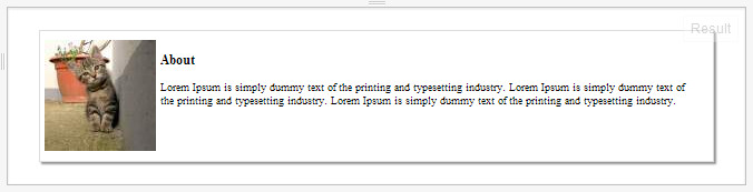
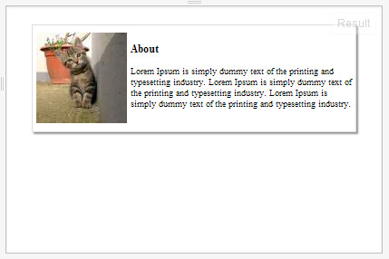
虽然当容器变小时,图像和内容块不再保持内联。我希望容器不断增加高度以处理内容文本的包装,如下所示:
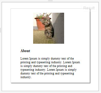
如果容器达到极限,元素将移动并居中,但始终尽量不要在侧面创建尽可能少的空白,如下所示:
我有一些几乎可行的HTML:Example
<div style="margin:20px; height:auto; box-shadow: 2px 2px 1px #999999;   border-style:solid; border-width:1px; border-color:#dddddd; padding:4px; background-color:white; " >
        <div style="width:100%;" >
            <div style="display:inline-block; padding-top:4px; height:100px; width:100px;">
                <img src='http://placekitten.com/100/100'>
            </div>
            <div style="display:inline-block;  vertical-align:top; padding-top:4px; min-width:70%; max-width:70%;">
                <h2 style=" font-size:12px;">About</h2>
                <p style="font-size:10px;">Lorem Ipsum is simply dummy text of the printing and typesetting industry. Lorem Ipsum is simply dummy text of the printing and typesetting industry. Lorem Ipsum is simply dummy text of the printing and typesetting industry. </p>
            </div>
        </div>
</div>
2 个答案:
答案 0 :(得分:2)
只需将text-align: center添加到外部区块即可。内部div将继承这一点,因此您还应该将text-align: left添加到文本块中。
答案 1 :(得分:1)
看看我的小提琴。我想这就是你所追求的:
.wrap {
    border: 1px solid #ddd;
    margin: 20px;
    padding: 15px;
}

.wrap img {
    float: left;
    margin-right: 10px;
}

.wrap p {
    margin: 0;
    overflow: hidden;
}

@media(max-width: 500px) {
    .wrap img {
        float: none;
        display: block;
        margin-left: auto;
        margin-right: auto;
        margin-bottom: 10px;
    }
    .wrap p {
        text-align: center;
    }
}
相关问题
最新问题
- 我写了这段代码,但我无法理解我的错误
- 我无法从一个代码实例的列表中删除 None 值,但我可以在另一个实例中。为什么它适用于一个细分市场而不适用于另一个细分市场?
- 是否有可能使 loadstring 不可能等于打印?卢阿
- java中的random.expovariate()
- Appscript 通过会议在 Google 日历中发送电子邮件和创建活动
- 为什么我的 Onclick 箭头功能在 React 中不起作用?
- 在此代码中是否有使用“this”的替代方法?
- 在 SQL Server 和 PostgreSQL 上查询,我如何从第一个表获得第二个表的可视化
- 每千个数字得到
- 更新了城市边界 KML 文件的来源?