使用Bootstrap 3.0的多个堆叠全宽背景图像
我正在尝试使用Bootstrap 3.0组建一个静态网页。
该页面基本上是叙述性的,由一系列带有背景图像的堆叠部分组成,文本和其他图像/元素叠加在顶部。
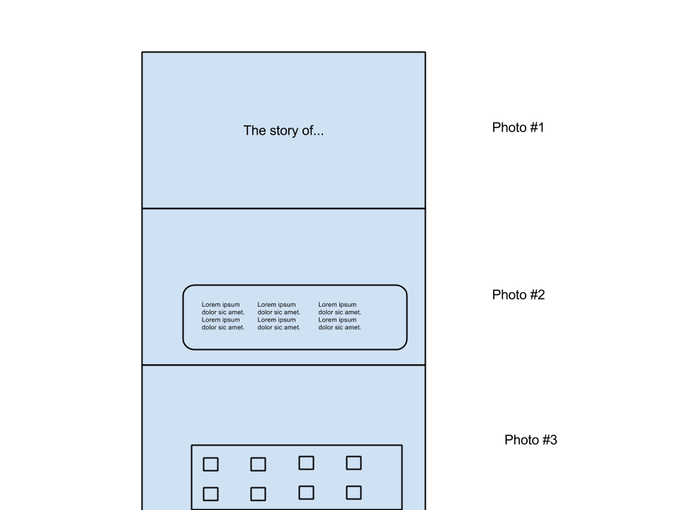
页面设计为从上到下滚动,每个部分的背景图像应填充水平宽度。
稍后,我还将使用Skrollr(https://github.com/Prinzhorn/skrollr)为图像添加视差。
但是,现在,我正在努力使用Bootstrap来开发HTML / CSS。
最初,我以为我可以这样做:
<body>
<div class="container">
    <section id="first">
        <div class="row annoucement col-md-4 col-md-offset-4">
            <h1>The story of...</h1>
        </div>
    </section
    <section id="second">
        <div class="row gallery col-md-4 col-md-offset-4">
            <!-- Image gallery boxes -->
        </div>
    </section
</div>
然后在CSS中:
    #first {
        background: url(img/1.jpg) no-repeat center center fixed;
        -webkit-background-size: cover;
        -moz-background-size: cover;
        -o-background-size: cover;
        background-size: cover;
    }
然而,背景图像不可见 - #first元素是1140px x 0px,因此图像没有显示。
我怀疑我没有正确使用标签类型 - 有关如何使用Bootstrap进行上述布局的任何建议吗?
1 个答案:
答案 0 :(得分:5)
您对网格系统的标记不正确,您应该从文档中查看the examples,基本上.row应该是一个容器元素,如果您希望背景覆盖整个页面,那么你不能在容器内有这些部分,这就是我的建议:
<body>
    <section id="first">
        <div class="container">
            <div class="row announcement">
                <div class="col-md-4 col-md-offset-4">
                     <h1>The story of...</h1>
                </div>
            </div>
        </div>
    </section>
    <section id="second">
        <div class="container">
            <div class="row gallery">
                <div class="col-md-4 col-md-offset-4">
                    <!-- Image gallery boxes -->
                </div>
            </div>
        </div>
    </section>
</body>
虽然你可能想要为你的内容使用更大的跨度大小,因为我相信col-md-4会太小,但是你可以决定:)
相关问题
最新问题
- 我写了这段代码,但我无法理解我的错误
- 我无法从一个代码实例的列表中删除 None 值,但我可以在另一个实例中。为什么它适用于一个细分市场而不适用于另一个细分市场?
- 是否有可能使 loadstring 不可能等于打印?卢阿
- java中的random.expovariate()
- Appscript 通过会议在 Google 日历中发送电子邮件和创建活动
- 为什么我的 Onclick 箭头功能在 React 中不起作用?
- 在此代码中是否有使用“this”的替代方法?
- 在 SQL Server 和 PostgreSQL 上查询,我如何从第一个表获得第二个表的可视化
- 每千个数字得到
- 更新了城市边界 KML 文件的来源?