与背景图象的CSS三角
尊重stackoverflowers,
如何使用背景图案创建三角形元素?
例如,我需要这样的div:
但我的状态是这样的:
所有带有三角形元素的示例都使用了无法使用img的边框....
这是我的小节课,需要合作:
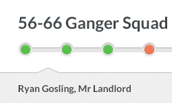
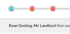
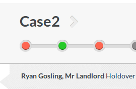
<div class="subsection"><span>Ryan Gosling, Mr Landlord</span></div>

.subsection {
  .box-shadow (0, -1px, 1px, 0, rgba(0, 0, 0, 0.3));
  background: url('/assets/pattern-lorem.png'); // The inner part of the slider have the pattern
  display: block;
  clear: both;
  float: left;
  width: 100%;
  padding-top: 15px;
  padding-bottom: 15px;
  display: none;
}
.subsection {
    position:relative;
}
.subsection:before {
    content:'';
    position:absolute;
    top:0;
    left:0;
    height:20px;
    width:0;
    border-left:20px solid white;
    border-bottom:16px solid transparent;
}
.subsection:after {
    content:'';
    position:absolute;
    top:36px;
    left:0;
    bottom:0;
    width:0;
    border-left:20px solid white;
    border-top:16px solid transparent;
}
我得到了:
哪个好......我怎样才能以所需的形式将箭头带到顶部? ...并覆盖案例div? ... 感谢。
3 个答案:
答案 0 :(得分:4)
如果您不关心跨浏览器兼容性,则可以使用旋转45度的伪元素并将样式附加到其上。你唯一需要的是背景,旋转(后退)45度以附加到伪元素:
div.coolarrow:before {
    content: '';
    position: absolute;
    z-index: -1;
    top: -24.7px;
    left: 10px;
    background-color: #bada55;
    width: 50px;
    height: 50px;

    background: url(url/to/your/45deg/rotated/background.gif);

    box-shadow: inset 0 0 10px #000000;
    transform: rotate(45deg);
}
这是一个简短的小提示(无背景):
的 Fiddle
为了解决其他情况,除了90度箭头之外,你还需要倾斜矩形。我真的不知道背景图像会发生什么......
答案 1 :(得分:1)
将图像作为div的背景,只需为边距添加负值,使其覆盖在条形图上。示例(虽然估计,我决不会声称这个工作)将是margin-left:-20px; margin-top:-20px;在行之后有它。
或者使用@ Py的答案,你可以使用这个CSS作为箭头,并使用相同的负边距使其排成一行。
#triangle-up { width: 0; height: 0; border-left: 50px solid transparent; border-right: 50px solid transparent; border-bottom: 100px solid red; margin-left: -20px; margin-top: -20px; }
答案 2 :(得分:1)
继续http://apps.eky.hk/css-triangle-generator/并生成它:D
OR
#triangle {
   width: 0;
   height: 0;
   border-bottom: 120px solid green;
   border-left: 60px solid transparent;
   border-right: 60px solid transparent;
}
相关问题
最新问题
- 我写了这段代码,但我无法理解我的错误
- 我无法从一个代码实例的列表中删除 None 值,但我可以在另一个实例中。为什么它适用于一个细分市场而不适用于另一个细分市场?
- 是否有可能使 loadstring 不可能等于打印?卢阿
- java中的random.expovariate()
- Appscript 通过会议在 Google 日历中发送电子邮件和创建活动
- 为什么我的 Onclick 箭头功能在 React 中不起作用?
- 在此代码中是否有使用“this”的替代方法?
- 在 SQL Server 和 PostgreSQL 上查询,我如何从第一个表获得第二个表的可视化
- 每千个数字得到
- 更新了城市边界 KML 文件的来源?