带有角形角的3D CSS按钮
我附上了一张图片,想知道是否有人知道如何使用CSS和html制作按钮?我试过边框和阴影,但不能正确的角落。
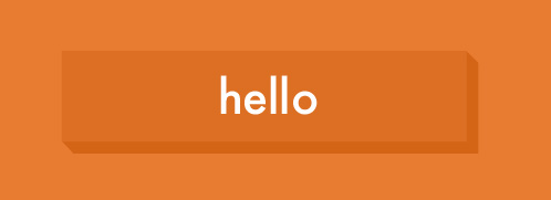
我需要它们是各种颜色(在不同的背景上),这就是我要问的原因。我不介意做不同的颜色或只是使用RGBA值。按钮总是比背景稍暗。
谢谢你的时间!
2 个答案:
答案 0 :(得分:6)
实现这一目标的简单方法是应用多个box-shadow s:
a{
    background: #ccc;
    display: block;
    box-shadow: #000 1px 1px 0,
                #000 2px 2px 0,
                #000 3px 3px 0,
                #000 4px 4px 0,
                #000 5px 5px 0,
                #000 6px 6px 0,
                #000 7px 7px 0,
                #000 8px 8px 0;
}
另一种方法,在伪元素上使用skew:
a{
    background: #ccc;
    display: block;
    position: relative;
}

b::before, b::after{
    content: '';
    position: absolute;
    top: 5px;               /* half of the shadow width */
    right: -10px;           /* negative shadow width */
    width: 10px;
    height: 100%;
    background: #000;
    transform: skewY(45deg);
}

b::after{
    height: 10px;
    width: 100%;
    bottom: -10px;          /* negative shadow height */
    left: 5px;              /* half of the shadow height */
    top: auto;
    right: auto;
    transform: skewX(45deg);
}
答案 1 :(得分:1)
此链接将为您提供所需内容: http://cssdeck.com/labs/fancy-3d-button
button {
    position: relative;
    color: rgba(255,255,255,1);
    text-decoration: none;
    background-color: rgba(219,87,5,1);
    font-weight: 700;
    font-size: 3em;
    display: block;
    padding: 4px;
    -webkit-border-radius: 8px;
    -moz-border-radius: 8px;
    border-radius: 8px;
    -webkit-box-shadow: 0px 9px 0px rgba(219,31,5,1), 0px 9px 25px rgba(0,0,0,.7);
    -moz-box-shadow: 0px 9px 0px rgba(219,31,5,1), 0px 9px 25px rgba(0,0,0,.7);
    box-shadow: 0px 9px 0px rgba(219,31,5,1), 0px 9px 25px rgba(0,0,0,.7);
    margin: 100px auto;
    width: 160px;
    text-align: center;

    -webkit-transition: all .1s ease;
    -moz-transition: all .1s ease;
    -ms-transition: all .1s ease;
    -o-transition: all .1s ease;
    transition: all .1s ease;
相关问题
最新问题
- 我写了这段代码,但我无法理解我的错误
- 我无法从一个代码实例的列表中删除 None 值,但我可以在另一个实例中。为什么它适用于一个细分市场而不适用于另一个细分市场?
- 是否有可能使 loadstring 不可能等于打印?卢阿
- java中的random.expovariate()
- Appscript 通过会议在 Google 日历中发送电子邮件和创建活动
- 为什么我的 Onclick 箭头功能在 React 中不起作用?
- 在此代码中是否有使用“this”的替代方法?
- 在 SQL Server 和 PostgreSQL 上查询,我如何从第一个表获得第二个表的可视化
- 每千个数字得到
- 更新了城市边界 KML 文件的来源?