<p>中的文字在移动设备上缩小,而div不在</p>
有谁知道这里发生了什么?我在opera,dolphin和工厂android浏览器上测试过。 (虽然现在似乎正在制作歌剧)
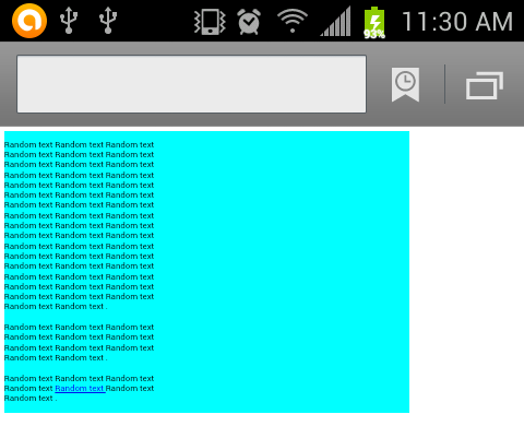
div不会改变大小,但文本会以某种方式缩小以适应div的一部分。 无论如何要防止这种情况?
为了清楚起见,我试图在移动浏览器上实现与PC版相同的外观。
由于浏览器似乎存在问题,如何强制文本占用div的整个宽度?我尝试将p标签设置为100%但没有成功。
div必须具有该宽度并与页面左侧对齐。
*更新1:我在galaxy s4上尝试了以下代码(之前在s2上尝试过)并且在opera mini和dolphin上遇到了同样的错误。 可以使用opera mini simulator在线显示错误,您只需要在某处托管html文件。
*更新2:我认为问题存在,因为加载网页时,它会以正常大小(像素)加载,因此段落只占据页面的一小部分。然后,页面缩小,以便所有内容适合页面,但文本不会传播,它会保留在初始的小空间中。
在Pc上,应该是:

我尽可能地缩小了代码:
<!DOCTYPE html PUBLIC "-//W3C//DTD XHTML 1.0 Transitional//EN" "http://www.w3.org/TR/xhtml1/DTD/xhtml1-transitional.dtd">
<html xmlns="http://www.w3.org/1999/xhtml" lang="en-us">
<head>

<meta content="text/html; charset=utf-8" http-equiv="Content-Type" />

<meta content="" name="keywords" />
<meta content="" name="description" />

<title></title>

</head>
<body>
<div style="width:1000px; margin-left:auto; margin-right:auto;" >

<div style="float:left; width:758px; background-color:aqua;">
<p>

Random text Random text Random text Random text Random text Random text Random text Random text
Random text Random text Random text Random text Random text Random text Random text Random text
Random text Random text Random text Random text Random text Random text Random text Random text
Random text Random text Random text Random text Random text Random text Random text Random text
Random text Random text Random text Random text Random text Random text Random text Random text
Random text Random text Random text Random text Random text Random text Random text Random text
Random text Random text .
<br />
<br />
Random text Random text Random text Random text Random text Random text Random text Random text
Random text Random text Random text .
<br />
<br />
Random text Random text Random text Random text
<a href="http://www.a.com/a.html">
Random text </a> Random text
Random text .
</p>
</div>
</div>
</body>
</html>
感谢。
7 个答案:
答案 0 :(得分:3)
最好开始应用HTML5和正确的doctype:
<!DOCTYPE html>
然后调整视口,以便可以应用它:
<meta name="viewport" content="width=device-width, initial-scale=1">
我没有Opera Mini进行测试,但根据兼容性表,它应该可以正常工作。
答案 1 :(得分:0)
添加
<meta name="viewport" content="width=device-width, initial-scale=1">
到您的页面。
以下是有关视口元标记的详细信息:http://webdesign.tutsplus.com/tutorials/htmlcss-tutorials/quick-tip-dont-forget-the-viewport-meta-tag/
答案 2 :(得分:0)
在Webkit中尝试添加css可能是文本缩放的事情:
- {-webkit-text-size-adjust:100%; }
或
- {-webkit-text-size-adjust:none; }
答案 3 :(得分:0)
移动网络浏览器会自动缩放页面,以便用户可以更清晰地查看文本。如果您想阻止文本缩放,请在<head>:
<meta name="viewport" content="width=device-width, initial-scale=1">
答案 4 :(得分:0)
我在Droid Razr(Droid OS 4.1.2) - 股票浏览器上遇到了与此几乎相同的问题。事实证明,浏览器本身存在问题 - 设置损坏或其他问题。 转到设置&gt;高级&gt;重置为默认值&gt;好的修复了问题。
答案 5 :(得分:0)
我发现当我使用
时text-align: center;
一切都很好,但是当我使用
时text-align: left;
文字缩小(Android 4.1浏览器)
需要进一步研究......
答案 6 :(得分:0)
尝试以相对单位指定宽度,例如%。
如下:
<强>宽度:100%;第一个div和..
<强>宽度:75%;对于里面的div
- 我写了这段代码,但我无法理解我的错误
- 我无法从一个代码实例的列表中删除 None 值,但我可以在另一个实例中。为什么它适用于一个细分市场而不适用于另一个细分市场?
- 是否有可能使 loadstring 不可能等于打印?卢阿
- java中的random.expovariate()
- Appscript 通过会议在 Google 日历中发送电子邮件和创建活动
- 为什么我的 Onclick 箭头功能在 React 中不起作用?
- 在此代码中是否有使用“this”的替代方法?
- 在 SQL Server 和 PostgreSQL 上查询,我如何从第一个表获得第二个表的可视化
- 每千个数字得到
- 更新了城市边界 KML 文件的来源?