将缺少的因子级别添加到ggplot2热图中
我有一个基于ggplot2的热图,可以显示某些因素的出现次数。但是,不同的数据集有时没有某些因素的实例,这意味着它们各自的热图看起来会有所不同。为了使并排比较更容易,我想添加缺失的级别。不幸的是我没有成功。
所以,我的数据看起来像这样:
> head(numRules)
  Job Generation NumRules
1   0          0        2
2   0          1        1
3   0          2        1
4   0          3        1
5   0          4        1
6   0          5        1
> levels(factor(numRules$NumRules))
[1] "1" "2" "3"
我使用以下代码渲染一个漂亮的热图,计算所有作业每代的规则数量:
ggplot(subset(numRules, Generation < 21), aes(x=Generation, y=factor(NumRules))) +
   stat_bin(aes(fill=..count..), geom="tile", binwidth=1, position="identity") +
   ylab('Number of Rules')
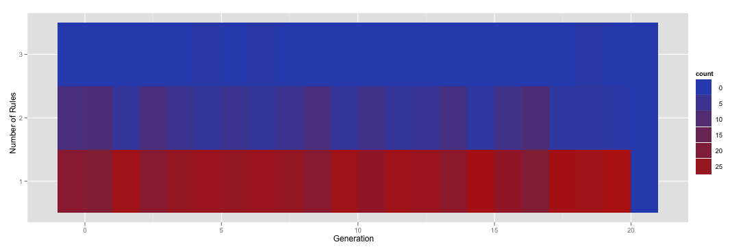
Heat map of count of number of rules by generation for all jobs
因此,热图表示,大多数情况下,跑步对于给定的一代只有一条规则,但有时你得到两条,而在极少数情况下你会得到三条。
现在,完全不同的一组运行实际上对于给定的一代实际上没有规则。然而,进行并排比较会有点混乱,因为一个热图的y轴在[1,3]中具有规则数,而另一个可能在[0,2]中。我想做的是标准化热图,使它们所有的因子级别都在(0,1,2,3)中,而不管规则的数量。例如,我想重新渲染上面的热图以包含零规则的行,即使在该特定数据框中没有该实例。
我用各种R咒语打破了这个问题,包括设置休息和音阶以及什么都无济于事。我的直觉是有一个简单的解决方案,但我无法找到它。
更新:
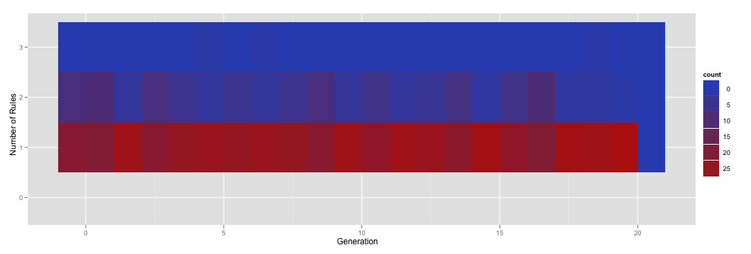
如果我在调用factor时手动指定级别,我会为零规则添加一行:
ggplot(subset(numRules, Generation < 21), aes(x=Generation, y=factor(NumRules,levels=c("0","1","2","3")))) + stat_bin(aes(fill=..count..), geom="tile", binwidth=1, position="identity") + ylab('Number of Rules')
产生this。
不幸的是,你可以看到这个新行没有正确着色。到达那里!
2 个答案:
答案 0 :(得分:1)
在这种情况下,更改数据会更容易。首先,阅读您的数据。然后设置变量NumRules以计算所有必要的级别(从0到3)
numRules = read.table(text="  Job Generation NumRules
1   0          0        2
2   0          1        1
3   0          2        1
4   0          3        1
5   0          4        1
6   0          5        1", header=TRUE)

numRules$NumRules = factor(numRules$NumRules, levels=c(0, 1, 2, 3))
现在计算NumRules和Generation的每个组合在函数table()的数据中的次数,并将其保存到某个对象。
tab<-table(numRules$NumRules,numRules$Generation)
tab

    0 1 2 3 4 5
  0 0 0 0 0 0 0
  1 0 1 1 1 1 1
  2 1 0 0 0 0 0
  3 0 0 0 0 0 0
使用库melt()中的函数reshape2以长格式生成此表并更改列名
library(reshape2)
tab.long<-melt(tab)
colnames(tab.long)<-c("NumRules","Generation","Count")
使用geom_tile()在新数据框架中绘制数据,并将fill=设置为包含实际数量的列。
ggplot(tab.long, aes(x=Generation, y=NumRules,fill=Count)) +
    geom_tile() +
  ylab('Number of Rules')

答案 1 :(得分:0)
如果您感兴趣的所有NumRules都是该因素的级别,那么您只需在drop=FALSE中指定scale_y_discrete()即可解决此问题:
numRules = read.table(text="  Job Generation NumRules
1   0          0        2
2   0          1        1
3   0          2        1
4   0          3        1
5   0          4        1
6   0          5        1", header=TRUE)

numRules$NumRules = factor(numRules$NumRules, levels=c(1, 2, 3))

ggplot(subset(numRules, Generation < 21), aes(x=Generation, y=NumRules)) +
  scale_y_discrete(drop=FALSE) +
  stat_bin(aes(fill=..count..), geom="tile", binwidth=1, position="identity") +
  ylab('Number of Rules')
结果:

- 我写了这段代码,但我无法理解我的错误
- 我无法从一个代码实例的列表中删除 None 值,但我可以在另一个实例中。为什么它适用于一个细分市场而不适用于另一个细分市场?
- 是否有可能使 loadstring 不可能等于打印?卢阿
- java中的random.expovariate()
- Appscript 通过会议在 Google 日历中发送电子邮件和创建活动
- 为什么我的 Onclick 箭头功能在 React 中不起作用?
- 在此代码中是否有使用“this”的替代方法?
- 在 SQL Server 和 PostgreSQL 上查询,我如何从第一个表获得第二个表的可视化
- 每千个数字得到
- 更新了城市边界 KML 文件的来源?