жҢүй’®еҸ еҠ еұӮжҳҫзӨәеңЁSwiftUIзҡ„жҢүй’®ж–Үжң¬дёҠж–№
жҲ‘зҡ„ButtonйңҖиҰҒеҮ дёӘеҸ еҠ еұӮжүҚиғҪиҺ·еҫ—жүҖйңҖзҡ„ж ·ејҸпјҲжҸҸиҫ№пјҢйҳҙеҪұзӯүпјүгҖӮ
дҪҶжҳҜпјҢиҝҷдәӣеҸ еҠ еұӮ然еҗҺдјҡиҰҶзӣ–Buttonж–Үжң¬гҖӮ
жҹҘзңӢпјҡ
struct ProfileTest: View {
var body: some View {
Button(action: {
}){
HStack {
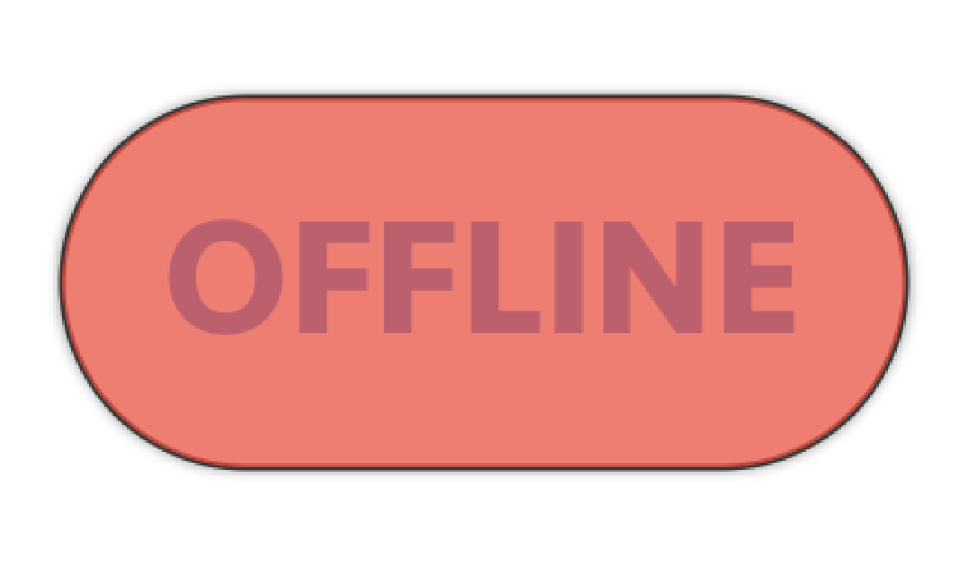
Text("OFFLINE")
.font(.custom("Seravek-Bold", size: 25))
.fontWeight(.bold)
.foregroundColor(Color.blue)
}
}.padding(EdgeInsets(top: 12, leading: 15, bottom: 12, trailing: 15))
.cornerRadius(50)
.overlay(
RoundedRectangle(cornerRadius: 50)
.stroke(Color.black, lineWidth: 1)
)
.overlay(
RoundedRectangle(cornerRadius: 50)
.fill(Color.red)
.shadow(color: Color.black.opacity(1), radius: 1)
)
.opacity(0.7)
.padding(.bottom, 100)
.padding(.bottom, 20)
}
}
еҰӮдҪ•и°ғж•ҙи§ҶеӣҫпјҢдҪҝи“қиүІж–Үжң¬жҳҫзӨәеңЁиғҢжҷҜдёҠж–№ пјҹ
1 дёӘзӯ”жЎҲ:
зӯ”жЎҲ 0 :(еҫ—еҲҶпјҡ1)
жӮЁеҸҜд»ҘдҪҝз”ЁиҮӘе®ҡд№үButtonStyleгҖӮ
- еҲӣе»әиҮӘе·ұзҡ„еҪўзҠ¶пјҢ并еңЁе…¶йЎ¶йғЁж·»еҠ
.overlay(configuration.label)
struct CustomButtonStyle: ButtonStyle {
    func makeBody(configuration: Self.Configuration) -> some View {
        configuration.label
            .hidden()
            .padding(EdgeInsets(top: 12, leading: 15, bottom: 12, trailing: 15))
            .cornerRadius(50)
            .overlay(
                RoundedRectangle(cornerRadius: 50)
                    .stroke(Color.black, lineWidth: 1)
            )
            .overlay(
                RoundedRectangle(cornerRadius: 50)
                    .fill(Color.red)
                    .shadow(color: Color.black.opacity(1), radius: 1)
            )
            .opacity(0.7)
            .overlay(configuration.label)
            .padding(.bottom, 100)
            .padding(.bottom, 20)
    }
}
жӮЁиҝҳеҸҜд»ҘдҪҝз”Ёconfiguration.isPressedиҮӘе®ҡд№үжҢүй’®жҢүдёӢж—¶зҡ„ж ҮзӯҫиЎҢдёәгҖӮ
- е°Ҷе…¶еә”з”ЁдәҺжӮЁзҡ„
Buttonпјҡ
struct ContentView: View {
    var body: some View {
        Button(action: {}) {
            HStack {
                Text("OFFLINE")
                    .font(.custom("Seravek-Bold", size: 25))
                    .fontWeight(.bold)
                    .foregroundColor(Color.blue)
            }
        }
        .buttonStyle(CustomButtonStyle())
    }
}
зӣёе…ій—®йўҳ
- IEдёҠдёҚжҳҫзӨәеҸ еҠ жҢүй’®
- еҸ еҠ жҳҫзӨәеңЁжҢүй’®дёҠж–№
- жӮ¬еҒңжҢүй’®дёҠжҳҫзӨәеҸ еҠ
- еңЁUIAlertViewеҸ еҠ еұӮдёҠж–№ж·»еҠ жҢүй’®
- GlyphiconжҳҫзӨәеңЁжҢүй’®ж–Үжң¬дёҠж–№
- еңЁж–Үжң¬жӮ¬еҒңдёҠжҳҫзӨәеҸ еҠ еұӮ
- еңЁеҸ еҠ еұӮдёҠж–№ж”ҫзҪ®дёҖдёӘжҢүй’®
- еҰӮдҪ•еңЁж–Үжң¬жҲ–жҢүй’®дёҠжҳҫзӨәжҲ–йҡҗи—ҸиҰҶзӣ–еӣҫ
- жҢүй’®еҸ еҠ еұӮжҳҫзӨәеңЁSwiftUIзҡ„жҢүй’®ж–Үжң¬дёҠж–№
- еҰӮдҪ•д»Ҙзј–зЁӢж–№ејҸжҳҫзӨәSwiftUIеҸ еҠ еұӮпјҹ
жңҖж–°й—®йўҳ
- жҲ‘еҶҷдәҶиҝҷж®өд»Јз ҒпјҢдҪҶжҲ‘ж— жі•зҗҶи§ЈжҲ‘зҡ„й”ҷиҜҜ
- жҲ‘ж— жі•д»ҺдёҖдёӘд»Јз Ғе®һдҫӢзҡ„еҲ—иЎЁдёӯеҲ йҷӨ None еҖјпјҢдҪҶжҲ‘еҸҜд»ҘеңЁеҸҰдёҖдёӘе®һдҫӢдёӯгҖӮдёәд»Җд№Ҳе®ғйҖӮз”ЁдәҺдёҖдёӘз»ҶеҲҶеёӮеңәиҖҢдёҚйҖӮз”ЁдәҺеҸҰдёҖдёӘз»ҶеҲҶеёӮеңәпјҹ
- жҳҜеҗҰжңүеҸҜиғҪдҪҝ loadstring дёҚеҸҜиғҪзӯүдәҺжү“еҚ°пјҹеҚўйҳҝ
- javaдёӯзҡ„random.expovariate()
- Appscript йҖҡиҝҮдјҡи®®еңЁ Google ж—ҘеҺҶдёӯеҸ‘йҖҒз”өеӯҗйӮ®д»¶е’ҢеҲӣе»әжҙ»еҠЁ
- дёәд»Җд№ҲжҲ‘зҡ„ Onclick з®ӯеӨҙеҠҹиғҪеңЁ React дёӯдёҚиө·дҪңз”Ёпјҹ
- еңЁжӯӨд»Јз ҒдёӯжҳҜеҗҰжңүдҪҝз”ЁвҖңthisвҖқзҡ„жӣҝд»Јж–№жі•пјҹ
- еңЁ SQL Server е’Ң PostgreSQL дёҠжҹҘиҜўпјҢжҲ‘еҰӮдҪ•д»Һ第дёҖдёӘиЎЁиҺ·еҫ—第дәҢдёӘиЎЁзҡ„еҸҜи§ҶеҢ–
- жҜҸеҚғдёӘж•°еӯ—еҫ—еҲ°
- жӣҙж–°дәҶеҹҺеёӮиҫ№з•Ң KML ж–Ү件зҡ„жқҘжәҗпјҹ