CSS过渡-将子div扩展到其父级宽度和高度
这是我的出发点-https://codepen.io/illianyh/pen/bGpJgma。
/*For IE CSS3 transition property works starting IE10*/
* {box-sizing: border-box;}
body {font-family: 'Playfair Display', serif; margin: 0;text-align: center}
h1 {font-weight: normal;color: #6A5953}
kbd {font-size: 0.9em;display:inline-block;line-height:1.1;}

div, h2, img {
  -webkit-transition: .5s ease-in-out;
  -moz-transition: .5s ease-in-out;
  -o-transition: .5s ease-in-out;
  transition: .5s ease-in-out;
}
h2 {
  color: #E39F81;
  text-shadow: 1px 1px 0 #FFE3BD;
}
h2:hover {
  text-shadow: 1px 1px 0 #FFE3BD, 2px 2px 0 #FFE3BD, 3px 3px 0 #FFE3BD, 4px 4px 0 #FFE3BD, 5px 5px 0 #FFE3BD;

}

.parent {
  width: 560px;
  height: 386px;
  margin: 0 auto;
  background: black;
  position: relative;
}

.box {
  width: 50%;
  position: absolute;
  right: 0;
  top: 153px;
}

.four {
  width: 423px;
  height: 248px;
  background-color: #95A1B1;
  margin: 0 auto;
}
.four:hover {
  width: 500px;
  height: 300px;
  box-shadow: 0 15px 15px -10px rgba(0,0,0, .5);
}
<h1>CSS3 Transition examples</h1>
<div class="parent"></div>
<div class="box"><div class="four"><kbd>width, height, box-shadow</kbd></div></div>
</div>
我如何使孩子向其父母的内部,内部和顶部扩展,而不是在其外部扩展。
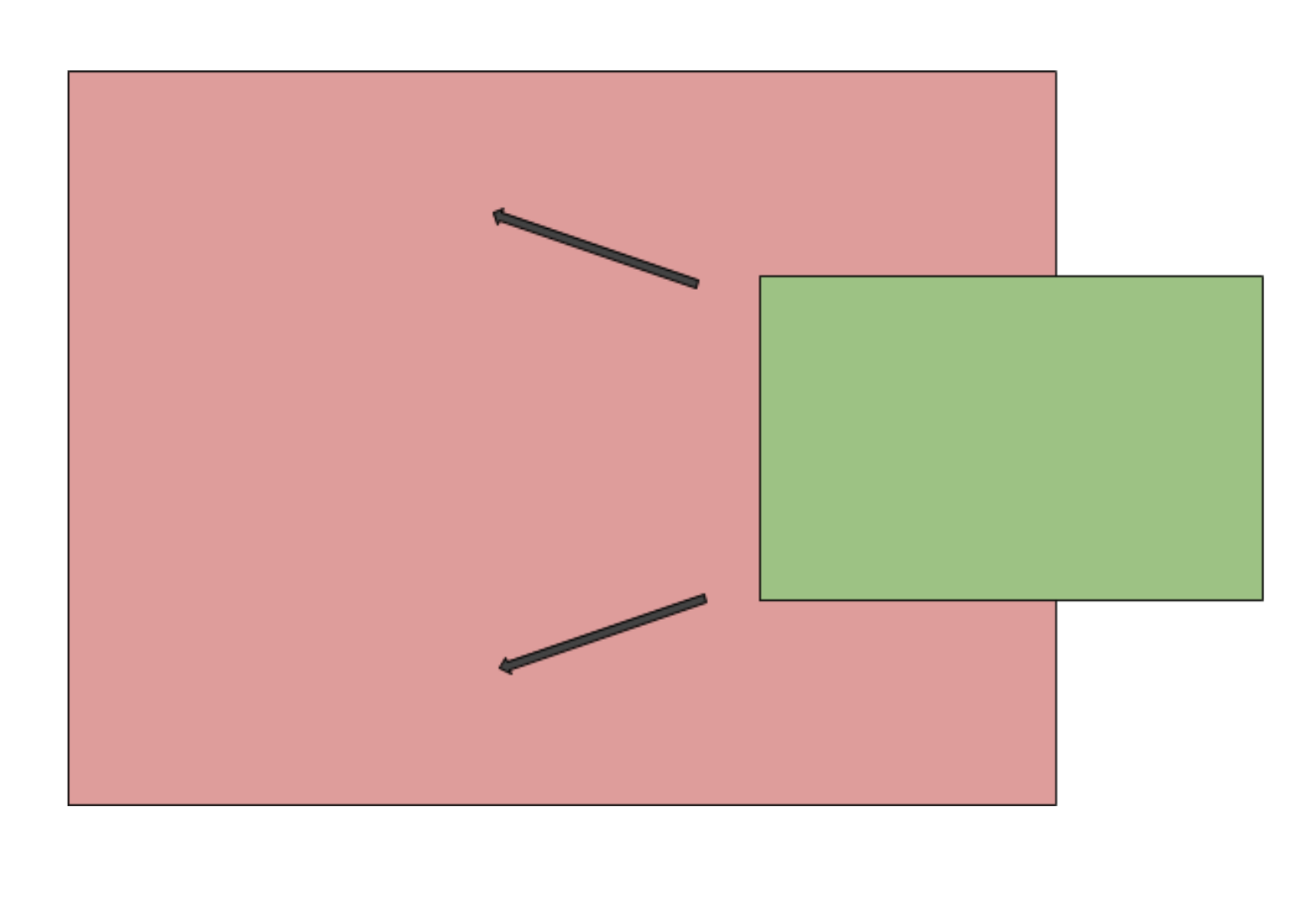
以下是我要实现的图表:
初始状态(箭头代表孩子展开的方向):
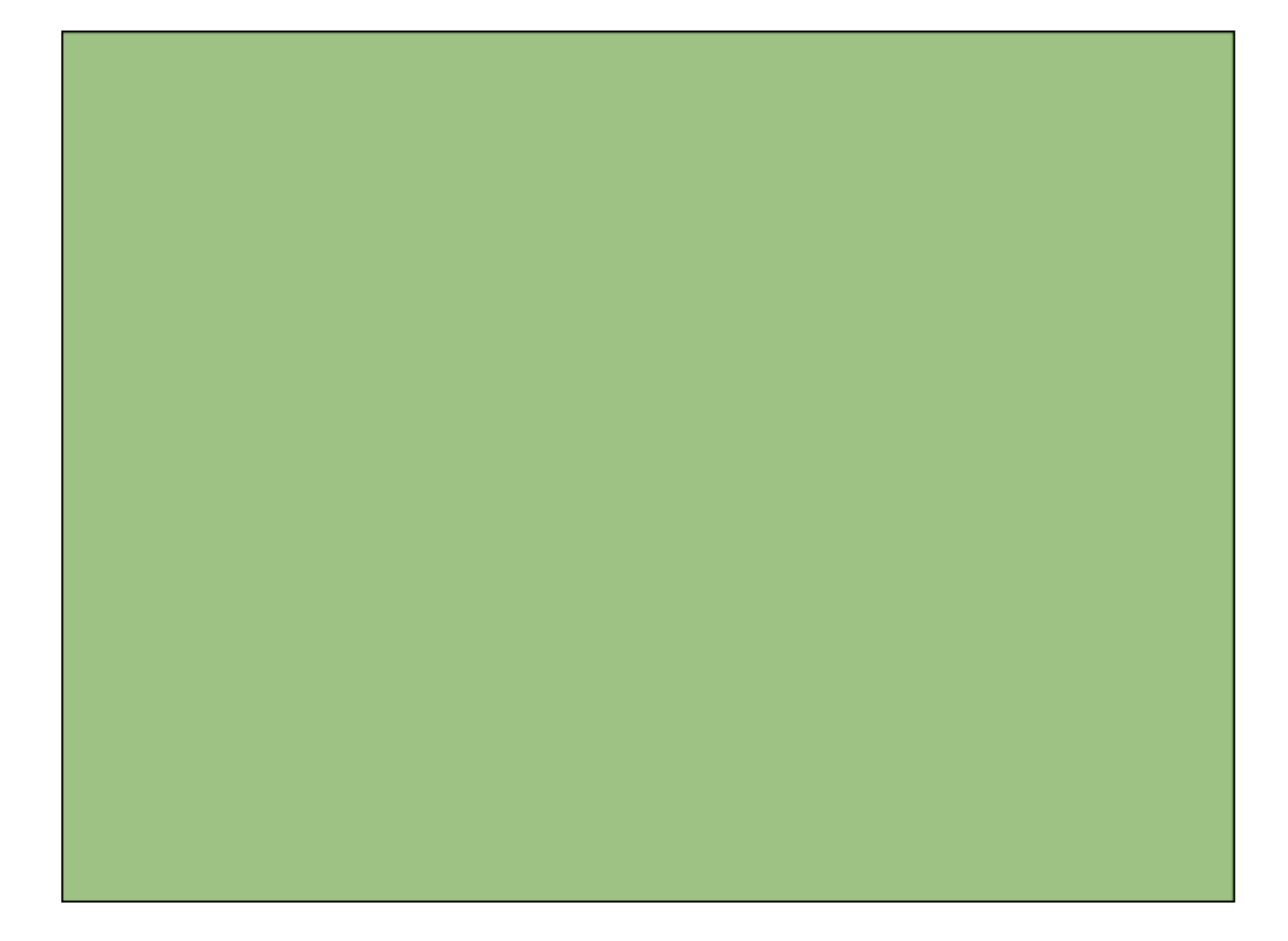
这是最终状态,最后,子div具有与父div相同的宽度和高度。父级现在隐藏在子级后面:
2 个答案:
答案 0 :(得分:2)
- 父级具有固定的位置,且具有相对位置
- 孩子的百分比或任何大小类型的absoulte位和左上角位置与父级固定大小相关(可能是父级的百分比)
- 转换可以在已知大小上进行
以下是我为您解决的一个示例:CODEPEN
.parent {
  position:relative;
  width: 560px;
  height: 386px;
  margin: 0 auto;
  background: black;
  position: relative;
  background: red;
}
.child {
  position:absolute;
  background: blue;
  height:70%;
  width: 50%;
  right: -20%;
  top:15%;
  box-shadow: 0 15px 15px -10px rgba(0,0,0, .5);
  transition: all 0.5s ease;
}
.parent:hover .child{
  top: 0%;
  right: 0;
  width:100%;
  height:100%;
  box-shadow: 0 0px 0px 0px rgba(0,0,0, .5);
}
.text{
  position:absolute;
  top: 50%;
  left: 50%;
  -webkit-transform: translate(-50%, -50%);
  -ms-transform: translate(-50%, -50%);
  transform: translate(-50%, -50%);
}
答案 1 :(得分:1)
解决方案是首先将孩子放置在父级中,并放置其位置和大小,使其与父级完全一致(我们称其为孩子的 actual 实际位置)。然后,使用带有scale和translate函数的transform属性,将子级定位在其开始位置。最后,当用户将鼠标悬停在孩子上方时,可以将转换和缩放值重置为其默认值。这样可以使孩子动画到实际位置。
.parent {
  width: 200px;
  height: 150px;
  margin: 0 auto;
  background: black;
  position: relative;
}

.box {
  transform: translate(100px, 53px) scale(0.5);
  position: absolute;
  left: 0;
  top: 0;
  right: 0;
  bottom: 0;
  transition: .5s ease-in-out;
  background: orange;
}

.box:hover {
   transform: translate(0, 0) scale(1);
}
<h1>CSS3 Transition examples</h1>
<div class="parent">
<div class="box"></div>
</div>
这是FLIP技术的简化版本。
相关问题
最新问题
- 我写了这段代码,但我无法理解我的错误
- 我无法从一个代码实例的列表中删除 None 值,但我可以在另一个实例中。为什么它适用于一个细分市场而不适用于另一个细分市场?
- 是否有可能使 loadstring 不可能等于打印?卢阿
- java中的random.expovariate()
- Appscript 通过会议在 Google 日历中发送电子邮件和创建活动
- 为什么我的 Onclick 箭头功能在 React 中不起作用?
- 在此代码中是否有使用“this”的替代方法?
- 在 SQL Server 和 PostgreSQL 上查询,我如何从第一个表获得第二个表的可视化
- 每千个数字得到
- 更新了城市边界 KML 文件的来源?