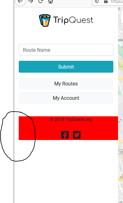
жҲ‘жӯЈеңЁеҠӘеҠӣж”ҫзҪ®дёҖдёӘз•ҷеңЁдҫ§иҫ№ж Ҹеә•йғЁзҡ„зІҳжҖ§йЎөи„ҡгҖӮдҪҶжҳҜпјҢдёҖдёӘе°Ҹй—®йўҳеӣ°жү°зқҖжҲ‘гҖӮдјјд№ҺйЎөи„ҡд»Һе·Ұиҫ№ејҖе§Ӣжңүиҫ№и·қпјҢиҖҢеҸіиҫ№жІЎжңүиҫ№и·қгҖӮжҲ‘еңЁиҝҷйҮҢеҒҡй”ҷдәҶд»Җд№ҲпјҹиҜ·жҹҘзңӢдёӢйқўзҡ„еұҸ幕жҲӘеӣҫпјҡ
No margin on the right side of the footer
* {
    font-family: 'Roboto', sans-serif;
}

body {

    background-color: #fff;
}

/* Every CSS rule for the Sidebar and it's contents */

.logo {
    width: 180px;
    height: 55px;
    margin: 14px auto;
    background-size: contain;
    background-repeat: no-repeat;
    background-image: url(../images/logo.png);
}

.sidebar {
    height: 100vh;
    background-color: #fff;
}

#map {
    height: 100vh;
}

.collapse ul {
    list-style-type: none;
}
.collapse ul li {
    padding: 10px;
}

footer {
    margin: 40px 0;
    font-size: 14px;
    width: 100%;
    text-align: center;
    position: absolute;
    background-color: red;
}
<!doctype html>
<html lang="en">
<head>
<!-- Required meta tags -->
<meta charset="utf-8">
<meta name="viewport" content="width=device-width, initial-scale=1, shrink-to-fit=no">
<title>TripQuest</title>
<!-- Bootstrap CSS -->
<link rel="stylesheet" href="https://stackpath.bootstrapcdn.com/bootstrap/4.3.1/css/bootstrap.min.css" integrity="sha384-ggOyR0iXCbMQv3Xipma34MD+dH/1fQ784/j6cY/iJTQUOhcWr7x9JvoRxT2MZw1T" crossorigin="anonymous">
<!--Custom CSS-->
<link rel="stylesheet" type="text/css" href="assets/css/main.css">
<!--Font Awesome-->
<link rel="stylesheet" href="https://use.fontawesome.com/releases/v5.11.2/css/all.css" integrity="sha384-KA6wR/X5RY4zFAHpv/CnoG2UW1uogYfdnP67Uv7eULvTveboZJg0qUpmJZb5VqzN" crossorigin="anonymous">
</head>
<body>
<div class="container-fluid">
<div class="row">
<div class="sidebar col-3">
<div class="logo"></div>
<div class="mt-5"></div>
<div class="form-group">
<input type="text" class="form-control" id="routename" placeholder="Route Name">
</div>
<div class="form-group">
<button type="submit" class="btn btn-info btn-md btn-block">Submit</button>
</div>
<button type="button" class="btn btn-light btn-md btn-block" data-toggle="collapse" data-target="#myroutes">My Routes</button>
<div id="myroutes" class="collapse">
<div class="mt-3 mb-3">
<ul>
<li>10/29/2019 - Roy</li>
<li>10/12/2019 - Roy</li>
<li>10/05/2019 - Roy</li>
</ul>
</div>
</div>
<div class="mt-2"></div>
<button type="button" class="btn btn-light btn-md btn-block" data-toggle="modal" data-target="#exampleModal">My Account</button>
<!-- Modal -->
<div class="modal fade" id="exampleModal" tabindex="-1" role="dialog" aria-labelledby="exampleModalLabel" aria-hidden="true">
<div class="modal-dialog" role="document">
<div class="modal-content">
<div class="modal-header">
<h5 class="modal-title" id="exampleModalLabel">My Account</h5>
<button type="button" class="close" data-dismiss="modal" aria-label="Close">
<span aria-hidden="true">×</span>
</button>
</div>
<div class="modal-body">
The user's "My Account" content will go in this modal window.
</div>
<div class="modal-footer">
<button type="button" class="btn btn-secondary" data-dismiss="modal">Close</button>
</div>
</div>
</div>
</div>
<footer>
© 2019 TripQuest.org
<div class="mt-4 mt-b-3">
<i class="fab fa-2x fa-facebook-square" style="padding-right: 10px"></i>
<i class="fab fa-2x fa-twitter-square"></i>
</div>
</footer>
</div>
<div id="map" class="mapsec col-9" style="background-color: #f5f7f8;">Google Maps</div>
<script>
// Initialize and add the map
function initMap() {
// The location of Uluru
var uluru = {lat: 38.897663, lng: -77.036575};
// The map, centered at Uluru
var map = new google.maps.Map(
document.getElementById('map'), {zoom: 13, center: uluru});
// The marker, positioned at Uluru
var marker = new google.maps.Marker({position: uluru, map: map});
}
</script>
<!--Load the API from the specified URL
* The async attribute allows the browser to render the page while the API loads
* The key parameter will contain your own API key (which is not needed for this tutorial)
* The callback parameter executes the initMap() function
-->
<script async defer
src="https://maps.googleapis.com/maps/api/js?key=AIzaSyACgLN4EW-PpbSRRzZm5iBGeDcgS1OKLHQ&callback=initMap">
</script>
</div>
</div>
<!-- Optional JavaScript -->
<!-- jQuery first, then Popper.js, then Bootstrap JS -->
<script src="https://code.jquery.com/jquery-3.3.1.slim.min.js" integrity="sha384-q8i/X+965DzO0rT7abK41JStQIAqVgRVzpbzo5smXKp4YfRvH+8abtTE1Pi6jizo" crossorigin="anonymous"></script>
<script src="https://cdnjs.cloudflare.com/ajax/libs/popper.js/1.14.7/umd/popper.min.js" integrity="sha384-UO2eT0CpHqdSJQ6hJty5KVphtPhzWj9WO1clHTMGa3JDZwrnQq4sF86dIHNDz0W1" crossorigin="anonymous"></script>
<script src="https://stackpath.bootstrapcdn.com/bootstrap/4.3.1/js/bootstrap.min.js" integrity="sha384-JjSmVgyd0p3pXB1rRibZUAYoIIy6OrQ6VrjIEaFf/nJGzIxFDsf4x0xIM+B07jRM" crossorigin="anonymous"></script>
</body>
</html>
зӯ”жЎҲ 0 :(еҫ—еҲҶпјҡ0)
еӣ жӯӨпјҢдҫ§иҫ№ж ҸдёҠзҡ„col-3зұ»еңЁдҪңдёәзІҳжҖ§йЎөи„ҡзҲ¶зә§зҡ„иҠӮзӮ№зҡ„е·Ұдҫ§е’ҢеҸідҫ§ж·»еҠ дәҶ15pxзҡ„еЎ«е……гҖӮйЎөи„ҡзҡ„е·ҰдёҠи§’ејҖе§ӢдәҺеЎ«е……еҶ…йғЁпјҢиҝҷжҳҫ然дёҚжҳҜжӮЁжғіиҰҒзҡ„гҖӮ
жңҖз®ҖеҚ•зҡ„и§ЈеҶіж–№жЎҲпјҲе°Ҫз®ЎжңүзӮ№жҖӘејӮпјүжҳҜйҖҡиҝҮеңЁйЎөи„ҡдёҠдҪҝз”Ёиҙҹиҫ№и·қжқҘжҠөж¶ҲеЎ«е……гҖӮдҪҝз”Ёиҙҹиҫ№и·қе°Ҷеё®еҠ©жӮЁзӣёеҜ№ең°е®ҡдҪҚеңЁз»қеҜ№е®ҡдҪҚзҡ„е…ғзҙ дёҠгҖӮзңӢиө·жқҘеғҸпјҡ
...

footer {
    margin: 40px 0 40px -15px;
    font-size: 14px;
    width: 100%;
    text-align: center;
    position: absolute;
    background-color: red;
}

...
иҝҷдәӣеёғеұҖзұ»еһӢжӯЈжҳҜCSSзҪ‘ж јзҡ„и®ҫи®Ўзӣ®зҡ„пјҢеӣ жӯӨпјҢеҰӮжһңжӮЁжңүи¶іеӨҹзҡ„иғҪеҠӣжҺўзҙўCSSзҪ‘ж јпјҢжҲ‘дјҡиҝҷж ·еҒҡгҖӮжӮЁеҸҜд»ҘеңЁд»ҘдёӢдҪҚзҪ®жүҫеҲ°жңүе…іCSSзҪ‘ж јзҡ„ж–ҮжЎЈпјҡhttps://developer.mozilla.org/en-US/docs/Web/CSS/CSS_Grid_Layout