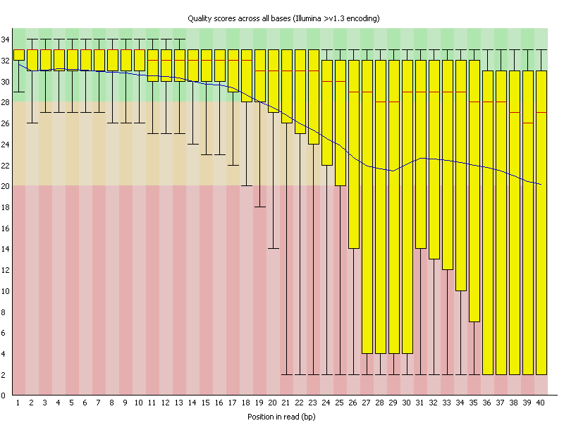
基本上,我找不到此问题的解决方案。 我检查了Matplotlib,Pandas和seaborn的文档,以找到一种方法在一组轴上绘制图表,该图表使用预先计算的序列数据在框中显示数据组的箱线图(UQ,LQ,Mean等)。 tsv表单,格式为FastQC报告,例如: https://www.bioinformatics.babraham.ac.uk/projects/fastqc/Help/3%20Analysis%20Modules/per_base_quality.png
#Position   Mean    Median  Lower Quartile  Upper Quartile  10th Percentile 90th Percentile
...
10  40.1102169515942    41.0    41.0    41.0    37.0    41.0
11  40.14826572575025   41.0    41.0    41.0    37.0    41.0
12  40.12512352866827   41.0    41.0    41.0    37.0    41.0
13  40.069397493337185  41.0    41.0    41.0    37.0    41.0
...
等 我找到的最接近该图的东西是matplotlib中名为https://matplotlib.org/gallery/statistics/bxp.html的函数,我在先前对问题Matplotlib boxplot using precalculated (summary) statistics的回答中发现了该函数, 但是我不确定这是否允许在同一轴上进行多个绘图。我觉得我前一段时间在R中遇到了这个问题,但是我并不精通它。 任何帮助将不胜感激。