如何将阴影添加到使用css`clip-path`制成的三角形中?
我创建了一个具有css clip-path属性的三角形,里面几乎没有内容。
.triangle {
            background-color: grey;
            -webkit-clip-path: polygon(50% 10%, 0% 100%, 100% 100%);
            clip-path: polygon(50% 10%, 0% 100%, 100% 100%);
            height: 100%;
            width: 100%;
            overflow: hidden;
            position: relative;
            filter: drop-shadow(9px 9px 9px rgba(255, 23, 23, 0.5));


            img {
                width: 100%;
                position: relative;
                left: 0;
                top: 5%;

                @media only screen and (min-device-width: 768px) and (max-device-width: 1024px) {
                    width: 110%;
                }
            }

            &::after {
                background-color: black;
                content: "";
                display: block;
                width: 100%;
                height: 100%;
                position: absolute;
                top: 0;
                left: 0;
                transition: opacity .5s;
                opacity: 0;
            }
      }
我在其中放置了很少的内容,并且为了产生悬停边框效果,我创建了另一个隐藏在该三角形后面的三角形。
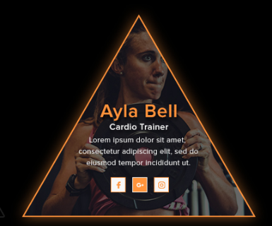
我想让SHADOW悬停在这个三角形周围。如下图所示。
我尝试了::before,但是没有用,其他可用的解决方案都不适用于剪切路径三角形。
2 个答案:
答案 0 :(得分:2)
这里是一个没有clip-path的想法,其诀窍是依靠级联倾斜变换来创建三角形形状并保留内容的初始外观:
.tri {
  margin: 40px;
  width: 250px;
  height: 200px;
  border-left: 2px solid orange;
  border-bottom: 2px solid orange;
  overflow: hidden;
  transform-origin: bottom;
  transform: skewX(-32deg);
  filter:drop-shadow(0 0 5px red);
}

.tri>.container {
  height: 100%;
  border-right: 2px solid orange;
  overflow: hidden;
  transform: skewX(51.35deg);
  transform-origin: bottom;
}

.tri>.container>div {
  transform-origin: bottom;
  transform: skewX(-32deg);
  height: 100%;

  /* Irrelevant styles */
  text-align: center;
  display: flex;
  flex-direction: column;
  justify-content:center;
  color:#fff;
  background:
    linear-gradient(rgba(0,0,0,0.2),rgba(0,0,0,0.2)),
    url(https://picsum.photos/id/10/1000/800) center/cover;
}

body {
 background:grey;
}
<div class="tri">
<div class="container">
<div>
<h1>Title</h1>
<p>some text here</p>
</div>
</div>
</div>
答案 1 :(得分:1)
只需将父元素添加到triangle并将drop-shadow添加到父元素。
尝试一下:
.triangleParent {
  filter: drop-shadow(9px 9px 9px rgba(255, 23, 23, 0.5));
}

.triangle {
  background-color: grey;
  -webkit-clip-path: polygon(50% 10%, 0% 100%, 100% 100%);
  clip-path: polygon(50% 10%, 0% 100%, 100% 100%);
  height: 100%;
  width: 100%;
  overflow: hidden;
  position: relative;
  filter: drop-shadow(9px 9px 9px rgba(255, 23, 23, 0.5));
}

.triangle img {
  width: 100%;
  position: relative;
  left: 0;
  top: 5%;
  @media only screen and (min-device-width: 768px) and (max-device-width: 1024px) {
    width: 110%;
  }
}

.triangle::after {
  background-color: black;
  content: "";
  display: block;
  width: 100%;
  height: 100%;
  position: absolute;
  top: 0;
  left: 0;
  transition: opacity .5s;
  opacity: 0;
}
<div class="triangleParent">
<div class="triangle">
<img src="https://images.pexels.com/photos/414612/pexels-photo-414612.jpeg?auto=compress&cs=tinysrgb&dpr=1&w=500" />
</div>
</div>
相关问题
最新问题
- 我写了这段代码,但我无法理解我的错误
- 我无法从一个代码实例的列表中删除 None 值,但我可以在另一个实例中。为什么它适用于一个细分市场而不适用于另一个细分市场?
- 是否有可能使 loadstring 不可能等于打印?卢阿
- java中的random.expovariate()
- Appscript 通过会议在 Google 日历中发送电子邮件和创建活动
- 为什么我的 Onclick 箭头功能在 React 中不起作用?
- 在此代码中是否有使用“this”的替代方法?
- 在 SQL Server 和 PostgreSQL 上查询,我如何从第一个表获得第二个表的可视化
- 每千个数字得到
- 更新了城市边界 KML 文件的来源?