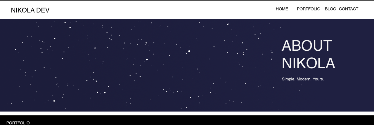
我正在尝试实现以下效果,但是在定位文本并使下划线到达屏幕末端时遇到一些麻烦。
.header {
  height: 550px;
  width: 100%;
  background-color: #1F2041;
  position: relative;
}

.header h1, .header h2{
  color: white;
  font-size: 52px;
  text-transform: uppercase;
  margin-bottom: 20px;
  border-bottom: 1.5px solid currentColor;
  line-height: 0.7;
  position: absolute;
  top: 210px;
}

.header p {
  margin-top: 40px;
  color: white;
}
<div class="header">
<h2>About</h2>
<h2>Nikola</h2>
<p>Simple. Modern. Yours.</p>
</div>
答案 0 :(得分:1)
使用float和clear尝试类似的操作。根据需要调整400px的大小。也许这种方式(浮动)不是最好的方式,可能首选使用边距,但是请避免使用position: absolute或元素可能会快速重叠。
.header {
    height: 550px;
    width: 100%;
    background-color: #1F2041;
    text-align: right;
}
.header * {
    float: right;
    clear: right;
    width: 400px;
    text-align: left;
    color: white;
    margin: 0 0 20px;
}

.header h1, .header h2{
    color: white;
    font-size: 52px;
    text-transform: uppercase;
    border-bottom: 1.5px solid currentColor;
}
<div class="header">
<h2>About</h2>
<h2>Nikola</h2>
<p>Simple. Modern. Yours.</p>
</div>
答案 1 :(得分:0)
也许您需要类似的东西? 通过绝对div,您可以更改其在父相对div中的位置。
您设置了一个静态高度,因此顶部和底部的边距大约为150像素,您将得到所需的
请记住,在使用position:absolute;时,它相对于父div为position:relative
.header {
  height: 550px;
  width: 100%;
  background-color: #1F2041;
  position: relative;
}

.content-div{
  position:absolute;
  margin: 150px 0 150px auto;
  width: 250px;
  right: 0;
}

.header h1, .header h2{
  color: white;
  font-size: 52px;
  text-transform: uppercase;
  margin-bottom: 20px;
  border-bottom: 1.5px solid currentColor;
  line-height: 0.7;
}

.header p {
  margin-top: 40px;
  color: white;
}
<div class="header">
<div class="content-div">
<h2>About</h2>
<h2>Nikola</h2>
<p>Simple. Modern. Yours.</p>
</div>
</div>