CSS object-fit:包含;在布局中保持原始图像宽度
我正在尝试使用object-fit: contain使我的图像在某些flexbox容器内响应,并且在调整图像的大小时,布局似乎保持原始图像的大小,从而导致出现滚动条。
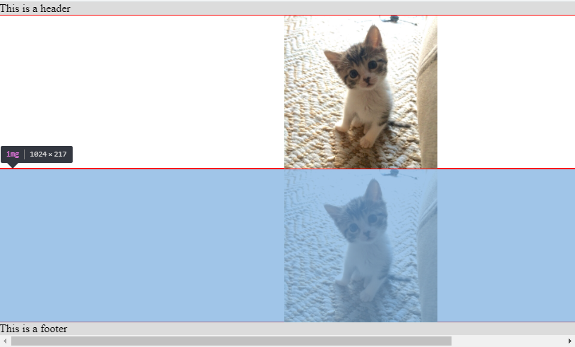
使用Chrome开发工具检查图像的宽度,显示宽度仍然为1024(但是高度已适当减小)。
(我从Auto Resize Image in CSS FlexBox Layout and keeping Aspect Ratio? 那里获得了启发)
我还缺少一些其他CSS属性吗?
JSFiddle:https://jsfiddle.net/w6hgqf18/1/
html,
body {
  margin: 0;
  height: 100%;
}

.page {
  height: 100%;
  display: flex;
}

.main-container {
  flex: 1 1 0;
  display: flex;
  flex-direction: column;
}

.half-containers {
  flex: 0 1 50%;
  overflow: auto;
  box-sizing: border-box;
  border: 0.5px solid red;
  display: flex;
}

.page-header {
  flex: 0 0 auto;
  background-color: #dcdcdc;
}

.page-footer {
  flex: 0 0 auto;
  background-color: #dcdcdc;
}

img {
  object-fit: contain;
}
<div class="page">
<div class="main-container">
<div class="page-header">
This is a header
</div>
<div class="half-containers">
<img src='https://i.imgur.com/tqQvuFr.jpg' />
</div>
<div class="half-containers">
<img src='https://i.imgur.com/tqQvuFr.jpg' />
</div>
<div class="page-footer">
This is a footer
</div>
</div>
</div>
2 个答案:
答案 0 :(得分:4)
您拥有的是合乎逻辑的,您只需要了解object-fit的工作方式即可。让我们从一个简单的例子开始:
.box {
  width:300px;
  height:300px;
  border:1px solid;
}
img {
 width:100%;
 height:100%;
 object-fit:contain;
}
<div class="box">
<img src="https://picsum.photos/300/200?image=1069">
</div>
如您所见,我使用了300x200框内拉伸的300x300图像,因此打破了它的比例,如果您检查图像的宽度/高度,您会发现它的尺寸仍为300x300(应用object-fit之前的缩小度)。
object-fit属性指定如何将替换元素的内容装配到由其使用的高度和宽度建立的框。
基本上,我们视觉上更改图像的内容,使其适合图像所建立的空间。 object-fit不会更改图像的大小,但会以该大小为参考来更改其内部内容。
让我们以相同的示例为例,改用50%:
.box {
  width:300px;
  height:300px;
  border:1px solid;
}
img {
 width:50%;
 height:50%;
 object-fit:contain;
}
<div class="box">
<img src="https://picsum.photos/300/200?image=1069">
</div>
现在图像的尺寸为150x150,在其中我们将内容更改为具有 contain 效果。
所有值都将发生相同的逻辑
.box {
  width:300px;
  height:300px;
  border:1px solid;
}
img {
 width:50%;
 height:50%;
}
<div class="box">
<img src="https://picsum.photos/300/200?image=1069" style="object-fit:contain;">
</div>
<div class="box">
<img src="https://picsum.photos/300/200?image=1069" style="object-fit:cover;">
</div>
在您的示例中,您有相同的事情。没有object-fit的图片如下图
html,
body {
  margin: 0;
  height: 100%;
}

.page {
  height: 100%;
  display: flex;
}

.main-container {
  flex: 1 1 0;
  display: flex;
  flex-direction: column;
}

.half-containers {
  flex: 0 1 50%;
  overflow: auto;
  box-sizing: border-box;
  border: 0.5px solid red;
  display: flex;
}

.page-header {
  flex: 0 0 auto;
  background-color: #dcdcdc;
}

.page-footer {
  flex: 0 0 auto;
  background-color: #dcdcdc;
}

img {
  /*object-fit: contain;*/
}
<div class="page">
<div class="main-container">
<div class="page-header">
This is a header
</div>
<div class="half-containers">
<img src='https://i.imgur.com/tqQvuFr.jpg' />
</div>
<div class="half-containers">
<img src='https://i.imgur.com/tqQvuFr.jpg' />
</div>
<div class="page-footer">
This is a footer
</div>
</div>
</div>
添加object-fit不会更改其大小,只会更改我们看到的内容:
html,
body {
  margin: 0;
  height: 100%;
}

.page {
  height: 100%;
  display: flex;
}

.main-container {
  flex: 1 1 0;
  display: flex;
  flex-direction: column;
}

.half-containers {
  flex: 0 1 50%;
  overflow: auto;
  box-sizing: border-box;
  border: 0.5px solid red;
  display: flex;
}

.page-header {
  flex: 0 0 auto;
  background-color: #dcdcdc;
}

.page-footer {
  flex: 0 0 auto;
  background-color: #dcdcdc;
}

img {
  object-fit: contain;
}
<div class="page">
<div class="main-container">
<div class="page-header">
This is a header
</div>
<div class="half-containers">
<img src='https://i.imgur.com/tqQvuFr.jpg' />
</div>
<div class="half-containers">
<img src='https://i.imgur.com/tqQvuFr.jpg' />
</div>
<div class="page-footer">
This is a footer
</div>
</div>
</div>
现在,另一个问题是您的图像的宽度为1024px,而弹性项目将不会stretch past its content size due to the min-width constraint,因此您需要添加{{1} }。这样一来,您就不会再出现溢出问题,那么您的图像将被包含在flexbox布局所定义的区域内。
min-width:0html,
body {
margin: 0;
height: 100%;
}
.page {
height: 100%;
display: flex;
}
.main-container {
flex: 1 1 0;
display: flex;
min-width: 0; /*added*/
flex-direction: column;
}
.half-containers {
flex: 0 1 50%;
overflow: auto;
box-sizing: border-box;
border: 0.5px solid red;
display: flex;
}
.page-header {
flex: 0 0 auto;
background-color: #dcdcdc;
}
.page-footer {
flex: 0 0 auto;
background-color: #dcdcdc;
}
img {
object-fit: contain;
min-width: 0; /*added*/
}
考虑到<div class="page">
<div class="main-container">
<div class="page-header">
This is a header
</div>
<div class="half-containers">
<img src='https://i.imgur.com/tqQvuFr.jpg' />
</div>
<div class="half-containers">
<img src='https://i.imgur.com/tqQvuFr.jpg' />
</div>
<div class="page-footer">
This is a footer
</div>
</div>
</div>和background-image,您也可以得到相同的输出,因为没有更多内容,您不再需要为background-size:contain约束而烦恼
min-widthhtml,
body {
margin: 0;
height: 100%;
}
.page {
height: 100%;
display: flex;
}
.main-container {
flex: 1 1 0;
display: flex;
flex-direction: column;
}
.half-containers {
flex: 0 1 50%;
overflow: auto;
box-sizing: border-box;
border: 0.5px solid red;
display: flex;
background:url(https://i.imgur.com/tqQvuFr.jpg) center/contain no-repeat;
}
.page-header {
flex: 0 0 auto;
background-color: #dcdcdc;
}
.page-footer {
flex: 0 0 auto;
background-color: #dcdcdc;
}
答案 1 :(得分:0)
您可以将img标签与div的{{1}}包装在一起,并将图像width: 100%设置为height,而无需使用100%:< / p>
object-fithtml,
body {
margin: 0;
height: 100%;
}
.page {
height: 100%;
display: flex;
}
.main-container {
flex: 1 1 0;
display: flex;
flex-direction: column;
}
.half-containers {
flex: 0 1 50%;
overflow: auto;
box-sizing: border-box;
border: 0.5px solid red;
display: flex;
}
.page-header {
flex: 0 0 auto;
background-color: #dcdcdc;
}
.page-footer {
flex: 0 0 auto;
background-color: #dcdcdc;
}
.img-container {
width: 100%;
}
img {
height: 100%;
}
- 我写了这段代码,但我无法理解我的错误
- 我无法从一个代码实例的列表中删除 None 值,但我可以在另一个实例中。为什么它适用于一个细分市场而不适用于另一个细分市场?
- 是否有可能使 loadstring 不可能等于打印?卢阿
- java中的random.expovariate()
- Appscript 通过会议在 Google 日历中发送电子邮件和创建活动
- 为什么我的 Onclick 箭头功能在 React 中不起作用?
- 在此代码中是否有使用“this”的替代方法?
- 在 SQL Server 和 PostgreSQL 上查询,我如何从第一个表获得第二个表的可视化
- 每千个数字得到
- 更新了城市边界 KML 文件的来源?