如何在本机应用程序中剪切边框?
这是我想要通过布局中的绿色按钮实现的图像。
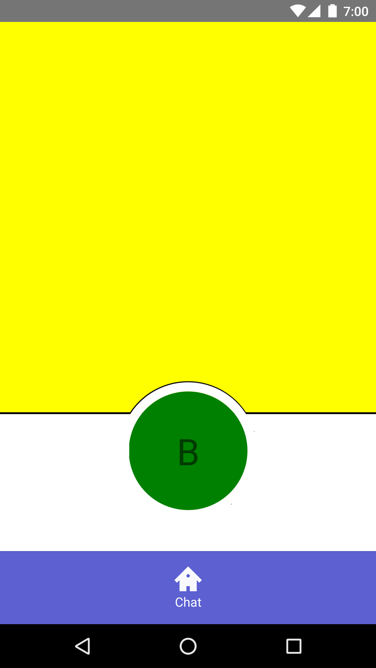
是否注意到视图B上方的边框?我希望底部栏的边框周围有一条曲线。
为此,我创建了视图结构-
import React from 'react'
import { Text, View } from 'react-native'

class OkScreen extends React.Component {
  static navigationOptions = {
    header: null
  }

  render () {
    return (
      <View
        style={{
          flexDirection: 'column',
          alignSelf: 'stretch',
          flexGrow: 1
        }}
      >
        <View
          style={{
            backgroundColor: 'yellow',
            flexGrow: 1
          }}
        />
        <View
          style={{
            borderWidth: 1
          }}
        />
        <View
          style={{
            backgroundColor: 'white',
            flexDirection: 'row',
            justifyContent: 'space-evenly',
            alignItems: 'center',
            height: 150,
            borderTopWidth: 10,
            borderTopColor: 'white'
          }}
        >
          <View
            style={{
              borderWidth: 10,
              alignItems: 'center',
              justifyContent: 'center',
              height: 152,
              width: 152,
              borderRadius: 76,
              bottom: 40
            }}
          >
            <View
              style={{
                height: 150,
                width: 150,
                borderRadius: 75,
                backgroundColor: 'green',
                alignItems: 'center',
                justifyContent: 'center',
                borderWidth: 10,
                borderColor: 'white'
              }}
            >
              <Text
                style={{
                  fontSize: 40
                }}
              >
                B
              </Text>
            </View>
          </View>
        </View>
      </View>
    )
  }
}

export default OkScreen
这种方法行不通,最终看起来像这样-

我应该采取什么方法进行这项工作?任何建议将不胜感激。
2 个答案:
答案 0 :(得分:0)
您可以在包含按钮的白色视图后面添加一个白色圆形视图,为该圆形提供所需的边框,并为按钮提供zIndex = 3和包含视图zIndex = 2。
使用position: absolute将视图彼此重叠,并用上,下,左,右进行调整。提示:使用StyleSheet组件并将所有样式保留在那里,设置宽度,高度等时不要依赖点。使用'%'或const {width, height} Dimensions.get('window')并使用它们使您的应用程序具有响应性
答案 1 :(得分:0)
您可以在黄色元素上执行此操作,而不是像以下一样使用radial-gradient和linear-gradient(不确定对react native的支持):
.yellow {
  height:100px;
  background:
    linear-gradient(#000,#000) right bottom/calc(50% - 50px) 3px no-repeat,
    linear-gradient(#000,#000) left bottom /calc(50% - 50px) 3px no-repeat,
    radial-gradient(circle at 50% 100%,transparent 49px,#000 50px,#000 52px,yellow 53px);
}

.green {
  width:80px;
  height:80px;
  margin: -40px auto;
  background:green;
  border-radius:50%;
}
<div class="yellow">
</div>
<div class="green">
</div>
您也可以考虑使用边框和阴影组合来近似:
.yellow {
  height:100px;
  background:yellow;
  border-bottom:2px solid;
}

.green {
  width:100px;
  height:100px;
  border:2px solid transparent;
  border-top-color:#000;
  box-sizing:border-box;
  margin: -17px auto;
  padding:2px;
  background:green content-box;
  box-shadow:0 0 0 10px #fff inset;
  border-radius:50%;
}
<div class="yellow">
</div>
<div class="green">
</div>
相关问题
最新问题
- 我写了这段代码,但我无法理解我的错误
- 我无法从一个代码实例的列表中删除 None 值,但我可以在另一个实例中。为什么它适用于一个细分市场而不适用于另一个细分市场?
- 是否有可能使 loadstring 不可能等于打印?卢阿
- java中的random.expovariate()
- Appscript 通过会议在 Google 日历中发送电子邮件和创建活动
- 为什么我的 Onclick 箭头功能在 React 中不起作用?
- 在此代码中是否有使用“this”的替代方法?
- 在 SQL Server 和 PostgreSQL 上查询,我如何从第一个表获得第二个表的可视化
- 每千个数字得到
- 更新了城市边界 KML 文件的来源?