调整大小以扩大和最小化div
我想并排制作3 div,当单击一个按钮同时折叠另一个按钮时,每个按钮都可以扩展到全屏显示(但仍显示垂直方向的标题)。像CodePen一样。这是他们页面中的样子。
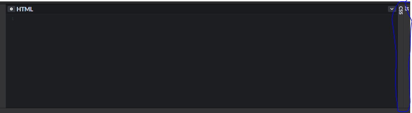
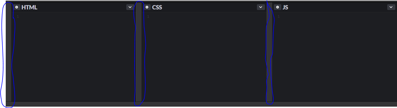 最初,它并排显示3个相等大小的div。当您双击侧面的调整大小时,它将扩展一个div并折叠另一个div,但折叠的div不会完全隐藏。
 我试图检查他们的页面源代码,发现此行只有一个代码。
<div class="editor-resizer html-editor-resizer" title="Double-click to expand."></div>
<div id="box-html" class="box box-html" data-type="html">
   <div class="powers">
      <div class="powers-drag-handle" title="Double-click to expand."></div>
      <div class="editor-actions-left">
         <button id="settings-pane-html" class="button button-medium mini-button settings-nub" data-type="html" title="Open HTML Settings">
            <svg class="icon-gear" width="10" height="10">
               <use xlink:href="#gear"></use>
            </svg>
         </button>
         <h2 class="box-title html-editor-title" id="html-editor-title"><span class="box-title-name">HTML</span></h2>
      </div>
   </div>
   <div class="code-wrap">
      <pre id="html" class="code-box" aria-labeledby="html-editor-title">
         <code>

         </code>
      </pre>
      <div class="error-bar" id="error-bar-html">
         <span class="error-icon" data-type="html">
         !
         </span>
      </div>
   </div>
</div>
但是我找不到用于此行为的任何JavaScript或CSS。我该如何实现?是否有来自jQuery或Bootstrap的此类组件的插件?还是我必须从头开始创建?
2 个答案:
答案 0 :(得分:4)
您可以先做一个自己的最小示例,例如以下可以改进的示例。我认为它比尝试重现像codepen之类的复杂代码要好:
它可以在悬停中使用,但是您可以通过单击某些JS轻松实现它
.container {
  display: flex;
  height: 200px;
}

.container>div {
  flex: 1;
  background:
    linear-gradient(red, red) left/15px 100% no-repeat,
    blue;
  padding-left: 15px;
  color: #fff;
  transition: 0.5s all;
}

.container:hover>div {
  min-width: 15px;
  padding: 0;
  flex: 0;
  writing-mode: vertical-lr;
}

.container>div:hover {
  flex: 1;
  padding-left: 15px;
  writing-mode: initial;
}
<div class="container">
<div>HTML</div>
<div>CSS</div>
<div>JS</div>
</div>
答案 1 :(得分:0)
我已经创建了一个Vue组件库。它具有可理解的结构,并且具有许多辅助事件和道具。而且它是触摸友好的,并且支持垂直/水平分割。 Github link
Vue.component('MultiSplitPane', VueMultiSplitPane.MultiSplitPane)
Vue.component('Pane', VueMultiSplitPane.Pane)

new Vue({
  el: '#app'
})
@import url('https://fonts.googleapis.com/css2?family=Fira+Code&display=swap');
body {
font-family: 'Fira Code', monospace;
background: #d8d1d9;
}
.v-pane-custom .v-pane .content {
background: #fff;
}
.v-pane-custom .content .innerContent {
padding: 20px;
line-height: 1.5;
}
.paneNested>.content>.innerContent {
padding: 0;
}<div id="app">
<multi-split-pane split="horizontal" height="400px" width="1000px" resizerWidth="30px" classes="v-pane-custom">
<Pane>
<template v-slot:content>
Lorem Ipsum is simply dummy text of the printing and typesetting industry. Lorem Ipsum has been the industry's standard dummy text ever since the 1500s, when an unknown printer took a galley of type and scrambled it to make a type specimen book. It has survived not only five centuries, but also the leap into electronic typesetting, remaining essentially unchanged. It was popularised in the 1960s with the release of Letraset sheets containing Lorem Ipsum passages, and more recently with desktop publishing software like Aldus PageMaker including versions of Lorem Ipsum.
</template>
</Pane>
</multi-split-pane>
</div>
<script src="https://cdn.jsdelivr.net/npm/vue@2.6.12/dist/vue.js"></script>
<script src="https://cdn.jsdelivr.net/npm/vue-multi-split-pane@1.1.1/dist/vue-multi-split-pane.min.js"></script>
相关问题
最新问题
- 我写了这段代码,但我无法理解我的错误
- 我无法从一个代码实例的列表中删除 None 值,但我可以在另一个实例中。为什么它适用于一个细分市场而不适用于另一个细分市场?
- 是否有可能使 loadstring 不可能等于打印?卢阿
- java中的random.expovariate()
- Appscript 通过会议在 Google 日历中发送电子邮件和创建活动
- 为什么我的 Onclick 箭头功能在 React 中不起作用?
- 在此代码中是否有使用“this”的替代方法?
- 在 SQL Server 和 PostgreSQL 上查询,我如何从第一个表获得第二个表的可视化
- 每千个数字得到
- 更新了城市边界 KML 文件的来源?