带圆角的C#WPF ComboBox IsMouseOver不起作用
我发现这个代码在组合框上做圆角,我稍微修改了一下,但我有两个问题:
1)组合框(文本框+ togglebutton)上的鼠标悬停不会 工作。 (我希望在鼠标悬停时使用带有蓝色背景的标准行为,只是为了看看是否发生了事情而放置红色)
2)当我点击togglebutton时,我得到了弹出窗口,但是如何让文本框可以点击以获得弹出窗口?
这就是我得到的:

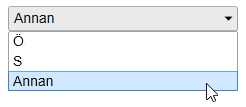
这是鼠标悬停时我想要的(但有圆角)

以下是代码:
<Style x:Key="BorderStyle">
    <Setter Property="Control.BorderBrush" Value="#A0A1A2" />
    <Setter Property="Control.BorderThickness" Value="1" />
    <Setter Property="Control.Background" Value="Transparent" />
    <Setter Property="Control.Foreground" Value="#101010" />
    <Setter Property="Control.FontFamily" Value="Arial" />
    <Setter Property="Control.FontWeight" Value="Normal" />
    <Setter Property="Control.FontStretch" Value="Normal" />
    <Setter Property="Control.FontStyle" Value="Normal" />
</Style>

<Style x:Key="ComboBoxTextBoxStyle" TargetType="{x:Type TextBox}">
    <Style.Triggers>
        <Trigger Property="IsMouseOver" Value="true">
            <Setter Property="Background" Value="Red" />
        </Trigger>
    </Style.Triggers>
    <Setter Property="Template">
        <Setter.Value>
            <ControlTemplate TargetType="{x:Type TextBox}">
                <Grid>
                    <Border CornerRadius="2,0,0,2"
                            BorderThickness="1,1,0,1"
                            Background="{TemplateBinding Background}"
                            BorderBrush="#A0A1A2">
                        <ScrollViewer x:Name="PART_ContentHost"/>
                    </Border>
                </Grid>
            </ControlTemplate>
        </Setter.Value>
    </Setter>
</Style>

<Style x:Key="ComboBoxButtonStyle" TargetType="{x:Type ToggleButton}">
    <Style.Triggers>
        <Trigger Property="IsMouseOver" Value="true">
            <Setter Property="Background" Value="Red" />
        </Trigger>
    </Style.Triggers>
    <Setter Property="Template">
        <Setter.Value>
            <ControlTemplate TargetType="{x:Type ToggleButton}">
                <Border Background="#EAEAEA"
                        x:Name="border"
                        CornerRadius="0,2,2,0"
                        BorderThickness="0,1,1,1"
                        BorderBrush="#A0A1A2">
                    <ContentPresenter />
                </Border>
            </ControlTemplate>
        </Setter.Value>
    </Setter>
</Style>

<Style  x:Key="RoundComboBox" TargetType="{x:Type ComboBox}" BasedOn="{StaticResource BorderStyle}">
    <Setter Property="HorizontalContentAlignment" Value="Left"/>
    <Setter Property="VerticalContentAlignment" Value="Center"/>
    <Setter Property="FontSize" Value="14px"/>
    <Setter Property="IsReadOnly" Value="True"/>
    <Setter Property="Height" Value="25"/>
    <Setter Property="Template">
        <Setter.Value>
            <ControlTemplate TargetType="{x:Type ComboBox}">
                <Grid>
                    <Grid.ColumnDefinitions>
                        <ColumnDefinition/>
                        <ColumnDefinition MaxWidth="18"/>
                    </Grid.ColumnDefinitions>

                    <TextBox Name="PART_EditableTextBox"
                             Padding="0,0,0,0"
                             IsHitTestVisible="False"
                             Height="{TemplateBinding Height}"
                             BorderBrush="#A0A1A2"
                             Background="#EAEAEA"
                             Style="{StaticResource ComboBoxTextBoxStyle}"/>

                    <ToggleButton Grid.Column="1"
                                  Height="{TemplateBinding Height}"
                                  Style="{StaticResource ComboBoxButtonStyle}"
                                  Focusable="False"
                                  IsChecked="{Binding Path=IsDropDownOpen, Mode=TwoWay, RelativeSource={RelativeSource TemplatedParent}}"
                                  ClickMode="Press">
                        <Path Grid.Column="1"
                              HorizontalAlignment="Center"
                              VerticalAlignment="Center"
                              Data="M 0 0 L 4 4 L 8 0 Z"
                              Fill="Black" />
                    </ToggleButton>

                    <ContentPresenter Grid.Column="0"
                                      Name="ContentSite"
                                      Content="{TemplateBinding SelectionBoxItem}"
                                      ContentTemplate="{TemplateBinding SelectionBoxItemTemplate}"
                                      ContentTemplateSelector="{TemplateBinding ItemTemplateSelector}"
                                      VerticalAlignment="Center"
                                      HorizontalAlignment="Left"
                                      Margin="6,0,0,0"/>

                    <Popup Grid.Column="0"
                           Name="Popup"
                           Placement="Bottom"
                           IsOpen="{TemplateBinding IsDropDownOpen}"
                           AllowsTransparency="True"
                           Focusable="False"
                           PopupAnimation="Slide">

                        <Grid Name="DropDown"
                              SnapsToDevicePixels="True"
                              MinWidth="{TemplateBinding ActualWidth}"
                              MaxHeight="{TemplateBinding MaxDropDownHeight}">

                            <Border x:Name="DropDownBorder"
                                    BorderThickness="1"
                                    CornerRadius="2"
                                    Background="White"
                                    BorderBrush="#A0A1A2"/>
                            <ScrollViewer SnapsToDevicePixels="True">
                                <StackPanel IsItemsHost="True" KeyboardNavigation.DirectionalNavigation="Contained" />
                            </ScrollViewer>
                        </Grid>

                    </Popup>
                </Grid>
            </ControlTemplate>
        </Setter.Value>
    </Setter>
</Style>
1 个答案:
答案 0 :(得分:1)
这里有一些问题。我在XAML中更改的每个项目都已注释。
我还从togglebutton和textbox样式中删除了IsMouseOver触发器,并将其置于ComboBox样式中。现在,当鼠标位于ComboBox上方的任何位置时,它会设置整个组合框的背景。 ComboBox模板中的两个控件现在具有Background="{TemplateBinding Background}",因此它们将使用该触发器设置的背景颜色。
我已在文本框中恢复了IsHitTestVisible,但使用了TemplateBinding将其绑定到ComboBox的IsEditable属性。这将为您提供文本框上方的正确鼠标指针。
<!--
Better to define this in one place.
I'd do the same with the border color that you use everywhere.
-->
<SolidColorBrush x:Key="ComboBackgroundBrush" Color="#EAEAEA" />

<Style x:Key="ComboBoxTextBoxStyle" TargetType="{x:Type TextBox}">
    <!--
    Must set this in a setter, not an an attribute on the control instance.
    The attribute you had will override anything the style does. This is part of
    "dependency property value precedence".
    -->
    <Setter Property="Background" Value="{StaticResource ComboBackgroundBrush}" />
    <Setter Property="Template">
        <Setter.Value>
            <ControlTemplate TargetType="{x:Type TextBox}">
                <Grid>
                    <Border CornerRadius="2,0,0,2"
                            BorderThickness="1,1,0,1"
                            Background="{TemplateBinding Background}"
                            BorderBrush="#A0A1A2"
                            >
                        <ScrollViewer x:Name="PART_ContentHost"/>
                    </Border>
                </Grid>
            </ControlTemplate>
        </Setter.Value>
    </Setter>
</Style>

<Style x:Key="ComboBoxButtonStyle" TargetType="{x:Type ToggleButton}">
    <Setter Property="Background" Value="{StaticResource ComboBackgroundBrush}" />
    <Setter Property="Template">
        <Setter.Value>
            <ControlTemplate TargetType="{x:Type ToggleButton}">
                <!--
                Needs {TemplateBinding Background} so it uses whatever background brush
                the control has at any given moment.
                -->
                <Border Background="{TemplateBinding Background}"
                        x:Name="border"
                        CornerRadius="0,2,2,0"
                        BorderThickness="0,1,1,1"
                        BorderBrush="#A0A1A2">
                    <ContentPresenter />
                </Border>
            </ControlTemplate>
        </Setter.Value>
    </Setter>
</Style>

<Style x:Key="ComboBoxOverlayToggleButtonStyle" TargetType="ToggleButton">
    <Setter Property="Focusable" Value="False" />
    <Setter Property="ClickMode" Value="Press" />
    <Setter Property="Template">
        <Setter.Value>
            <ControlTemplate TargetType="ToggleButton">
                <Grid Background="Transparent" />
            </ControlTemplate>
        </Setter.Value>
    </Setter>
</Style>
<Style x:Key="RoundComboBox" TargetType="{x:Type ComboBox}" BasedOn="{StaticResource BorderStyle}">
    <Setter Property="HorizontalContentAlignment" Value="Left"/>
    <Setter Property="VerticalContentAlignment" Value="Center"/>
    <Setter Property="FontSize" Value="14px"/>
    <Setter Property="IsReadOnly" Value="True"/>
    <Setter Property="Height" Value="25"/>
    <Setter Property="Template">
        <Setter.Value>
            <ControlTemplate TargetType="{x:Type ComboBox}">
                <Grid>
                    <Grid.ColumnDefinitions>
                        <ColumnDefinition/>
                        <ColumnDefinition MaxWidth="18"/>
                    </Grid.ColumnDefinitions>

                    <ToggleButton
                        Grid.Column="0"
                        Style="{StaticResource ComboBoxOverlayToggleButtonStyle}"
                        IsChecked="{Binding Path=IsDropDownOpen, Mode=TwoWay, RelativeSource={RelativeSource TemplatedParent}}"
                        />

                    <!--
                    Two problems:
                        1. IsHitTestVisible="False" prevented it from getting any mouse messages.
                        2. Background attribute was overriding anything the Style did,
                           so even if the trigger had fired, its setter would have failed.
                    Also, Height="{TemplateBinding Height}" is unnecessary. It'll size to its parent Grid.
                    And BorderBrush="#A0A1A2" should probably be in the Style
                    -->
                    <TextBox Name="PART_EditableTextBox"
                             Padding="0,0,0,0"
                             BorderBrush="#A0A1A2"
                             Style="{StaticResource ComboBoxTextBoxStyle}"
                             Background="{TemplateBinding Background}"
                             IsHitTestVisible="{TemplateBinding IsEditable}"
                             />

                    <ToggleButton Grid.Column="1"
                                  Height="{TemplateBinding Height}"
                                  Style="{StaticResource ComboBoxButtonStyle}"
                                  Focusable="False"
                                  IsChecked="{Binding Path=IsDropDownOpen, Mode=TwoWay, RelativeSource={RelativeSource TemplatedParent}}"
                                  ClickMode="Press"
                                  Background="{TemplateBinding Background}"
                                  >
                        <Path Grid.Column="1"
                              HorizontalAlignment="Center"
                              VerticalAlignment="Center"
                              Data="M 0 0 L 4 4 L 8 0 Z"
                              Fill="Black" />
                    </ToggleButton>

                    <ContentPresenter Grid.Column="0"
                                      Name="ContentSite"
                                      Content="{TemplateBinding SelectionBoxItem}"
                                      ContentTemplate="{TemplateBinding SelectionBoxItemTemplate}"
                                      ContentTemplateSelector="{TemplateBinding ItemTemplateSelector}"
                                      VerticalAlignment="Center"
                                      HorizontalAlignment="Left"
                                      Margin="6,0,0,0"
                                      />

                    <Popup Grid.Column="0"
                           Name="Popup"
                           Placement="Bottom"
                           IsOpen="{TemplateBinding IsDropDownOpen}"
                           AllowsTransparency="True"
                           Focusable="False"
                           PopupAnimation="Slide">

                        <Grid Name="DropDown"
                              SnapsToDevicePixels="True"
                              MinWidth="{TemplateBinding ActualWidth}"
                              MaxHeight="{TemplateBinding MaxDropDownHeight}">

                            <Border x:Name="DropDownBorder"
                                    BorderThickness="1"
                                    CornerRadius="2"
                                    Background="White"
                                    BorderBrush="#A0A1A2"/>
                            <ScrollViewer SnapsToDevicePixels="True">
                                <StackPanel IsItemsHost="True" KeyboardNavigation.DirectionalNavigation="Contained" />
                            </ScrollViewer>
                        </Grid>

                    </Popup>
                </Grid>
            </ControlTemplate>
        </Setter.Value>
    </Setter>
    <Style.Triggers>
        <Trigger Property="IsMouseOver" Value="true">
            <Setter Property="Background" Value="Red" />
        </Trigger>
    </Style.Triggers>
</Style>
相关问题
最新问题
- 我写了这段代码,但我无法理解我的错误
- 我无法从一个代码实例的列表中删除 None 值,但我可以在另一个实例中。为什么它适用于一个细分市场而不适用于另一个细分市场?
- 是否有可能使 loadstring 不可能等于打印?卢阿
- java中的random.expovariate()
- Appscript 通过会议在 Google 日历中发送电子邮件和创建活动
- 为什么我的 Onclick 箭头功能在 React 中不起作用?
- 在此代码中是否有使用“this”的替代方法?
- 在 SQL Server 和 PostgreSQL 上查询,我如何从第一个表获得第二个表的可视化
- 每千个数字得到
- 更新了城市边界 KML 文件的来源?